Having a standout website is crucial, especially in the mechanics industry. A well-crafted website acts as the digital handshake for auto repair shops and mechanics, providing the initial impression potential customers receive. It’s not solely about visual appeal; top-notch mechanic websites skillfully marry functionality with design to create a seamless experience that leads customers from initial interest to booking services. These platforms not only detail services and expertise but also highlight customer testimonials, simplifying the decision for car owners to entrust their vehicles to you.
Moreover, websites for mechanics are essential tools for establishing credibility and authority in the auto repair industry. A well-designed website provides a platform for mechanics to highlight their certifications, specializations, and years of experience. It’s a space where trustworthiness and reliability are communicated through professional design, detailed service descriptions, and engaging content. An effective website can set a mechanic shop apart from competitors by emphasizing its unique selling propositions and commitment to customer satisfaction.
Auto mechanic websites also play a crucial role in local search engine optimization (SEO), making your business more visible to people searching for auto repair services in your area. A website fine-tuned for search engines and mobile compatibility guarantees that when potential clients are searching for mechanic services, your site emerges at the forefront of their search outcomes. This digital presence is not just about being found; it’s about being chosen. Your website can influence decision-making through strategic design and content, turning visitors into customers.
Examples of the Best Auto Mechanic Website Designs
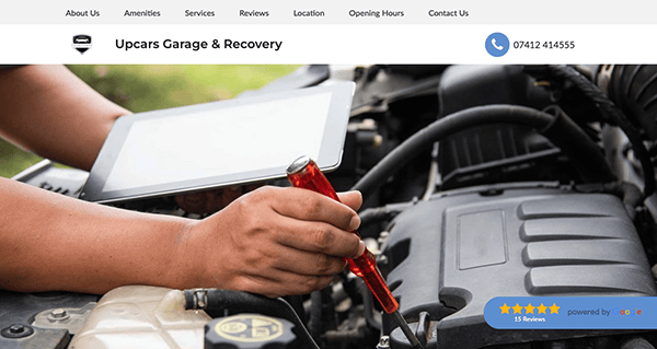
- Upcars Garage Harlow: Arriving visitors are instantly greeted by a tidy, polished layout that expresses confidence and knowledge. Its dedication to quality and attention to detail is reflected in applying a consistent color palette and excellent photographs. Users may easily locate the information they need on this website, including pricing, services offered, and contact data, courtesy of its simple navigation. A good user experience is enhanced by elements like a search function, a sticky header with a prominent navigation menu, and content sections that are arranged neatly. Its website uses calls to action (CTAs) to make it simple for prospective clients to grasp how to use their services.
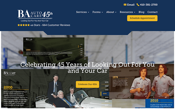
- BA Auto Care: The website sets the pace nicely for websites offering mechanical care services with its polished, precise design and easy-to-use navigation. For a modern mobile-first audience, its responsive design guarantees a flawless viewing experience across all devices. The website skillfully displays the company’s offerings via thorough descriptions and superior photographs, fostering credibility and trust. Widely displayed customer testimonials and an online booking system increase user convenience and confidence. The presence of an extensive blog section highlights BA Auto Care’s dedication to enlightening and enabling its clients.
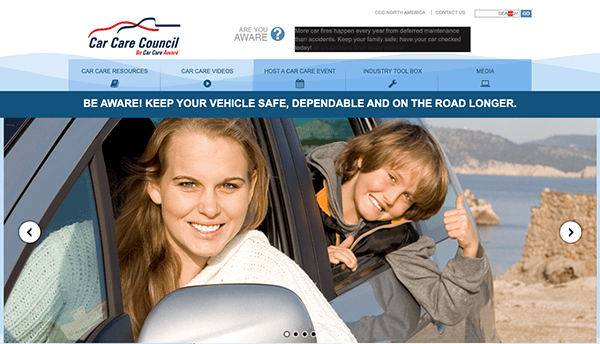
- Car Care Council: Its website is the shining instance of an educational and approachable online presence in the car sector. Its layout places a high priority on accessibility and convenience of use, making it possible for users to locate essential materials for car upkeep and repair quickly. The website’s design is simple and uncomplicated, featuring a logically arranged menu that leads users to all the necessary information, such as service schedules, industry news, and maintenance advice. The website uses a restrained palette of colors and visuals to improve readability without overpowering the text. Additionally, the Car Care Council has done a remarkable job educating car owners through interactive tools and instructional resources like the Car Care Guide and service interval schedules.
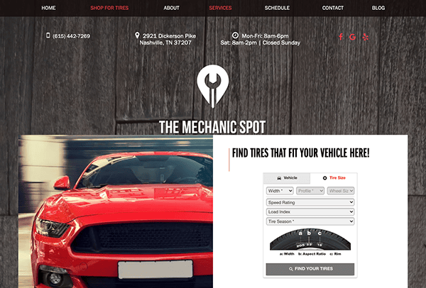
- The Mechanic Spot: Its website, which combines expert color schemes and high-quality graphics to create a sense of trust and competence, is a prime example of contemporary web design excellence in the automotive service sector. With an emphasis on user experience, its user-friendly structure and simplified navigation ensure that details about contacts, bookings, and services are readily available. The site’s responsiveness is essential for mobile consumers as it offers a consistent and captivating experience across all devices. The site’s material is enhanced by user reviews and an extensive FAQ area, which reassure prospective clients of the high caliber and dependability of the services provided. This website exemplifies how an automotive service business can achieve a robust online presence through effective design.
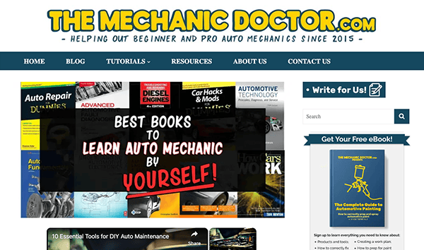
- The Mechanic Doctor: Its user-friendly design and simple navigation allow users to access various how-to articles, tool reviews, and mechanic tips. The thoughtful inclusion of visual components like photos and videos improves instructional information without being overpowering. The adaptable design of the website guarantees optimal performance on a wide range of devices, hence expanding its accessibility. The significance of aesthetics in web usability is highlighted by deliberate decisions regarding color scheme and font, which encourage readability and user engagement. This website not only provides its audience with high-quality, easily accessible content, but it also establishes a standard for online design in the automotive and educational domains. A unique example in its sector, The Mechanic Doctor, shows how valuable resources can be provided in a friendly and polished online environment.
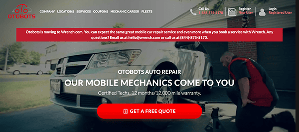
- Otobots: Its website features a professional, minimalistic design that highlights cleanliness. Because of its user-friendly layout, service details, costs, and appointment scheduling are readily available. The value proposition of Otobots is succinctly stated on the homepage, which skillfully employs calls to action to draw visitors in. The mobile-first audience is catered to via responsive design, guaranteeing a smooth surfing experience across all devices. User journey enhancements include customer testimonials and a thorough FAQ section addressing typical queries and fostering confidence. This website makes Otobots stand out as a customer-focused, cutting-edge auto repair service, demonstrating how innovative design can enhance a company. Otobots sets the standard for automobile service web design with its strategic design choices, effectively conveying its message and services.
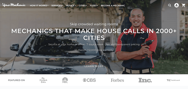
- Your Mechanic: It presents a sleek and sophisticated interface that attests to the effectiveness and convenience of mobile mechanic services, striking a fantastic mix between visual appeal and usefulness. The website cleverly uses color and font to keep things readable and focused on the essential things, such as service categories and booking options, while fostering a friendly atmosphere. Navigation is exceptionally user-friendly, with a clear, concise layout that guides visitors effortlessly to book services, explore pricing, and understand the range of services available.
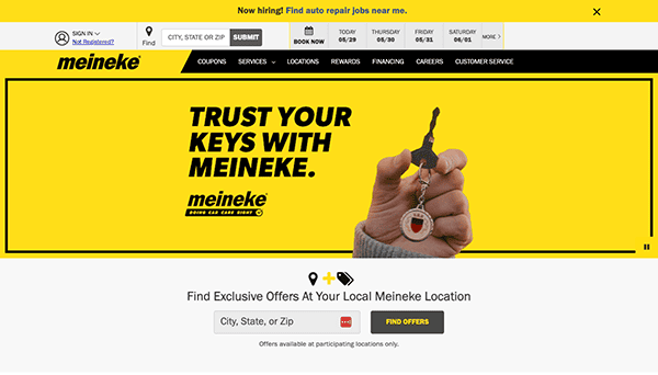
- Meineke: Its website demonstrates excellent web design, fusing professionalism and a user-friendly interface to improve the automobile service industry’s client experience. One of the most important features for today’s mobile consumers is its responsive design, which guarantees a flawless browsing experience across all devices. Quick loading times and well-placed calls to action make it easier for users to go from exploring services to scheduling appointments. Meineke’s professional image and brand identification are strengthened with high-quality photographs and a unified color palette. The website does a good job of fostering transparency and trust among its users by including customer feedback and thorough service descriptions. An instructive resources section emphasizes its dedication to customer education and empowerment.
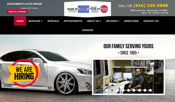
- Sacramento Auto Repair: The website’s crisp layout and excellent photography give a vibe of expertise and trustworthiness. Finding the information they require is made simple for visitors by the logical menu structure and easy navigation. The company’s knowledge and services are efficiently communicated using attention-grabbing headlines and succinct content. Throughout the website, prominent call-to-action buttons are positioned strategically to direct users to take the appropriate actions, such as making an appointment or discovering more about the business. User pleasure is increased by the website’s responsive design, which guarantees a smooth experience across devices. Visitors are given trust by the site’s constant reinforcement of its brand identity.
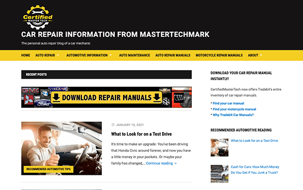
- Certified Master Tech: The website strikes an initial impression of professionalism and car repair competence credited to its elegant design and top-notch images. The menu layout is rationally arranged, making it easy for users to navigate to services, blog posts, and other resources. The company’s value proposition is effectively communicated through engaging content, and call-to-action buttons placed prominently on the page promote user involvement. The website’s responsive design guarantees seamless cross-device browsing, improving accessibility and user happiness. The reputation of Certified Master Tech as a reliable resource for auto repair and maintenance is strengthened by its consistent branding.
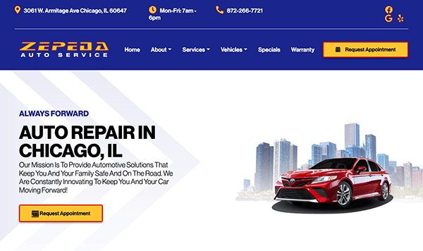
- Zepeda Auto Service: The website’s crisp design and excellent photography immediately create an eye-catching visual appeal. Captivating images of cars and maintenance equipment create an appealing ambiance, and the use of a unified color palette enhances the overall visual appeal. The layout’s well-considered arrangement of text and images improves readability and draws the eye in. The menu structure makes sense and offers direct access to various parts, including services, about us, and contact information. Prominent call-to-action buttons are placed strategically throughout the website to promote interaction and direct users toward the intended actions.
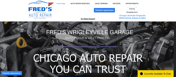
- Fred’s Auto Repair: The website’s clean layout and excellent photography immediately grab users’ attention. The well-considered arrangement of images and text improves readability and draws users in. It uses clear, educational information to convey its knowledge and offerings efficiently. Important components, including service offerings, contact details, accolades, recognition, and client testimonials, are highlighted, grabbing attention and promoting interaction. With its eye-catching design, simple navigation, engaging content, and flawless responsiveness, the website successfully highlights the business’s experience and dedication to client satisfaction.
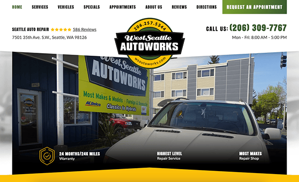
- West Seattle Autoworks: The website has a clean, professional touch. The color scheme strikes the ideal mix between bright artwork and white space, making it both classy and welcoming. The website’s clear navigation and well-organized style make navigating it simple. The website includes elements that make it easy for users to interact with the business, like online appointment scheduling and educational FAQs. Furthermore, the addition of excellent photos and videos successfully highlights the services provided, enticing viewers to learn more.
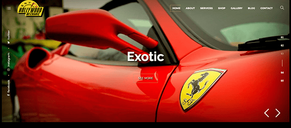
- Hollywood Mechanic: Upon accessing the homepage, one is immediately struck by the elegant and sophisticated design, which reflects Hollywood’s refinement. The visually arresting environment created by combining bright accents and dark hues creates an immersive browsing experience. Its well-structured style and fixed menu make the website easy to navigate and provide quick access to all of its essential sections. The website’s visuals authentically represent Hollywood Mechanic’s expertise and attention to detail. Their work portfolio is exhibited through stunning images that skillfully and precisely capture the soul of each project. Plus, with strategically placed and engaging calls-to-action (CTAs) peppered throughout, viewers are always just a click away from taking the next step toward your automotive needs.
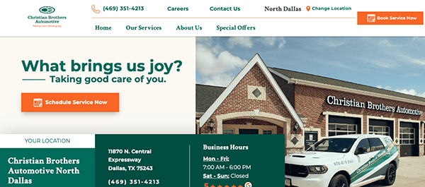
- Christian Brothers Automotive: The company’s dedication to providing outstanding service is reflected in the welcoming and pleasant style of the homepage. Vibrant images and succinct but educational parts immediately draw visitors in and provide the ideal atmosphere for an enjoyable browsing experience. The website’s vibrancy is due to its visually striking graphics and multimedia components, which also successfully highlight the competence and professionalism of its services. The website also prioritizes user convenience, including accessible online booking alternatives, educational FAQs, and suggestions. Compelling calls to action encourage users to take the following action, such as making an appointment for maintenance or getting in touch with their staff for support.
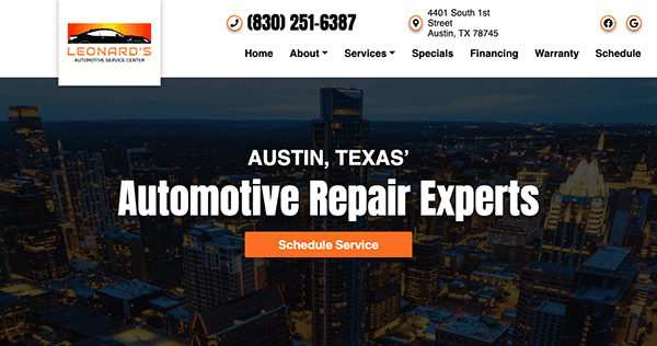
- Leonard’s: Visitors are welcomed to a friendly, easily navigable homepage that emanates professionalism and dependability. The neat appearance and simple navigation options immediately communicate the company’s commitment to client pleasure and openness. The website’s adaptation to different screen sizes and resolutions is evident, providing a consistent and delightful surfing experience for users of smartphones, tablets, and desktop computers. The addition of customer testimonials and publicly displayed credentials demonstrates the company’s commitment to excellence, instilling trust and confidence in prospective clients.
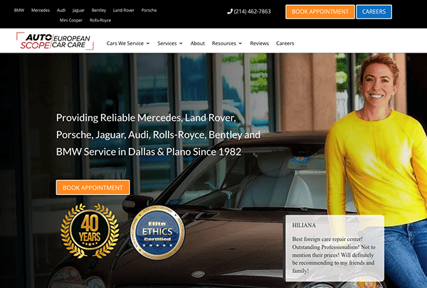
- Auto Scope: A warm and welcoming design greets you immediately when you arrive on the homepage, emphasizing dependability and professionalism. The clear structure and thoughtful placement of important information make it simple for users to quickly locate what they’re looking for, creating a pleasant browsing experience. The website’s vibrant use of yellow draws the visitor’s attention to critical areas and calls to action in an eye-catching and visually arresting way. The use of video testimonials and client reviews offers persuasive social proof by exhibiting authentic experiences and instilling trust in prospective clients that they may also anticipate outstanding service and contentment.
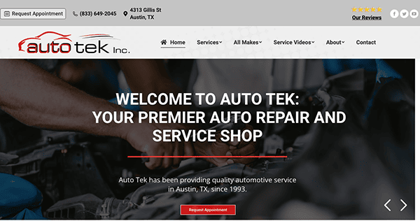
- Auto Tek Inc.: The website accommodates user preferences by creating a harmonic balance between informative content and captivating imagery. Carefully placing images next to important content draws users in and improves understanding by breaking up significant text passages into smaller chunks, making the surfing experience easier to read. The key features prominently positioned at the top of the page include reviews, social media links, phone numbers, and an easy-to-book appointment link. These elements provide instant access to vital resources, promoting quick connection with the brand and assuring seamless contact.
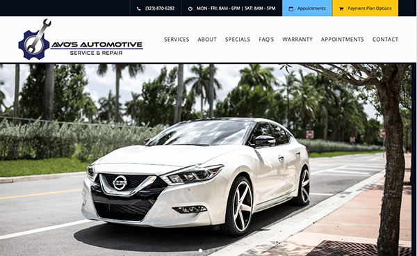
- Avo’s Automotive: This well-thought-out website for auto mechanics combines educational writing with eye-catching graphics in a harmonious whole. Ample white space guarantees a clear and uncluttered layout, and the thoughtful use of a soft blue color draws attention to essential features like their phone number and services, improving user experience and making it easier to find important information quickly. The thorough description of their roadside assistance service, which clearly outlines its advantages and value proposition, is noteworthy as it shows their dedication to providing excellent customer support. Glowing client endorsements and an integrated Google Map for simple location navigation encourage audience participation and trust.
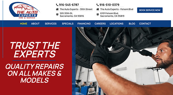
- The Auto Experts: The website greets users with an organized, polished design that communicates assurance and stability. Its thoughtful use of white space and subdued color accents creates a welcoming ambiance, instantly inspiring confidence in the brand. Magnificent graphics and interactive features take center stage, efficiently demonstrating its offerings’ professionalism and depth. Additionally, the visibility of the phone number at the top of the page and a prominent button to schedule an appointment ensures easy customer access, facilitating seamless communication and engagement with the business.
In the ever-evolving automotive industry, having a standout online presence is vital to attracting and retaining customers. The best auto mechanic websites combine user-friendly navigation, clear service listings, and compelling calls to action with a visually appealing design. These websites inform and engage visitors, encouraging them to book an appointment or contact the shop for more information. Focusing on customer reviews and before-and-after project galleries can also significantly enhance trust and credibility.
In wrapping up, it’s clear that a top-notch website is instrumental in driving the success of mechanic shops in the digital age. An effective website reflects the quality of your services, the depth of your expertise, and your commitment to customer satisfaction. It’s your most powerful marketing tool, working around the clock to attract new customers and retain existing ones.
For mechanics aiming to enhance their digital footprint, CyberOptik specializes in custom web design and development solutions crafted explicitly for the auto repair sector. Our experts are adept at designing engaging, SEO-optimized websites that attract search engines and prospective clients. Whether you’re debuting a new site or overhauling an existing one, our mission is to make your online presence distinguishable in the competitive digital arena.
Contact CyberOptik today for a free consultation about your mechanic website. Allow us to boost your business by creating a website that directly addresses the needs of your target audience and highlights why you are the premier choice for their auto repair requirements.

