A polished, professionally designed website is a must-have for any successful attorney. It serves to establish your credibility and as a dynamic platform for engaging visitors, promoting your practice areas, and showcasing your team’s expertise.
An exceptional attorney website must inspire trust at first glance, clearly articulate the firm’s practice areas, and feature compelling attorney bios. At CyberOptik, we specialize in crafting such websites, intertwining aesthetics with functionality to create an effective online presence for your practice.
As you plan your new attorney website, looking at industry leaders can provide valuable insights and inspiration. In this post, we’ve curated a selection of top attorney websites that excel in trust-building, user engagement, and clear presentation of practice areas.
Examples of the Best Attorney Website Designs
-
- Morrison & Foerster LLP: Morrison & Foerster LLP is a global law firm known for its legal expertise and innovative solutions. Its website features a modern professional design that aligns with the firm’s reputation and expertise. The main menu is strategically placed vertically and well-organized, and the search function allows users to access information and locate specific content quickly. Their website continues to enchant visitors as it incorporates high-quality images, videos, and interactive elements throughout the website, making communication and content more visually appealing. Highlights of their honor and awards and prominent display of privacy policy add credibility and trust to the firm’s services providing visitors to connect and potential clients to avail of its services.
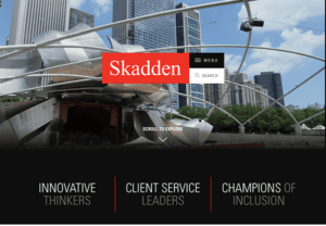
- Skadden: Sophistication at first glance on visitors as their website prompts with an eye-catching, intuitive navigation menu and search button strategically placed at the center with an interactive high-quality imagery background. The consistent use of a sophisticated color scheme and clean typography featuring its sleek and professional design exudes a sense of professionalism and credibility on its website. The website incorporates engaging visuals, including high-quality images and videos, strategically placed to highlight essential information and create visual interest throughout the site. Its user-friendly navigation system lets visitors access detailed information about the firm’s services, experience, and notable cases. Including attorney profiles and bios adds a personal touch and showcases the team’s expertise.
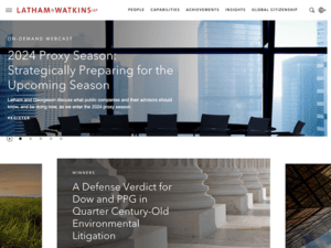
- Latham and Watkins LLP: The website provides comprehensive content on Latham & Watkins’ practice areas, industries served, and thought leadership, as it incorporates dynamic visuals, including high-quality images and videos, throughout the site. It strategically highlights information and conveys the firm’s brand name. The website has straightforward, intuitive navigation and a well-organized static main menu for easy access to the firm’s relevant information. It also offers language options and provides content in multiple languages to cater to a global audience. All these features uniquely represent Latham & Watkins LLP’s legal expertise and provide a valuable platform for clients and visitors to access information and engage with the firm.
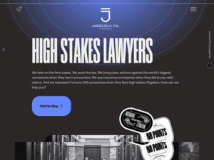
- Jaszczuk P.C. Attorneys: Upon first look at their website, its sleek and modern design captivates exceptional attention as it uses engaging bold typography classy yet elegant color scheme that reflects the firm’s brand and reputation. It has a clear and well-organized navigation system with an interactive mouse cursor, making the website more visually appealing and enhancing the overall user experience. The website’s content and key messages are explicit, presenting information logically. Including years of service in the firm industry and achievements adds credibility and trust to potential clients. Moreover, contact details, including an email address and phone number, are prominently visible in the website’s footer, making it easy for potential clients to approach the firm.
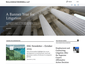
- Sullivan & Cromwell LLP: Sullivan & Cromwell LLP is a renowned law firm; its websites complement its expertise and prestige, featuring a simple yet professional layout design. The clean layout, ample white space, and consistent color scheme maintain its professional impression. The website’s straightforward navigation and homepage could immediately capture attention with a dynamic image slideshow and concise text, effectively communicating the firm’s key strengths and areas of focus. The website has a unique feature of a font resizer button placed prominently together with the website’s header. This feature empowers users to customize their reading experience, accommodating their preferences and needs for improved readability and usability. The website includes a section dedicated to news and events, keeping visitors informed about the firm’s latest announcements, awards, and participation in industry events, helping establish credibility, and showcasing the firm’s involvement in significant legal matters.
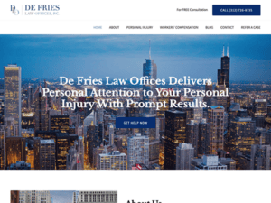
- De Fries Law: De Fries Law is a Chicago-based law firm specializing in personal injury cases. Its minimalist yet professional website design and layout put trustworthiness and confidence in visitors. The website features a clear and intuitive navigation menu prominently placed at the top of the page and remains visible as users scroll down, ensuring easy access to critical information. Including comprehensive practice area information, successful case results, client testimonials, detailed information about the firm’s attorneys, and educational resources create a powerful online presence and impart potential clients with the necessary information to make informed decisions about their personal injury cases.
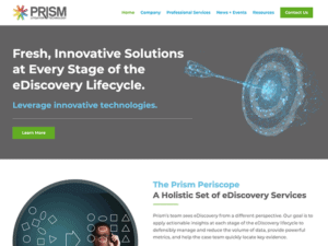
- Prism Litigation Technology: Prism Litigation Technology is a litigation support and eDiscovery company. Simplicity at its finest yet elegant design dominates the website, compels viewers’ attention, and conveys the firm’s key messages. A clean layout, clear fonts, carefully selected color schemes, and white spaces emphasize the firm’s quality services and expertise as its structure organize strategically. The website also emphasizes its credibility and transparency through the successful testimonies of its clients, giving more interest to visitors and potential clients to engage in its services. Hence, the website portrays a well-established firm that presents realistic services and necessary information to consider Prism Litigation Technology for their legal support needs.
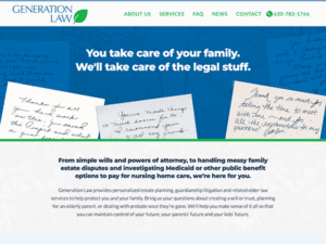
- General Law: Generation Law specializes in estate planning, guardianship litigation, and elder law. The website establishes professionalism and trust with its modern, welcoming design, clean layout, cool color scheme, and engaging high-quality imagery imposing positivity on first-time viewers. An accessible navigation menu is at the top, making visitors browse and navigate to different website sections easily. Its website stuns on its client-focused approach and highly emphasizes its commitment and compassionate services with care and understanding. Their website highlights feature the latest news, providing valuable information and educational resources related to estate planning and elder law. This feature demonstrates their commitment to keeping clients informed and empowered.
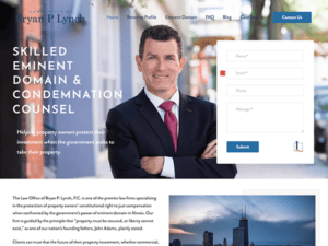
- The Law Office of Bryan P. Lynch: Clean and minimalist, the website of B. Lynch Law has a stunning design that provides comprehensive information on their practice areas and captures visitors’ attention. The easy navigation makes a seamless browsing experience. The website prominently displayed its contact form on its homepage, making it convenient for potential clients to reach out and schedule appointments. They have successfully featured Attorney Bryan’s profile, background information, experience, and qualifications. However, it enchants potential clients to know more about the firm, thus, giving trust and confidence in its capabilities.
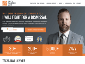
- Trey Porter Law: A pop of orange color scheme and modern design engages its website with professional and inviting vibes. The website presents its expertise and credibility by displaying the firm’s honor and awards, testimonies, and reviews of satisfied clients, adding more extraordinary experiences to potential clients to get into business. The content is well structured and easy to read with its clean typography and user-friendly navigation system. As a result, the firm’s essential information is provided to visitors effectively, grasping individuals seeking legal assistance for DWI cases in Texas.
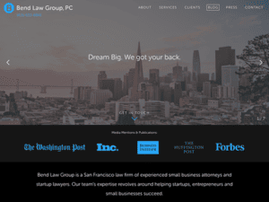
- Bend Law Group: As visitors land on their website, its branding information is an eye-catch getting everyone attached to its homepage message” Dream Big. We got you back”. It has a clean, modern color palette, easy-to-navigate menu, and well-formulated content, bringing visitors an aesthetically classy appearance and experience. Additionally, informative blogs, prominent displays of the law office’s contact information, testimonials, and achievements have a powerful impact on the firm’s successful track record and capabilities, accessible communication, building trust with potential clients, and reflecting the law office’s commitment to delivering quality legal services.
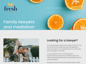
- Fresh Legal: With the firm’s name itself, its website brings a fresh, polished appearance with a vibrant color scheme, excellent in reflecting its brand presence. The content is concise, impactful, and tailored to the firm’s target audience, showcasing their commitment to client-centered services with a visually attractive “Book a Free Call” button. This feature overrides potential clients’ worries about bill charges for a legal consultation, compelling more visitors to get engaged and discuss its services. Moreover, the website also features a modern design, clear and organized navigation, an attorney’s profile, and contact options, putting on potential clients to take the following steps in obtaining legal assistance.
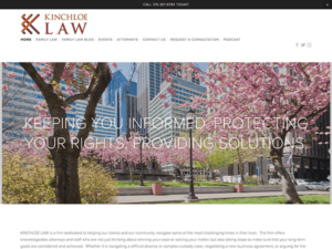
- Kinchloe Law: Kinchloe Law is a firm that covers family, disability, and business law in Philadelphia, Pennsylvania. Their website features a clean and professional design with consistent use of a simple color scheme, ample white space, and straightforward typography, grabbing visitors’ attention with a sense of trust and confidence. It has user-friendly navigation, a clear menu section, contact information, and a visually appealing button prompting visitors to start a chat from their homepage. The firm effectively showcases its expertise by providing comprehensive information on the attorney’s profile, services, and testimonies from satisfied clients, allowing visitors to make informed decisions when choosing an attorney to represent their legal interests.
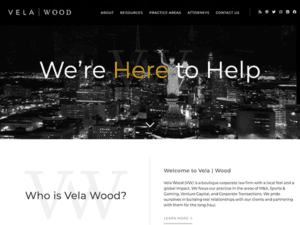
- Vela Wood: Their website’s stunning features are sleek, modern, and professional branding, showcasing the firm’s expertise in working with startups and venture capital. Using bold typography, vibrant colors, and dynamic visuals creates a visually appealing and memorable impression. Their unique yet elegant design and homepage featuring a dynamic slider add enchantment and an unforgettable experience for visitors to explore. The menu remains visible and accessible throughout the website. The website also includes profiles of the firm’s attorneys and positive experiences working with Vela Wood.
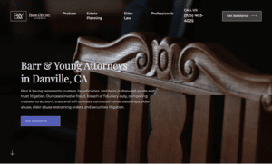
- Barr & Young Attorneys: Black and white color domination, straightforward typography, and clean design on its website put elegant and professional appeal, reflecting the sophistication of the firm’s brand and leading showcase of the firm’s expertise. Instilling trust and credibility as their layout design contributed to a well-polished appearance. The website presents its services and areas of practice through clear and concise content, its static well-organized menu, responsive mobile-friendly design, and a prominent contact information display. These features make it easy for visitors to contact the firm for inquiries or consultations and enhance the user’s seamless browsing experience.
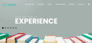
- Vogel LLP: Their website set a standard of its own with its highly captivating homepage slider messages and dynamic images, effectively showcasing its quality services, capacities, and capabilities over its 200 years of experience. Bringing the firm’s robust standard of commitment and values of its services. The website features a static well-structured menu exhibiting sections of the firm’s area of expertise, the attorney’s profile, services, publications, and contact details. The consistent use of interactive elements, clear typography, and easy-to-use navigation throughout the website allows visitors to have a joyous browsing experience full of information on the firms’ relevant details keeping visitors to get in touch with its online presence.
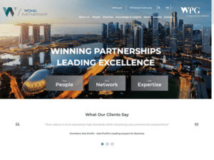
- WongPartnership LLP: High-quality visuals, polished color combination, and modern yet corporate website layout design bring elegance and portray the firm’s leading excellence. A distinct, concise navigation menu and a prominent search button make it easy for visitors to obtain the information they need with just a click. WongPartnership’s global reach is highlighted on the website, with information about its international offices and affiliations, making the firm more globally competent. It also offers language options, allowing visitors to switch between English and Chinese, catering to a diverse clientele, and enhancing accessibility for users who prefer different languages.
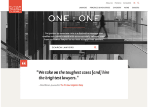
- Munger, Tolles & Olson LLP: Munger, Tolles & Olson LLP is a law firm based in the United States. The website’s simplicity attracts visitors and clings to a consistent, clean, and minimalist design. It properly provides the firm’s practice areas, attorney profiles, notable achievements, news updates, and contact information outlines. The website’s simplicity, comprehensive content, and ease of navigation significantly contribute to an excellent user interface and symbolize the law firm’s professionalism. Thus, all its features allow visitors and potential clients more options and information on the firm’s capabilities, specific legal services, attorney’s profile, and contact information.
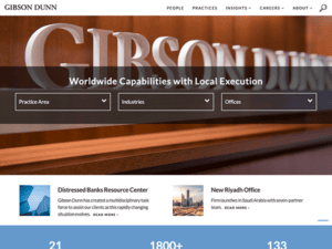
- Gibson, Dunn & Crutcher LLP: Their website prompts visitors of its global capabilities through a global reach approach, providing information with offices in major cities worldwide. Its international services are associated with its professional and visually engaging website design, providing comprehensive information about its practice areas, attorneys, achievements, and news updates. These details help clients and potential clients understand the breadth of the firm’s expertise and commitment to client services. The website also attributes a continuous use of cool colors, clear fonts, and high-quality images to create an aesthetically pleasing and modern interface.
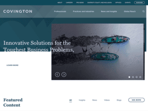
- Covington & Burling LLP: The website’s sleek and contemporary design features a clean layout and sophisticated color palette. The homepage prominently displays an intuitive navigation menu, allowing visitors to navigate to key sections quickly. With comprehensive information on the firm’s expertise spanning various industries and practice areas, the website effectively showcases its global presence and extensive legal services. The attorney profiles are compelling, offering in-depth backgrounds and experience for each lawyer. Moreover, the website exudes professionalism, provides a seamless user experience, and effectively represents the firm’s expertise and unwavering commitment to delivering high-quality legal services.
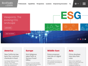
- Reed Smith LLP: The website of Reed Smith dazzles with its modern design, user-friendly interface, and homepage with striking imagery. One of its unique features is the comprehensive global presence showcased through an interactive map, demonstrating the firm’s reach and expertise in various jurisdictions. The concise layout, intuitive navigation, and aesthetically pleasing website design provide a seamless user experience. The website has a wealth of information about the firm’s services, industries represented, and legal expertise, conveying potential clients to get involved with its global reputation and commitment to delivering high-quality legal services.
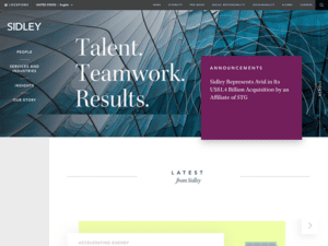
- Sidley Austin LLP: Sidley Austin’s website combines elegance with functionality, providing a wealth of information and resources to clients and visitors alike. It is a stun with its sophisticated and user-friendly design. One of its distinguishing features is the interactive megamenu, which allows users to navigate several practice areas, industries, and insights effortlessly. The homepage has a clean design with a prominent search bar and clear call-to-action buttons, making it convenient for users to access pertinent information. Another noteworthy feature is the robust Insights section, which provides a wealth of resources such as articles, client alerts, and podcasts, showing the firm’s thought leadership in various legal topics.
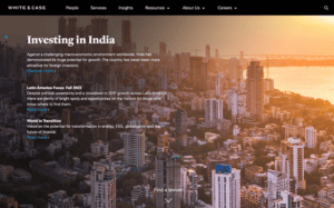
- White & Case LLP: The website of White & Case LLP is a compelling digital platform that smoothly blends an aesthetically appealing design with a wide range of resources, emphasizing the firm’s exceptional global legal experience. The website’s slick and modern style instantly draws attention, and its simple navigation enables effortless exploration of the firm’s practice areas, fields, and insights. With its notable innovative content, detailed attorney profiles, and a focus on worldwide reach, White & Case’s website is a valuable resource for clients and professionals, reaffirming the firm’s position as a leading international law practice committed to quality.
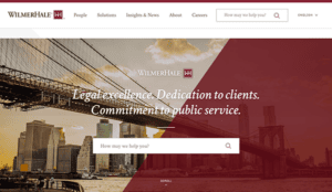
- Wilmer Hale: Their website is the pinnacle of a sophisticated and informative digital realm legal resource. With its sleek modern design, clear fonts, high-quality images, consistent color palette, and user-friendly interface, the website effortlessly guides visitors through the firm’s wide range of practice areas, industry expertise, and global reach. The website also has complete biographies of the firm’s outstanding attorneys, showing their breadth of knowledge and accomplishments. WilmerHale’s website demonstrates the firm’s commitment to providing extraordinary legal services, making it a vital resource for clients and legal professionals looking for top-tier legal representation and industry expertise.
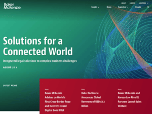
- Baker McKenzie: Baker McKenzie’s website demonstrates the firm’s unparalleled competence in navigating the complex world of global law. The website provides a smooth experience for users looking for vast legal resources, with a modern and easy-to-use design. From its robust library of insightful articles and publications to its extensive network of global offices and renowned attorneys, Baker McKenzie’s website is a trusted companion in understanding complex legal matters across borders. The site’s intuitive navigation and responsive design ensure easy access to valuable insights and up-to-date information, making it an invaluable tool for legal professionals and clients eager to stay ahead in the dynamic realm of international law.
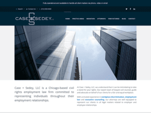
- Case + Sedey: The website impresses with its professional and sleek design, making it an excellent resource for individuals seeking legal assistance in employment law and civil rights matters. With its clean appearance and simple navigation, the homepage instantly grabs attention, allowing visitors easily explore the firm’s areas of competence and notable cases. Additionally, the firm’s track record of success and victories brought about a trustworthy and noteworthy platform for the firm’s services. With these attributes, their website sets a standard for individuals seeking experienced legal representation in employment law and civil rights.
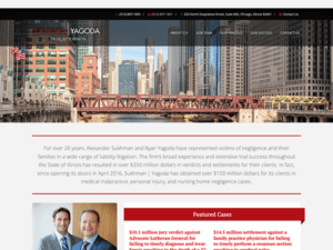
- Sukhman / Yagoda: The website design of Sukhman & Agoda is a trial attorneys’ firm that exudes professionalism and sophistication. The clean, modern layout and harmonious color scheme give visitors a visually compelling experience. The simple navigation menu makes exploring practice categories, attorney profiles, and other important information accessible. Intelligently positioning call-to-action buttons and contact information ensures that users are engaged and accessible at all times. High-quality graphics and well-organized information highlight the firm’s expertise and instill trust in potential clients.
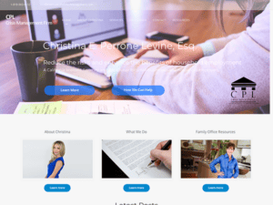
- CPL Crisis Management: The sleek and professional website design of CPL Crisis Management reflects its competence and dedication to offering excellent quality services. The site homepage immediately catches attention with a strong banner image and detailed messaging highlighting the firm’s competence in management solutions for the family office, legal, HR, staffing, accounting, and insurance, all under one roof. The content is written effectively and is fascinating, and it offers practical concepts and suggestions for efficiently navigating the website. The website also has an easy-to-use static menu mechanism that allows readers to access information on specific areas of interest rapidly.
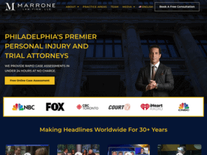
- Marrone Law Firm: Its website exudes calm assurance because of its minimalist design and neutral color scheme, yet it portrays classic elegance and professionalism. The homepage provides an in-depth summary of the firm’s areas of specialization, emphasizing its passion and commitment to providing complete legal aid through its accomplishments, significant figures of successfully managed cases, and satisfied clients’ testimonies. The website also includes a lot of motion graphics and images, which help to make the information a more visually compelling and memorable experience for visitors.
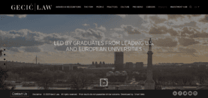
- Gecic Law: Their website appears to be sophisticated and luxurious. Every detail is pristine and professional, from excellent images and videos to black, white, and red color schemes. The website has interactive elements like a search bar, contact forms, and social network links, increasing user involvement and making communicating with the firm easier. The website contains extensive information about the firm’s abilities and expertise, emphasizing its commitment to providing high-quality legal solutions. Including client testimonials, awards, and recognitions strengthens their reputation and track record even more.
These websites represent the pinnacle of attorney web design. They balance a professional aesthetic with intuitive navigation, compelling attorney bios, and a valuable, regularly updated blog, offering a seamless user experience. They make it easy for clients to understand their services and choose their firm.
Like these successful attorneys, your practice deserves a website that ticks all the boxes: professional design, easy navigation, clear calls-to-action, an effective blog for SEO, and detailed attorney bios.
At CyberOptik, we’re experts in creating high-quality, user-friendly websites tailored to meet the unique needs of attorneys. We understand the importance of establishing trust and communicating your services, and we integrate these elements into our designs.
We’re committed to providing you with a website both looks professional and functions effectively, helping your firm attract and retain clients. By blending aesthetic appeal with practical functionality, we’ll help you create a site that effectively communicates your services, engages potential clients, and builds trust.
Contact CyberOptik today to discuss how we can collaborate to enhance your online presence. We’re excited to help you leverage the power of web design to elevate your firm’s digital presence and make a lasting impact on potential clients.


