Just looking for our Best Artisan Website examples list?
Crafting a compelling online presence is essential for artisans aiming to showcase their unique creations and connect with a broader audience. This guide distills the most critical insights to help you design a website that reflects your craftsmanship and drives engagement and conversions.
Key Takeaways
- Embrace Custom Design to Reflect Your Unique Brand: Websites in this industry thrive on individuality. By opting for custom design over generic templates, you ensure that your site authentically represents your brand’s story and values. This approach allows for tailored layouts, distinctive color schemes, and personalized user experiences that resonate with your target audience.
- Prioritize User-Centric Navigation: Intuitive formatting is crucial. A well-structured menu and clear pathways guide visitors seamlessly through your site, enhancing user satisfaction and encouraging exploration. Consider implementing breadcrumb trails and search functionalities to further improve usability.
- Optimize for Mobile Responsiveness: With a significant portion of web traffic originating from mobile devices, ensuring your site is mobile-friendly is non-negotiable. Responsive design adapts your site’s layout to various screen sizes, providing a consistent and accessible experience across all devices.
Why Artisan Website Design is More Than Just Looks
First impressions matter—and in 2026, your website is often the first and most powerful encounter potential customers have with your brand. In this industry, where craftsmanship and individuality are your business’s essence, your website design must do more than display your work—it must elevate it.
But a beautiful layout alone isn’t enough. The right web design can enhance user experience, guide seamless navigation, and build trust with your audience. It can also increase conversions, boost search engine visibility through thoughtful optimization, and support business growth from day one.
Whether you’re launching a new website or refining an existing one, this guide will walk you through what matters most for artisan website design in 2026—from WordPress tools to design strategies that ensure your site works as hard as you do. You’ll discover how thoughtful guidance, responsive layouts, and strategic optimization can drive real business impact—and when you’re ready, how to get in touch with a team that knows exactly how to bring it all together.
Website Planning & Purpose: Building a Strategic Foundation
Before diving into layouts, typography, or choosing a WordPress theme, successful design begins with a clear and intentional planning phase. This step defines the structure, goals, and strategic roadmap of your online presence—and it’s what separates a visually pretty site from a performance-driven business tool.
Understand Your Audience and Business Goals
Identify who your ideal customers are and what actions you want them to take on your website.
Define Clear Conversion Goals
Your site should be designed around specific user actions, like filling out a contact form, signing up for a newsletter, or making a purchase.
Map Your Website Structure
Effective design isn’t just about aesthetics; it’s also about usability. Outline your main pages (Home, About, Shop, Portfolio, Contact) and determine how they will be connected.
Plan for Content and SEO
Planning your content strategy in advance allows for better integration of optimization. Decide what content will live on each page and ensure it’s keyword-optimized.
Consider Technical Requirements
Determine the functional needs of your site: Will you need e-commerce tools? A gallery plugin? Appointment booking features?
Design Principles for an Effective Website
A well-designed site does more than look good—it tells a story, guides visitors, and converts interest into action.
Clarity and Simplicity
Avoid clutter and keep the layout simple to let your work speak for itself.
Visual Hierarchy
Use headings, image placement, and contrast to emphasize key information.
Consistency in Branding
Maintain consistent branding across every page, including your logo, colors, and fonts.
Mobile-First Responsiveness
Ensure your design is responsive, adjusting fluidly across all screen sizes.
Accessibility
Use readable fonts, adequate color contrast, and alt text for images to enhance accessibility.
Purposeful Use of Color and Texture
Use earthy tones, white space, or subtle textures that align with your brand’s look and feel.
Performance and Speed
Compress images, limit heavy scripts, and use clean code to improve load times.
Content & Navigation: Structuring Sites for Impact
Great design alone won’t carry your website—your content and how people find it need to work just as hard.
Organize Around User Intent
Structure content based on how your audience navigates and what they’re looking for.
Keep Navigation Simple and Predictable
Your top navigation should include 5–7 clear items: Home, About, Portfolio or Products, Blog (if applicable), and Contact.
Create a Scannable Content Hierarchy
Use headings, short paragraphs, bullet points, and strong imagery to make content easy to scan.
Lead With Story, Support With Structure
Each page should answer: What do I want the visitor to learn or do?
Prioritize Internal Linking
Guide users from one relevant page to another through strategic internal linking.
Don’t Hide Contact Options
Include contact links in your top navigation, footer, and key calls to action throughout the site.
Visual Elements: Bringing Artisan Brands to Life Online
In site design, visuals do more than decorate—they communicate your brand’s identity, craftsmanship, and value instantly.
Use High-Quality, Original Photography
Showcase your process, materials, and finished pieces in environments that reflect your aesthetic.
Create Visual Storytelling with Galleries and Grids
Organize visuals using clean, consistent formatting like sliders and image grids.
Align Colors and Typography With Your Brand
Select colors and fonts that echo the personality of your business.
Balance White Space and Visual Weight
Use white space to avoid clutter and guide the user’s eye.
Incorporate Icons and Microinteractions Thoughtfully
Subtle animations and icons improve usability and polish.
Use Video to Deepen Engagement
Short videos showing your process or workspace can significantly boost engagement.
Ongoing WordPress Maintenance
Launching your website is just the beginning—keeping it secure, fast, and functioning smoothly requires consistent maintenance.
Update Plugins, Themes, and WordPress Core
Outdated components can lead to functionality issues, security vulnerabilities, and broken layouts.
Perform Regular Backups
Backups protect your site from crashes, hacks, or accidental loss.
Monitor Security and Scan for Malware
Install a reputable security plugin and run malware scans routinely.
Optimize Site Speed and Performance
Compress images, enable caching, and eliminate unused plugins regularly.
Check Forms and Functional Features
Test forms, shopping carts, and any interactive tools monthly.
Maintain SEO Health
Audit and update content, metadata, and broken links to maintain visibility.
Best Artisan Website Design Examples
Creating an effective website is crucial for professional artists aiming to showcase their craftsmanship and connect with a broader audience. Below are 19 exemplary websites, including five designed by our experts, each demonstrating unique features that contribute to their success.
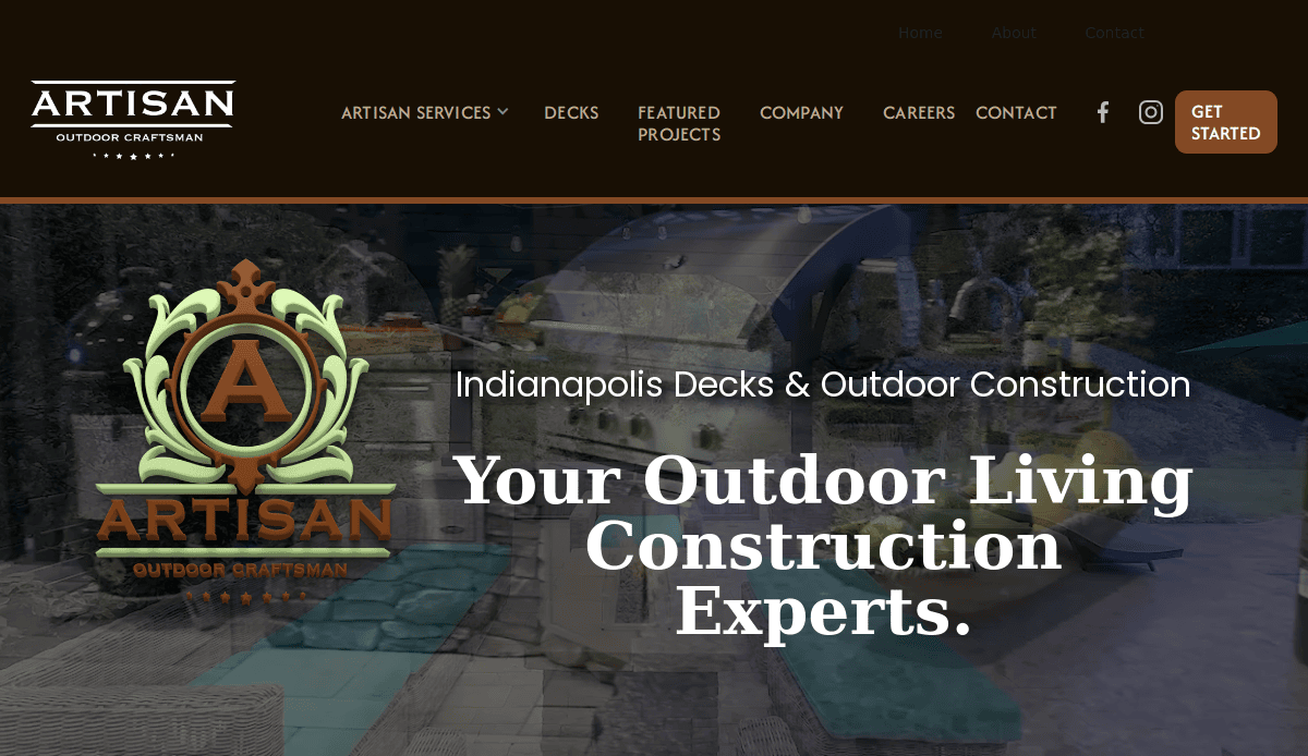
1. Artisan Outdoor Craftsman
Location: Chicago, IL
Key Takeaways:
- Engaging hero video that immediately captures visitor attention.
- High-quality imagery showcasing detailed craftsmanship.
- Clear calls-to-action guiding users to explore services.
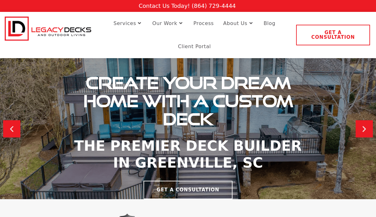
2. Legacy Decks
Location: Greenville, SC
Key Takeaways:
- Clean, modern design reflecting the brand’s identity.
- A prominent color palette creates a strong visual presence.
- Well-structured design facilitates easy user pathways.
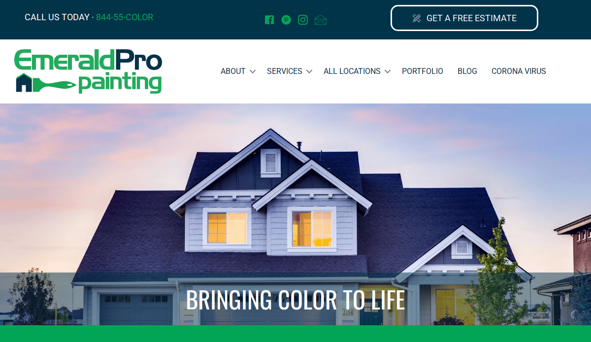
3. Emerald Pro Painting
Location: Denver, CO
Key Takeaways:
- Modern and timeless design with a relaxing color scheme.
- Clean imagery that captivates visitors instantly.
- Clearly marked call-to-action buttons enhance user engagement.
4. Jonathan Glynn Smith
Location: New York, NY
Key Takeaways:
- Photography-focused design keeps images front and center.
- Thumbnail media allows easy project exploration.
- Minimalist theme emphasizing the artist’s portfolio.
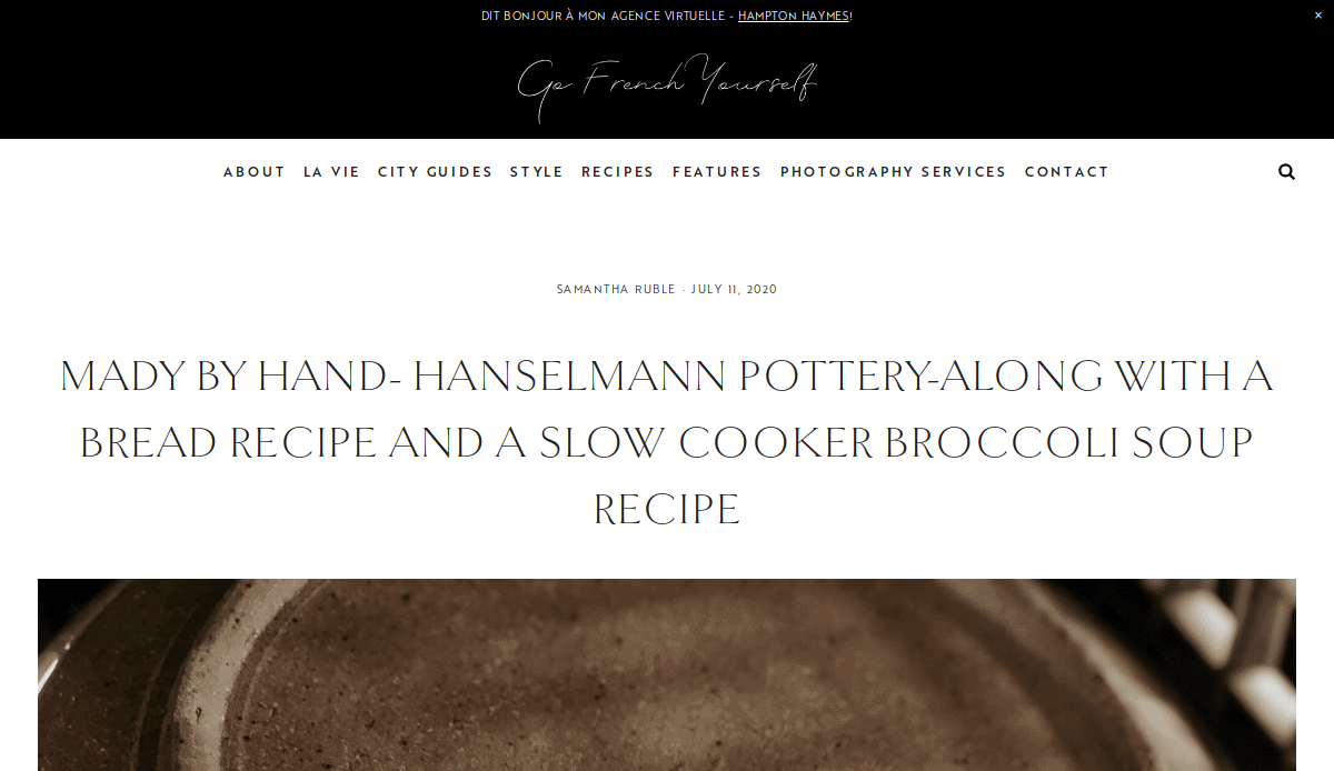
5. Hanselmann Pottery
Location: Binghamton, NY
Key Takeaways:
- Minimalistic design reflecting the simplicity of handmade pottery.
- High-quality imagery and clean design.
- Engaging “Who We Are” page telling the artisans’ story.
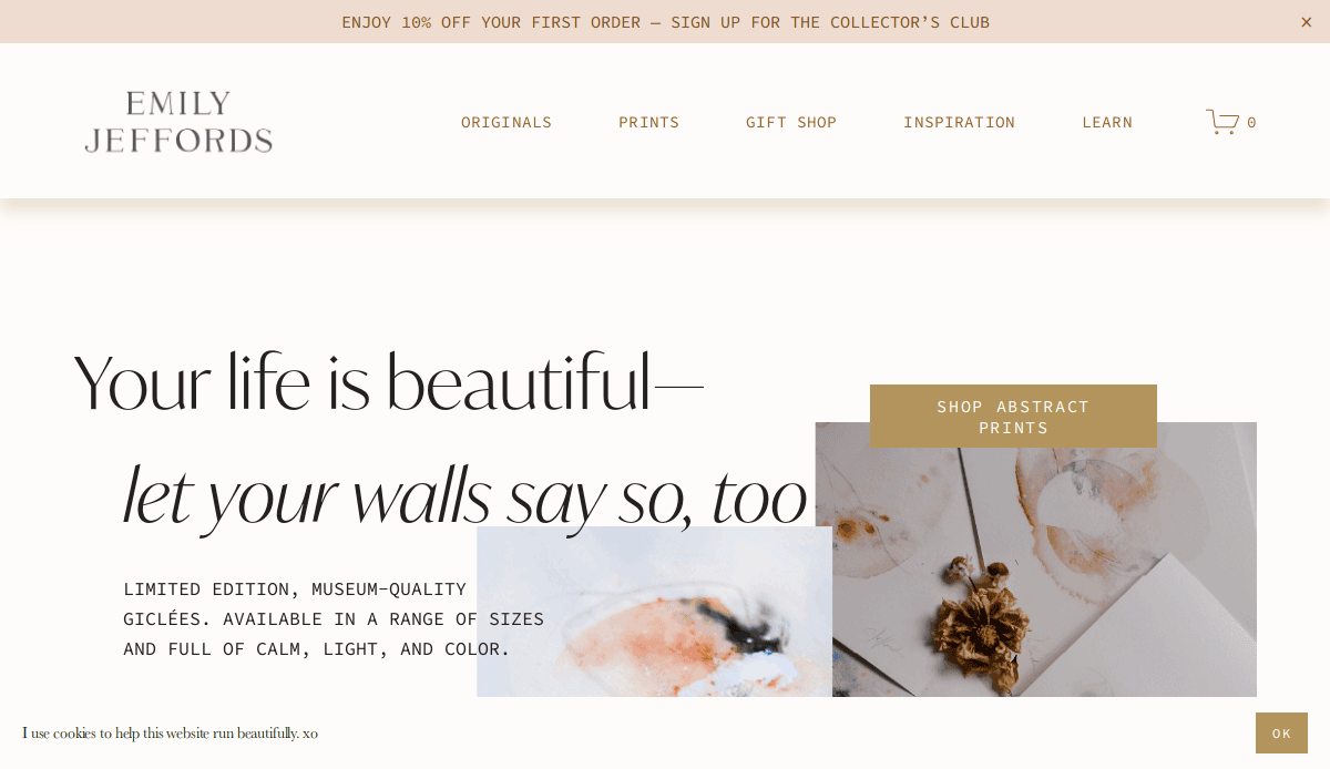
6. Emily Jeffords
Location: Greenville, SC
Key Takeaways:
- Visually stunning design complements artistic style.
- Newsletter sign-up captures leads.
- Soft color palette and elegant typography enhance aesthetics.
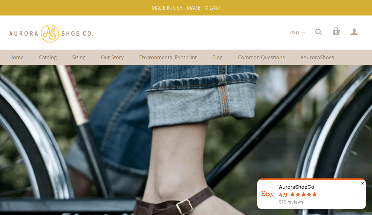
7. Aurora Shoe Co.
Location: Aurora, NY
Key Takeaways:
- Creative color scheme with practical features like a blog.
- Detailed product descriptions and high-quality images.
- “How It’s Made” section provides insight into craftsmanship.
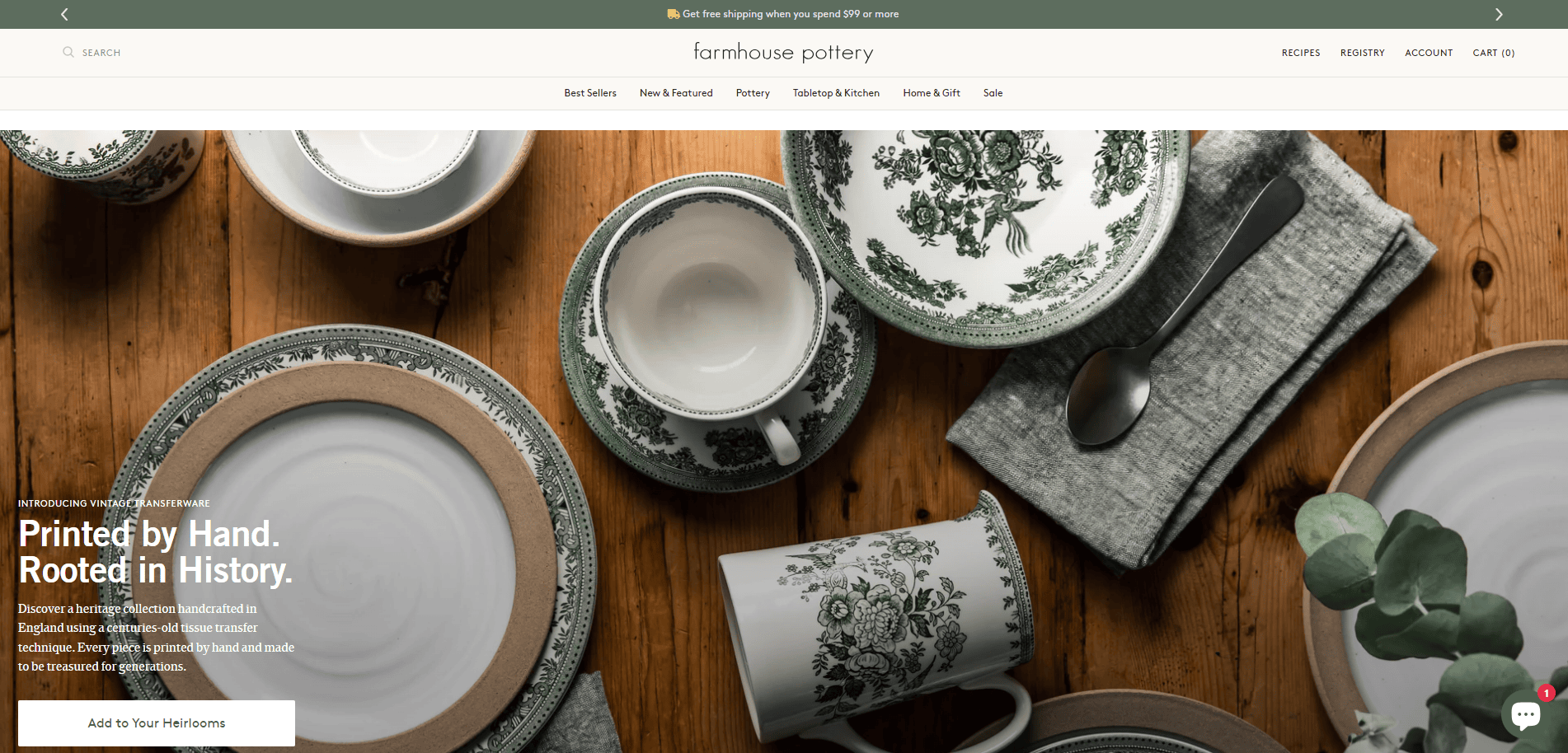
8. Farmhouse Pottery
Location: Woodstock, VT
Key Takeaways:
- Natural color palette and high-quality visuals.
- Clean and organized template highlighting handcrafted pottery.
- “Workshops” section and the “Journal” engage visitors.
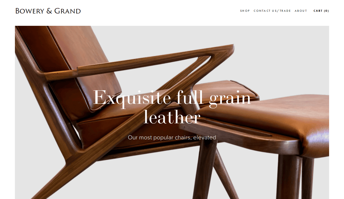
9. Bowery & Grand
Location: Brooklyn, NY
Key Takeaways:
- Modern design with well-labeled action steps.
- Use of videos to showcase products.
- Customer reviews and blogs enhance user engagement.
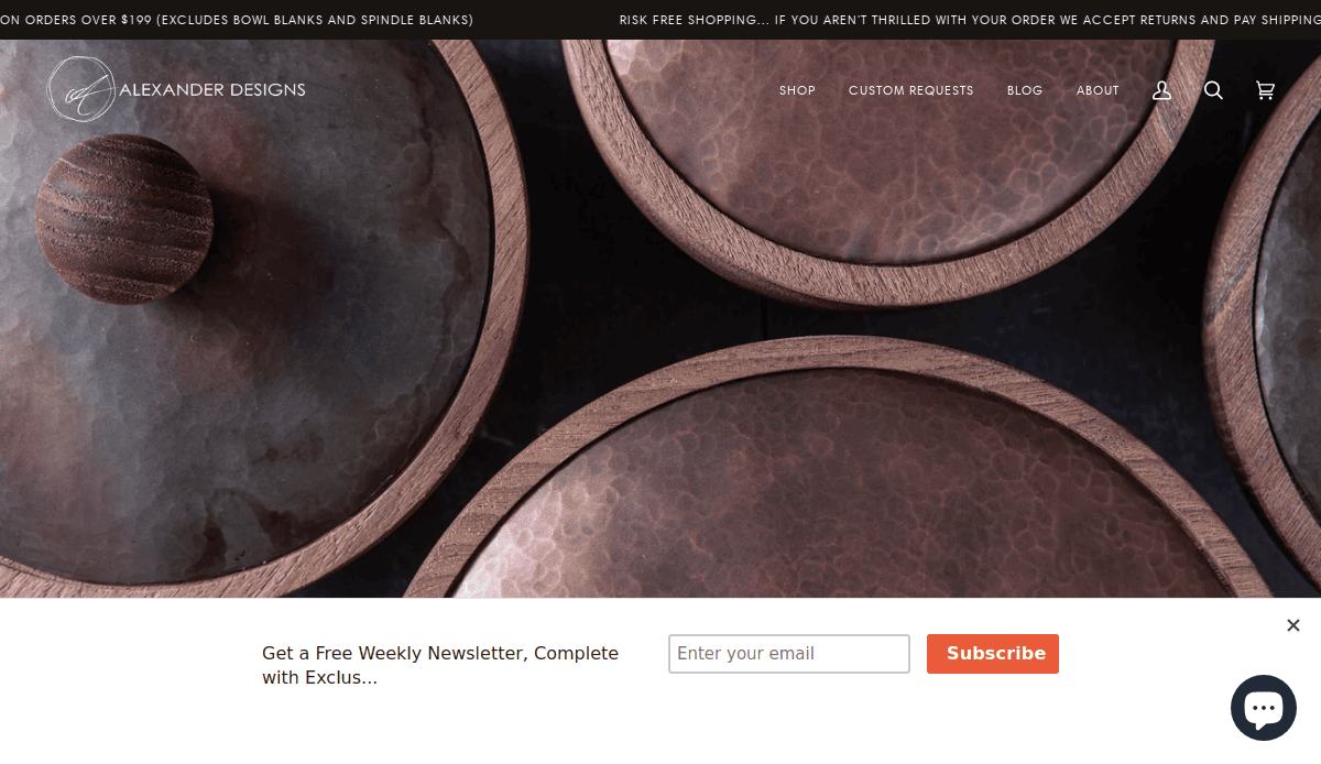
10. Alexander Designs
Location: San Francisco, CA
Key Takeaways:
- Black, white, and brown color palette creates a simple yet impactful design.
- Bold font for titles and high-quality product images.
- The customer review section promotes trust and credibility.
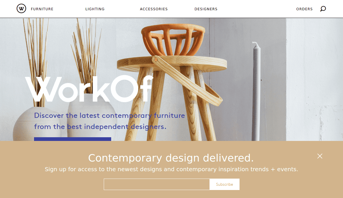
11. WorkOf
Location: New York, NY
Key Takeaways:
- Sleek design with high-quality images and detailed product descriptions.
- Modern design and intuitive formatting.
- Blog and social media links keep customers engaged.
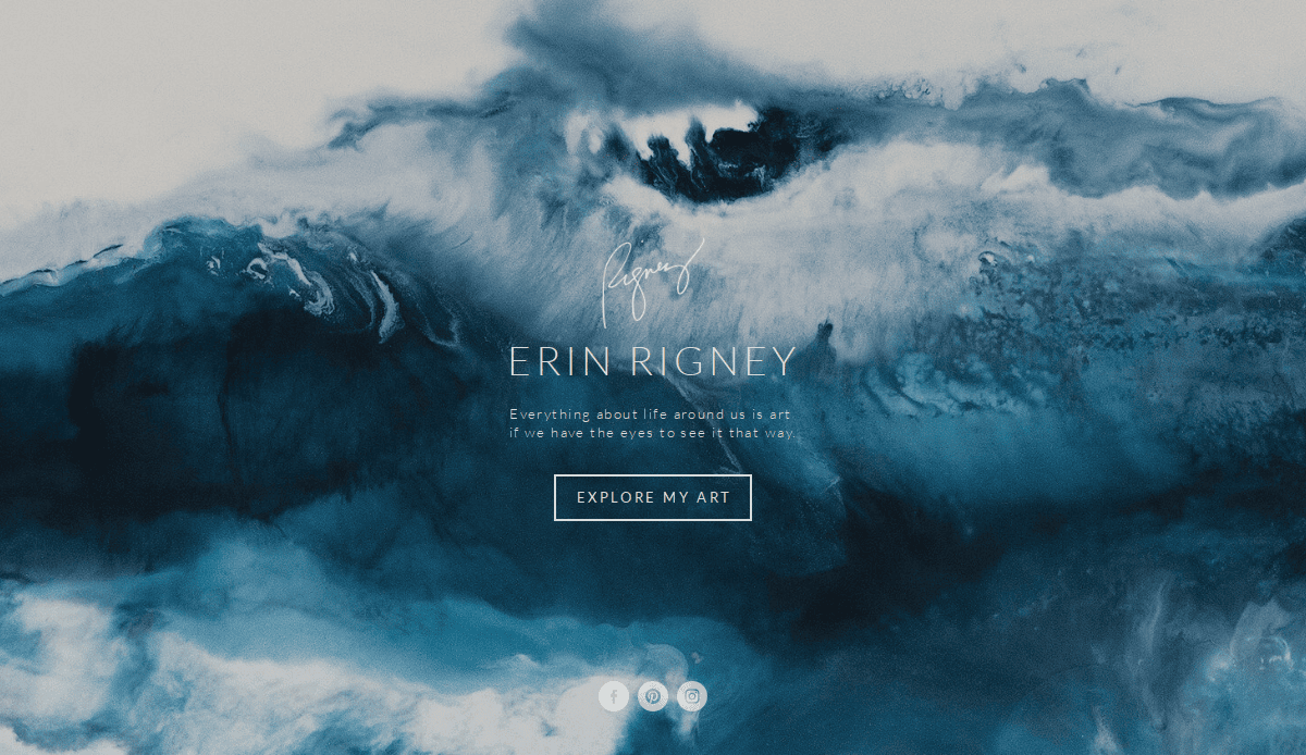
12. Erin Rigney
Location: Austin, TX
Key Takeaways:
- Welcome experience with a landing page featuring art and an inspiring quote.
- Clean and elegant design showcasing work.
- Blog and social media links connect with visitors.
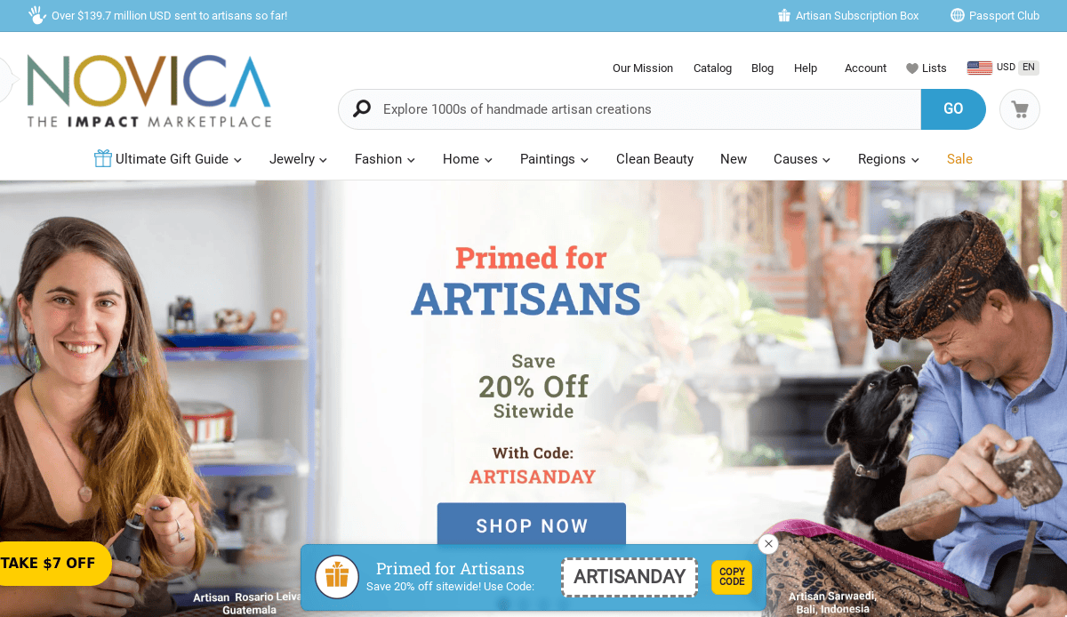
13. NOVICA
Location: Santa Monica, CA
Key Takeaways:
- User-friendly design with categories and filters.
- High-quality imagery and detailed product descriptions.
- Stories about artisans adding a personal touch.
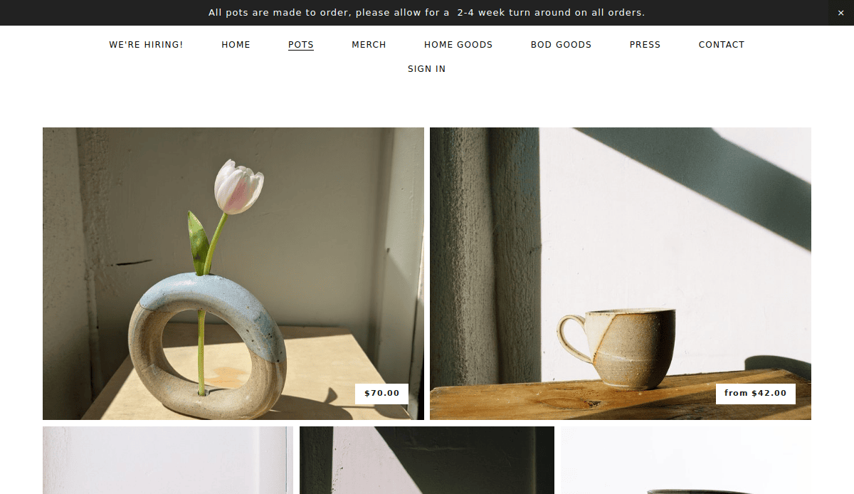
14. Whiskey & Clay
Location: Santa Fe, NM
Key Takeaways:
- Minimalist design with earthy tones and beautiful pictures.
- High-quality photographs of distinctive pottery pieces.
- Clean, sophisticated, organized theme
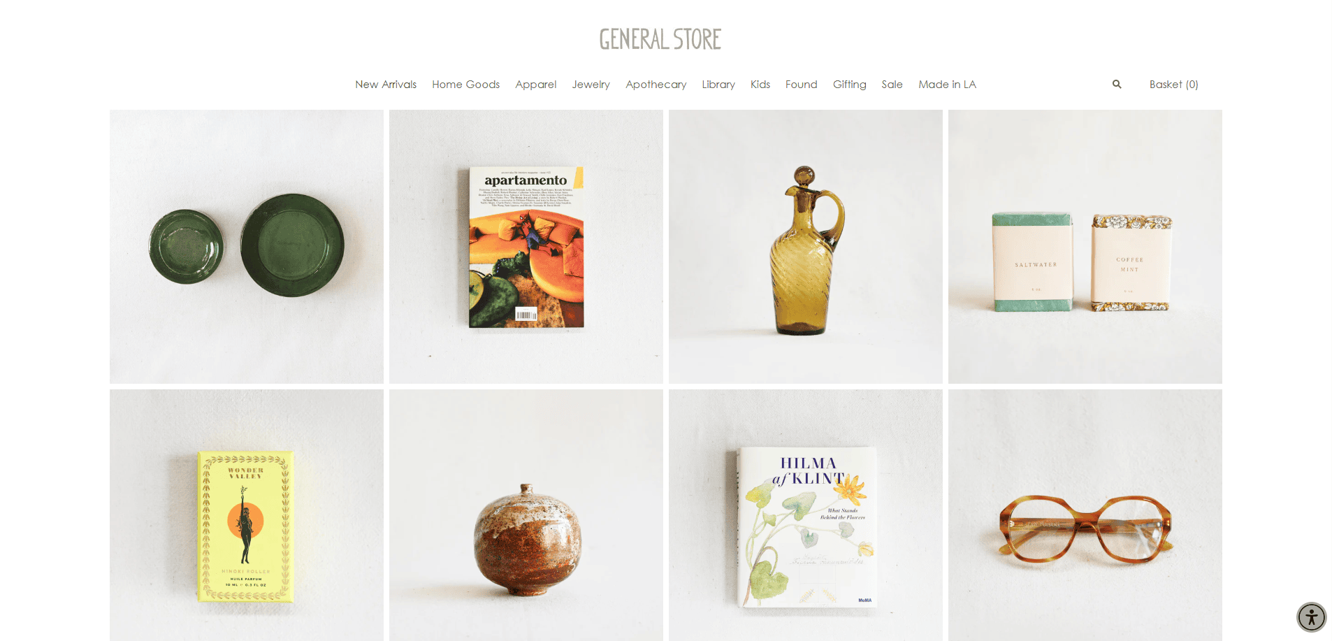
15. General Store
Location: Los Angeles, CA
Key Takeaways:
- Clean and intuitive layout, keeping things simple.
- Large and stunning imagery.
- Variety of products with a focus on usability.
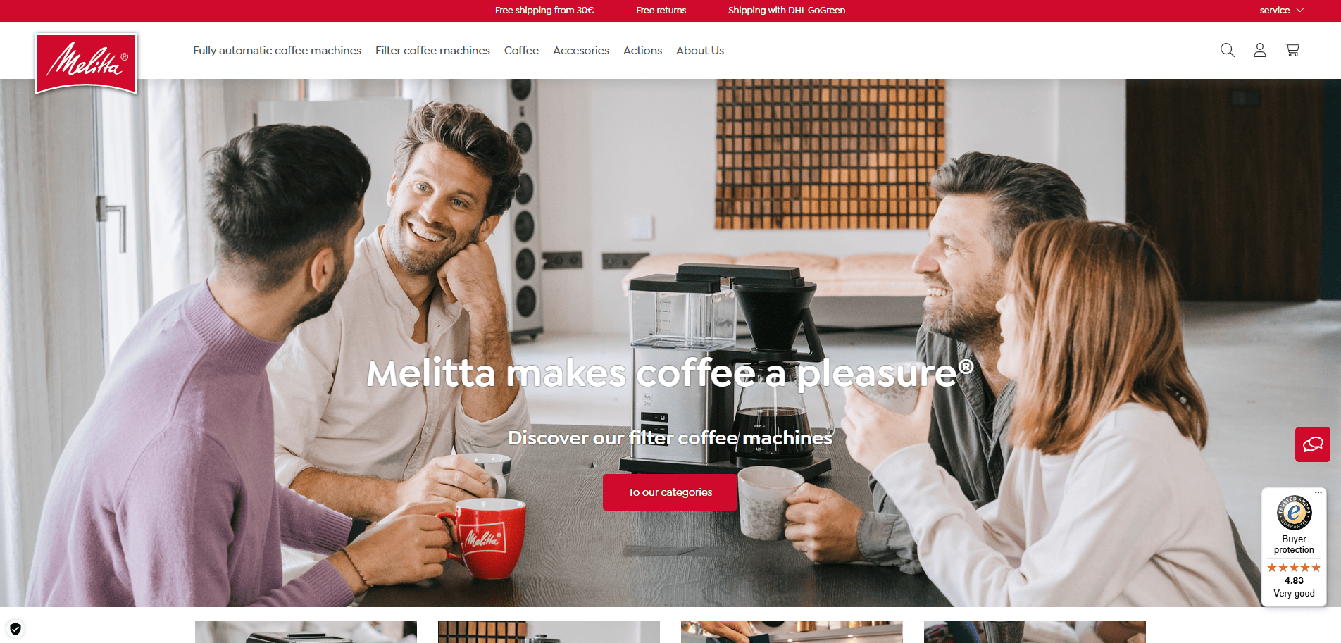
16. Melitta
Location: Clearwater, FL
Key Takeaways:
- Professional feel with a unique use of black, white, and gold.
- Automatically playing video captures attention.
- Theme that doesn’t feel crowded.
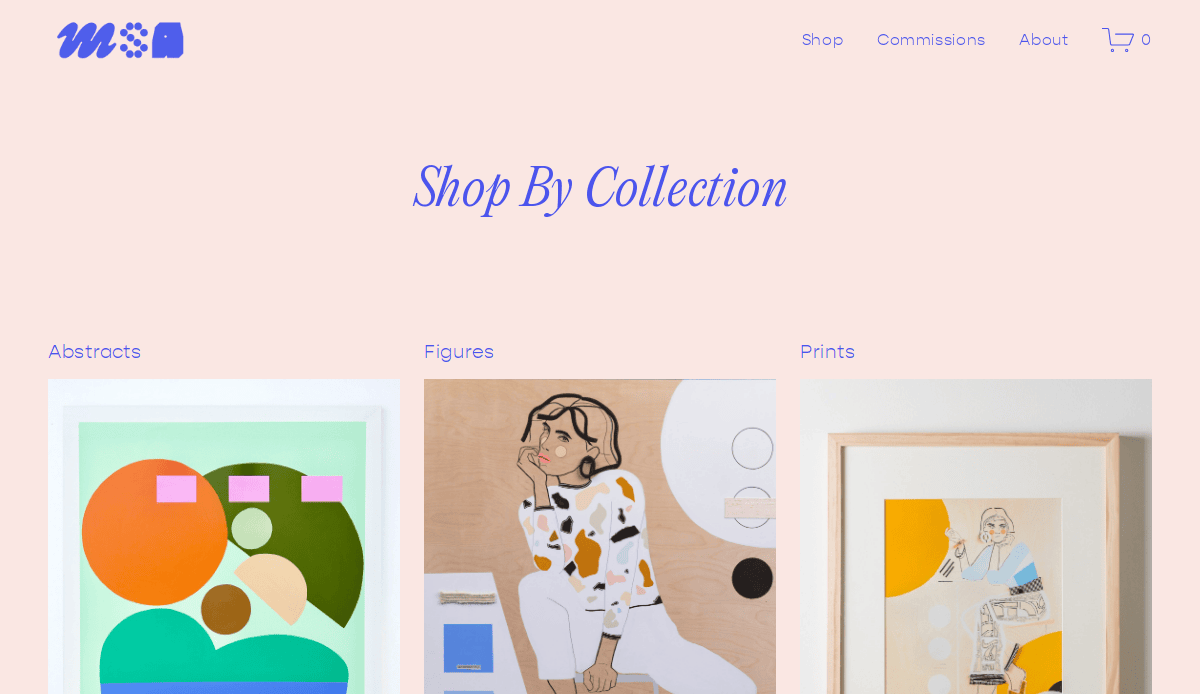
17. Meredith Steele
Location: Dallas, TX
Key Takeaways:
- Subtle animations enhance user experience.
- Use of a periwinkle accent adds uniqueness.
- Inclusion of a shop on the website.
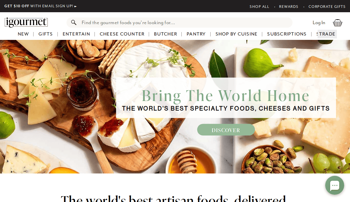
18. iGourmet
Location: West Pittston, PA
Key Takeaways:
- The red and white color scheme creates a simplistic design.
- Use of a search bar enhances navigation.
- Imagery helps navigate through the site.
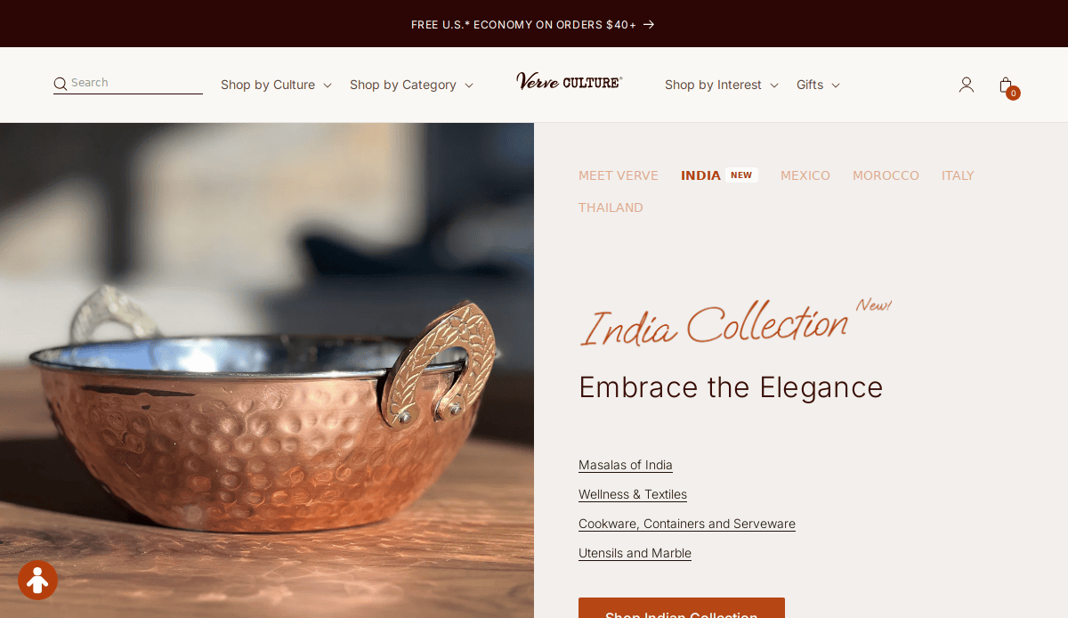
19. Verve Culture
Location: Boulder, CO
Key Takeaways:
- Nicely organized site with a natural color scheme.
- Professional font choice.
- Inclusion of social media enhances engagement.
These websites exemplify the best practices in professional web design, offering inspiration for industry professionals like you looking to create an online presence that effectively showcases their work and connects with their audience.
Ready to Launch a Visually Stunning Website in Your Industry?
Your website is more than a digital brochure—it’s the central hub for your artisan brand. Whether you’re showcasing artisan products, selling online through ecommerce, or building trust with a clean and intuitive homepage, your site’s design directly impacts how potential customers perceive and interact with your business.
If you’re serious about creating a website that reflects your artistry and functions as a growth engine, now is the time to partner with a team that understands the artisan industry and knows how to create a custom site that performs.
Get in touch with us to talk about how we can help you build a professional website that attracts customers, highlights your handmade products, and strengthens your brand to take the next step toward growing your business.
Frequently Asked Site Design Questions for Art Industry Pros
What makes an effective website for an artisan business?
An effective website balances functionality and aesthetics. It clearly showcases your products, including engaging product pages, displays contact information, and guides visitors with strong calls to action. Use of white space, consistent logo design, and high-quality images make the site visually engaging and easy to navigate. Including a customer review section and clean navigation structure builds trust and drives conversions.
Should I use website templates or invest in a custom website?
While website templates can work for some, those looking to stand out should strongly consider a custom website. A custom build allows your site to reflect your uniqueness and showcase your best themes through a tailored layout, creative color scheme, and brand-specific page structure. This level of customization can’t be fully achieved with generic templates.
How important is SEO for an artisan website’s success?
SEO is critical. A website that looks great but can’t be found by potential customers won’t grow your business. Incorporate keyword-rich website copy, optimize page titles and meta descriptions, and structure site content with headings and internal links. Consider reading more about our SEO services to keep your website competitive and discoverable.
What are the key features every artisanal website should include?
Top websites should include:
- A homepage with a strong value proposition
- Beautiful product pages that showcase your artisan work
- A landing page that features your story or process
- An easy-to-use search bar
- A blog for content marketing and storytelling
- Responsive design for mobile visitors
- Clear contact information and CTAs
Including these ensures your site effectively communicates your value and builds trust.
What platform should I use for my artisan website?
WordPress is a leading choice due to its flexibility, ease of use, and extensive plugin ecosystem. It’s ideal for those who need a scalable website platform that can support blogging, ecommerce, and custom design work. Explore our WordPress website design services to find out how we tailor WordPress solutions to artisan brands.
Do I need a professional web designer, or can I DIY with tools like Canva?
While tools like Photoshop or Canva are great for mockups and marketing materials, building a fully functioning website requires more than visual design. A professional web designer ensures your site is optimized for usability, mobile responsiveness, optimized, and long-term scalability. Working with a specialist helps you avoid costly mistakes and builds a site that performs and grows with your business.
How do I choose the right hosting service for my artisan site?
A reliable hosting service is essential to keep your website fast, secure, and online at all times. Look for features like automatic backups, SSL support, and responsive customer service. We offer website care and hosting plans designed for professionals who need peace of mind and performance reliability.
What are the best industry sites doing right?
The answer is authenticity, user experience, and performance. They feature strong homepage messaging, detailed product pages, consistent use of artistic themes, inclusion of a blog, and design work that feels handcrafted and intentional. These sites also pay close attention to color palette choices, like calming neutrals or earthy browns, to reinforce brand feel.
How often should I update my website’s content?
To keep your website relevant and engaging, update your content regularly. Add new products, refresh visuals, publish blog posts, and ensure all information, like contact details or product availability, is current. This helps improve optimization and ensures visitors always get an accurate view of what your business offers.
How can I showcase my artisan brand visually on my website?
To showcase your artisan identity, focus on cohesive visual branding: custom photography, consistent logo design, creative color scheme, and intuitive site layout. Use galleries, feature pages, and storytelling sections to bring your work to life. Our portfolio is a great place for artisans looking for inspiration on how to bring their vision to the screen.

