A great website serves as the digital runway for businesses to take off toward global recognition and operational excellence. It’s the first point of contact between aerospace companies and their clients, partners, or investors, making a powerful first impression crucial. A well-designed website in the aerospace sector highlights a company’s technological advancements and achievements and ensures that essential information is accessible, engaging, and easy to navigate. With the right design, an aerospace website can embody the innovation and precision that defines the industry itself.
The significance of having an effective digital presence must be balanced in an industry as competitive and specialized as aerospace. From showcasing cutting-edge technology and engineering marvels to providing detailed information about services and products, the best aerospace websites serve as a comprehensive platform that supports business growth and enhances brand credibility. They also facilitate communication, allowing seamless interaction with stakeholders across the globe. By prioritizing user experience, these websites reflect the company’s commitment to excellence and innovation, which are pivotal values in the aerospace sector.
A standout aerospace website not only communicates the technical prowess and vision of the company but also encapsulates its commitment to safety, sustainability, and the future of travel and transportation. It’s a digital embodiment of the company’s ethos and ambitions, designed to engage and inspire visitors, whether they are potential clients, investors, or the next generation of aerospace engineers. In an industry that’s all about pushing the boundaries of what’s possible, an exceptional website is your portal to the world, inviting everyone to see your contributions to the skies and beyond.
Examples of the Best Aerospace Website Designs
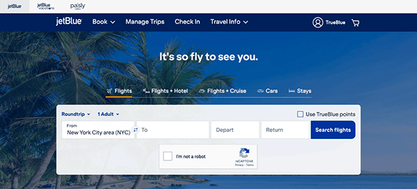
- Jetblue: The website’s sleek and minimalist design makes navigating incredibly easy. Bold color choices, especially JetBlue’s distinctive blue, provide a lively touch without being overpowered by the user. You can easily navigate the booking procedure because of everything’s straightforward organization, which includes large call-to-action buttons and menus. Its website is a breath of fresh air in the often cluttered world of online travel booking. Its booking process is simple and includes search choices to narrow down specific vacation destination data. The website features user-generated content, such as travel stories and photos shared by fellow JetBlue travelers, creating a sense of camaraderie and inspiration. Additionally, social media integration strengthens the feeling of community by enabling you to interact with the firm and other travelers on various platforms.
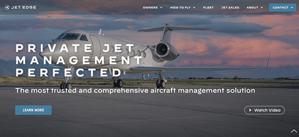
- Jet Edge: From the moment you visit its website, you can sense its elegance and sophistication. Its sleek design, simple navigation, and precise attention to detail create the ideal atmosphere for a lavish travel experience. The website welcomes users with eye-catching images that spark wanderlust and instantly capture the imagination. Because of the layout’s prominent navigation menus and intuitive and well-organized design, viewers could get the information they need. The website’s flexibility, including real-time availability and immediate pricing quotes, allows you to organize your trip easily. The website features multiple contact options, including phone, email, and contact forms, ensuring viewers can reach out whenever they need assistance.
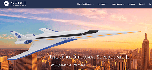
- Spike Aerospace: The website invites viewers to experience the future of supersonic flight with its modern features and elegant appearance. The company’s cutting-edge aircraft designs are showcased in high-quality photographs and videos on the website, which has a clean, minimalistic style that emphasizes the sophistication and elegance of supersonic travel. Bold color schemes and simple writing enhance the overall visual appeal and provide a really engaging browsing experience. Its website offers abundant resources and information, including comprehensive specs on aircraft designs and educational materials on supersonic travel for investors, travelers, and aviation fans alike. With a thorough FAQ section and contact form, visitors can easily reach out to the team for further information and assistance. Interactive elements like animated transitions and parallax scrolling enhance the overall feeling of immersion and provide a dynamic and captivating browsing experience that entices users to return time and time.
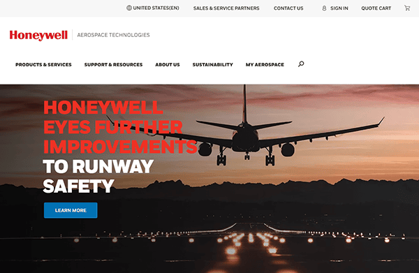
- Honeywell Aerospace: The website greets users with a simple, user-friendly design that immediately gives them confidence. Whether looking for its products, solutions, or insights into the aviation sector, accessing information is simple through the site’s well-organized structure and straightforward navigation menus. The website captivates visitors with high-quality visuals and multimedia elements strategically integrated throughout the platform. The company’s vast array of products and solutions is comprehensively showcased on the website. Every product, from cutting-edge propulsion technology and navigation systems to sophisticated avionics and aftermarket services, has comprehensive features, benefits, and specifications, making it easy for consumers to make judgments.
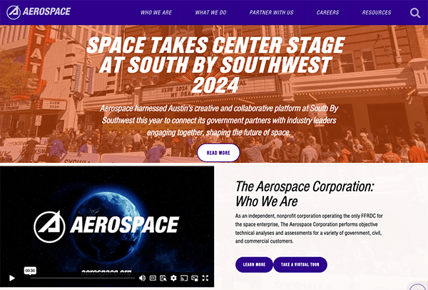
- The Aerospace Corporation: Upon initially accessing the website, users are greeted by a sophisticated and intuitive design that facilitates their exploration of its vast features. The website’s well-organized design ensures that customers can quickly find the information they need, whether about the company’s services, mission, or latest research projects. Attractive visuals capture visitors’ attention, such as eye-catching pictures of space missions, satellite launches, and cutting-edge technology. Multimedia elements such as animations, interactive infographics, and movies enhance the user experience and enable a thorough and captivating investigation of its undertakings.
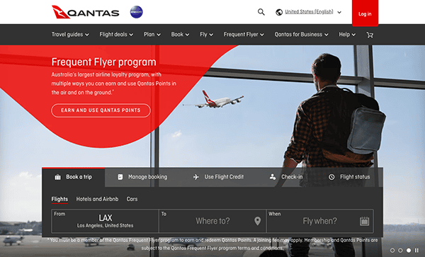
- Quantas: With its sleek and contemporary design, the website instantly grabs the user’s attention. Everything about the website, from the recognizable red and white color scheme to the inclusion of gorgeous imagery showcasing locations and aircraft, has been carefully considered to provide users with a cohesive and engaging experience. Its intuitive layout and easy-to-follow navigation ensure a seamless experience, whether looking for flights, managing bookings, or seeking travel inspiration. The intuitive search feature enables passengers to swiftly locate flights tailored to their preferences, offering price, schedule, and cabin class filters. The booking procedure is both simple and effective, providing travelers with clear instructions and prompts at every stage of the process.
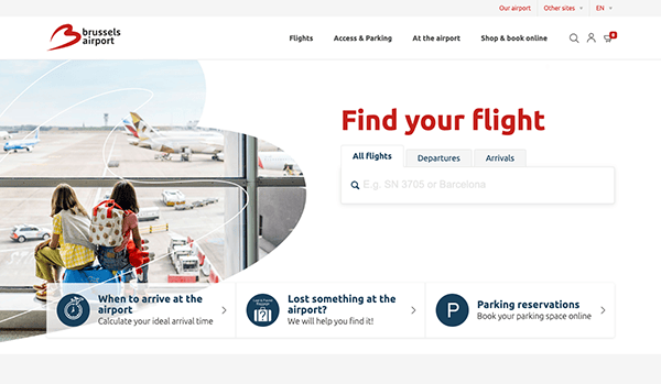
- Brussels Airport: Upon entering the site, visitors encounter a well-structured layout that smoothly directs them through its different sections. The intuitive navigation menu simplifies the process of locating crucial details like flight schedules, terminal maps, and transportation options, ensuring travelers can efficiently access the information needed to plan their journey. The website offers an easy-to-use interface and powerful search tools, simplifying the process of finding and booking flights. Users can conveniently search for flights according to their preferences, with the ability to filter results by airline, destination, and travel dates. The website provides various contact methods, such as email, contact forms, and live chat, ensuring assistance is readily available whenever needed.
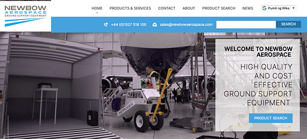
- Newbow Aerospace: The sophisticated and professional ambiance created by the website’s high-quality photography and modern style makes for an enjoyable browsing experience. Browsing its website is effortless, courtesy of its intuitive interface and neatly organized navigation menus. Whether you’re perusing the company’s products, discovering its mission, or exploring career opportunities, the clear layout ensures that everything is readily accessible, resulting in a smooth and seamless user experience.
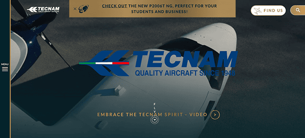
- Tecnam: The website provides an immersive journey into aviation excellence, boasting a sleek design and intuitive navigation. It showcases the company’s commitment to innovation and safety, with comprehensive features and a diverse range of aircraft models. Visitors can explore detailed specifications and performance data for each aircraft and immersive multimedia content such as virtual tours and flight test videos. The website also provides learning resources and support for pilots and enthusiasts, fostering community engagement and knowledge sharing. Designed for seamless responsiveness, it ensures consistent access across devices, reflecting the enduring legacy of craftsmanship and innovation in aviation.
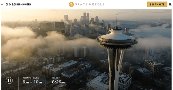
- Space Needle: Arriving on the website, visitors are met with a sleek and contemporary design reminiscent of the iconic company’s futuristic allure. The pristine layout, vivid visuals, and polished typography combine to establish an inviting ambiance, laying the foundation for an exceptional online journey. The website’s neat arrangement, lively visuals, and refined typography form an inviting atmosphere, laying the groundwork for an unforgettable online journey. Browsing through its website is effortless, facilitated by its intuitive navigation and user-friendly interface. Whether visitors are exploring ticket options or seeking information on upcoming events and attractions, they can quickly locate the desired information, ensuring a smooth and seamless experience from beginning to end.
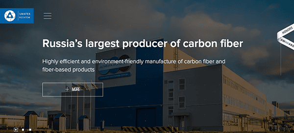
- Umatex Group: The website embodies modernity and functionality, welcoming visitors with a sleek design and easy navigation. Its minimalist style and engaging visuals create an inviting atmosphere, seamlessly guiding users through UMATex’s vast array of textile products and solutions. Each product is presented meticulously, with thorough descriptions and multimedia content, providing visitors with a comprehensive insight into UMATex’s expertise and innovation. Moreover, the website ensures a smooth experience across various devices, demonstrating responsiveness while prioritizing accessibility and fostering inclusivity and interaction with its users.
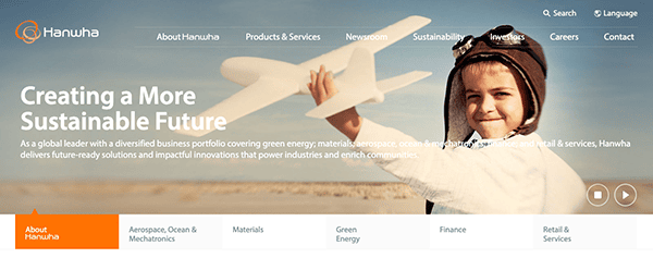
- Hanwha: The website has an attractive, modern design draws users in and immediately promotes exploration. Its easy-to-use navigation makes surfing easier and points people toward a wealth of information on Hanwha’s varied range of projects and enterprises. The website provides a wealth of information for users to peruse, ranging from in-depth product and service descriptions to educational articles and case studies. Multimedia interactive components, like videos and animations, improve user experience and provide dynamic insights into creative ideas. The website’s flexible design makes it easy to adjust to various screen sizes, giving visitors who visit it from PCs, tablets, or smartphones a consistent and hassle-free experience. Through social integration, guests may interact with their community, exchange stories, and remain current on events and news.
- Skyroads: The website radiates efficiency and elegance in every way, with a clean, minimalist design proclaiming modernity. The viewer’s attention is captured by striking, high-quality photos that are cleverly complimented by the careful use of white space to direct focus where it is appropriately needed. The visual experience is harmonized throughout with predominantly navy blue and white hues that impart a professional feel. The website’s subtle sky-blue accents highlight the aviation-themed style. Because of its user-friendly structure and intuitive design, navigating the website is a delight. It streamlines the browsing experience by enabling users to quickly and easily obtain the information they need, whether looking at flight possibilities, researching destinations, or making travel arrangements.
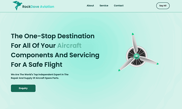
- Rock Dove Aviation: Their website is a model of simplicity and practicality, highlighting their main competencies in aircraft parts and services in an easy-to-understand manner. The whole atmosphere is practical and efficient, which fits in well with their primary objective. Predominately composed of greens and grays, the color scheme emanates stability and a tech-savvy vibe, with green standing out as a sign of innovation that precisely aligns with the company’s concept. By showcasing their partners and certificates, they significantly increase their credibility and inspire confidence in their products. This deliberate highlighting of their expertise highlights and reaffirms their dedication to industry collaboration and excellence.
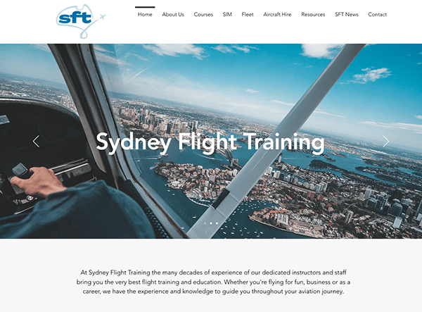
- Sydney Flight Training: The website provides a thrilling experience that expertly combines professionalism with the excitement of flying. A soothing blue color palette that evokes the serenity of the skies complements its clean, well-polished design, which radiates tranquillity. Aspiring aviation fans will find it immensely enticing as it captures the joy of flight with its captivating images of planes and vast horizons. Adding endorsements from their graduates raises the bar for credibility. These first-hand reports act as potent testimonials, offering sincere insights into the caliber and efficacy of the services provided. In addition, the website’s user-friendly design and extensive course content support anyone wishing to start or grow their careers in aviation, guaranteeing a smooth and rewarding experience.
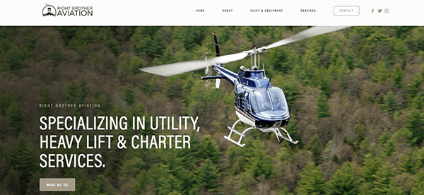
- Right Brother Aviation: The website prioritized usefulness above style and had an earthy, simple look. Its green pledge for tree-planting efforts and its choice of colors inspired by nature demonstrate its commitment to sustainability and environmental consciousness. The straightforward design offers a concise overview of their specialist services, including heavy lift operations and support for law enforcement, guaranteeing accessibility and clarity for visitors looking for particular information. The website provides a complete overview of their skills with a broad list of services supported by striking pictures. This strategy guarantees guests understand their solutions, cultivating trust in their knowledge and skills.
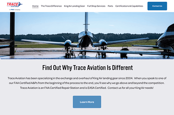
- Trace Aviation: The website, which only focuses on landing gear services, is a masterclass in clean, polished design. This design element by element demonstrates this specialization. It uses a monochromatic color scheme with well-placed blue accents to create a professional and reliable atmosphere, just what one wants in an aviation service provider. The layout is flawlessly simple with its clear, sharp text and high-definition graphics. When combined, these elements highlight the business’s attention to detail and commitment to excellence, precisely in line with the demands of its aviation clientele.
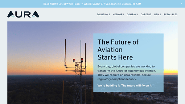
- Aura: The website has a sleek style that gives off a modern atmosphere. Blue is a significant color that represents advancement and creativity. With its futuristic design perfectly embodies the innovation concept, the website is a visual feast and a monument to forward-thinking. With its use of large, bold lettering and captivating pictures, the design emanates space. The content is presented in a balanced and exciting way that makes it easy to read and navigate. Together, these components enhance the state-of-the-art vibe connected to their aviation technology. The elegant and intuitive user interface draws the user in and clearly illustrates the technological advances it promises the sector.
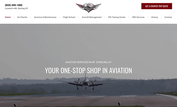
- Kentucky Airmotive: The design is simple yet effective with its traditional aviation color scheme of blue and white, which evokes visions of bright skies and denotes dependable service. The thoughtfully chosen photos showcase their charter services and flight school educational programs, giving a varied look into the options. Every section is devoted to exhibiting its offerings, strategically arranged to guarantee effortless traversal for guests. In addition, straightforward requests for charter quotations promote an easy-to-use interface, simplifying user interaction and the service request process. This well-considered design highlights the site’s usability and functionality while enhancing its visual attractiveness.
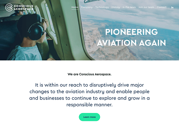
- Conscious Aerospace: With its cool colors and abundance of white space, the design exudes a clean style that precisely balances cutting-edge technology and environmental responsibility. Using hydrogen fuel cell powertrains, the striking graphics demystify their technology and highlight their commitment to zero-emission flying. This dedication to sustainability and innovation is shown in more ways than just the words they use. Their futuristic imagery effectively reinforces their message and makes it stick in the viewer’s mind.
Certain aerospace websites soar higher than others, setting benchmarks in design, functionality, and user engagement in the vast expanse of the digital universe. These sites exemplify how to effectively communicate complex information and innovation in an accessible and visually captivating manner. Whether through interactive elements, detailed case studies, or immersive visual content, the best aerospace websites captivate and educate visitors. They showcase the achievements and potential of the aerospace industry and demonstrate how a well-thought-out digital strategy can elevate a brand in a highly technical and competitive field.
As we navigate through these exemplars, it’s clear that the best aerospace and aviation websites share common traits: clarity, innovation, and a forward-thinking approach. They serve as digital ambassadors of the aerospace industry, offering insights into the advancements propelling humanity forward. By exploring these top-tier websites, businesses can gain valuable insights into creating a digital presence that truly stands out, combining aesthetic appeal with functional excellence to engage a global audience.
In concluding our exploration of the aerospace industry’s digital landscape, it’s evident that a compelling website is more than just a business necessity—it’s a strategic asset that propels companies to new heights. The best aerospace websites inform, inspire, and reflect the industry’s commitment to advancing human potential through innovation and technology. They are a testament to the power of strategic web design in shaping the future of aerospace and aviation.
If your aerospace business aims to reach new altitudes online, partnering with CyberOptik is your next strategic move. Specializing in crafting bespoke website solutions that resonate with your brand’s mission and the industry’s demands, CyberOptik understands the importance of a digital presence that stands out. For a free consultation on elevating your aerospace website to the forefront of digital innovation, contact CyberOptik today. Let’s embark on a journey to redefine what’s possible in the digital aerospace arena.

