Most aspects of web accessibility require knowledge of programming to be achieved. These elements are where our team at CyberOptik is a beneficial partner to help improve the experience for all of your website visitors, including those with disabilities. However, some items can be (and may need to be) done by you to maintain accessibility standards as content is updated on your site.
Several types of content that you will likely add to your website over time will require special attention to ensure those with vision limitations, mobility issues, and various other medical conditions are able to safely and effectively use your website.
This blog is a brief overview of guidelines and best practices as you continue to update and grow your website. In the following sections, we’ll cover various types of content and how to best approach them for accessibility.
Photography, Illustrations, & Icons
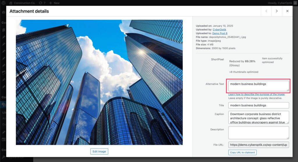
All images (photographs, illustrations, and icons) added to your website should include alternative text that accurately describes the substance of the image. A succinct description of the subjects, actions, and setting is adequate. It is not required to list every object, shape, or color within the image unless those characteristics are important to the broader context of the image.
A few examples of good alternative text:
- “Two men talking at a table in an office”
- “A woman points to a computer screen”
- “A group of people in volunteer shirts smile in a park”
- “Hammer and screw icon”
Here is where you can add alternative text to images in WordPress:
Graphics
This category of content can include charts, graphs, tables, workflows, text within an image file, etc. It is common for these elements to be added to a website as a static image (jpg, png, gif). However, visitors with visual limitations may be prevented from understanding the content of a graphic that is added in this manner.
Best Solution: Convert to HTML
Whenever possible, it’s best practice to add formatted html to display graphics instead of an image file. Some examples:
- Text should be added and formatted as HTML to a web page instead of uploaded as an image file whenever possible.
- There are plugins and blocks available in WordPress that can add data tables to pages. Since these tables are created in HTML, they can be adjusted for size and contrast with accessibility tools and read by screen readers.
- SVG graphics can include text within the SVG file (this doesn’t work if the SVG file is used as an image source).
Practical Solution: Add Alternative Text to Images
If it is not feasible to add graphics as coded HTML, as is often the case with graphs and workflows, the next best practice is to add alternative text for the graphic image file.
The alternative text for graphics should be as detailed as possible. Some Examples:
- A flyer is added to a slideshow on the homepage for an upcoming event that includes stylized text within an illustration. The alternative text should include all the text from the image file, rephrased as a paragraph for better comprehension, along with a description of the illustration.
- Alternative text for a bar chart should include each bar’s label, its value, and any other information relevant to what is being presented.
Color Info in Alternative Text
Importantly, any information represented by colors within a chart or graph should also be described in the alternative text. For example:
- If a bar is red instead of blue because its quantity is higher than a median point within the graph, that detail should be included in the description. “The second label is red to denote its value is greater than the median.”
- If a pie chart has a color key for its sections, the section should be described in the alternative text with the color and percentage. “The second item, presented in blue, represents 46% of the chart.”
Why is this important?
Let’s say a chart shows some value only by the color of the element within the chart. A user who experiences contrast differently or is color blind won’t be able to comprehend that element of the chart without further descriptive text.
Videos
Any videos you add to your website should contain an option for closed captioning. Manual captioning is the best practice but, in some cases, it is not possible, so automatic captioning can be used.
It is best practice to avoid any video from automatically playing. If a video does auto-play, the sound should be muted by default, and it should not contain flashing lights. Flashing lights should be avoided whenever possible with a clear warning when present. The video player should always have the option to pause and mute, and all controls within the video should be controllable by keyboard.
The easiest way to meet accessibility requirements is to have videos embedded from services like YouTube or Vimeo. Accessible controls are included in their video players by default, these services are optimized for video playback, and are likely to include options for auto-generated captioning if manual captions are not available.
Key Takeaways
- Do not autoplay videos with sound
- Warn of videos with flashing lights
- Include close captioning on any videos with audio
- All videos should be able to pause and mute (including by keyboard)
- Using YouTube of Video gives you most of the requirements by default
Contrast
If you manually set background or text colors within your website’s content through the WordPress Block Editor (Gutenberg), it is important to confirm that minimum contrast requirements are met:
- All plain text and links should have at least a 4.5:1 contrast ratio with the color of the background behind it.
- Larger, bolded titles can have a lesser 3:1 contrast ratio.
- Links within a body of text should be separated from the default text color with at least a 3:1 contrast ratio unless some other element is used to differentiate the link (such as an underline on the link text).
Avoid Color Only
It is best practice for any interactive element (clickable or hoverable) to be differentiated by more than just color. Some examples:
- Text links can be underlined by to visually denote they are links
- Buttons can have a unique font weight, size, or style
- Navigation links can use icons to denote dropdowns
If color is the only element used to denote interaction, it should have at least 3:1 contrast with its surrounding elements and its own hover effects.
The Yellow Problem
Yellow is the most difficult color to meet contrast requirements. If your site uses yellow for text or backgrounds, it is recommended that the color that shows either on top of or behind it is very dark. Do not use yellow with white or gray in combination.
A contrast checker tool can be used to verify: https://webaim.org/resources/contrastchecker/
Buttons & Links
The text contained within buttons and links should make the purpose of the link apparent. Instead of generic text such as “Learn More,” more specificity is required, such as “Learn More About Our Service.” To keep buttons shorter, you can also reword to the most condensed phrasing that still articulates the purpose, such as “View Service”.
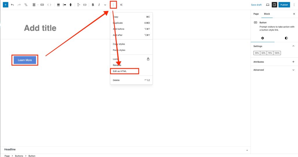
Button and Link Title Attributes
If it’s not feasible to add full descriptive text within the button or link, you can use the title attribute within the link html to succinctly describe the purpose of the button/link. This is not currently a setting in the WordPress Block Editor (Gutenberg), but you can edit the HTML like the following example:
<a href="/page-link/" title="Learn more about our services">Learn More</a>
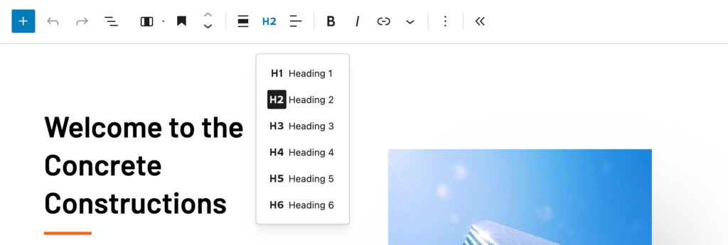
Headings & Hierarchy
Headings should follow a logical reading order. Much like an essay, a hierarchy of headings should be used to represent the topics and subtopics throughout the page. H1 headings are reserved for page titles only. You won’t use H1’s when adding content unless a page title is not automatically present at the top of your page. Most often, it is. H2 is used for the primary topics within the page, H3 for subtopics, and so on.
It’s best practice not to skip any headings in the hierarchy, such as going from H2 to H4 or starting a page with H3.
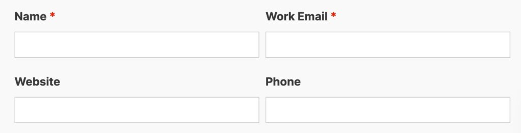
Forms
Incorrect Labeling
It is popular to use “placeholder” text instead of labels above or next to a field. Placeholder text shows within the field’s box, usually in a lighter gray color, and disappears when you click into the field to enter information. This style of labeling is not accessible.
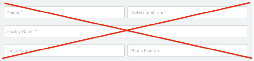
Correct Labeling
Every form field should include a label either above or to the left of the field that clearly describes the field’s purpose.
PDFs & Documents
Some documents that are stored on your website also need to be accessible, following all the same rules about text, headings, links, buttons, images, and forms that are outlined above.
All documents that present relevant and current information to visitors will need to be reviewed and updated if necessary. For example, an instruction document for logging into an active account will need to be reviewed to ensure it meets accessibility standards.
Legal Exceptions
If your organization needs to bring your website up to meet WCAG 2.1 AA guidelines due to new regulatory requirements, there is good news: significant exceptions are being afforded to document content. The following types of documents do not need to be updated to meet the new legal criteria:
- Any document that is linked to in an archive such as a dated list of documents containing meeting notes, created before the required compliance date.
- Any document that is historic in nature such as a pdf of old photos, created before the required accessibility compliance date.
- Any document that is no longer presenting relevant information to site visitors such as a flyer for an event from before the required accessibility compliance date.
Best Practice
Like with the Graphics item earlier in this document, it is best practice to convert any PDF to an HTML page as it is easier to maintain compliance in this format. If a document must stay a PDF for any reason, there are accessibility tools available to help you which are listed below under “Document Resources.”
This is, unfortunately, not an area of compliance that CyberOptik can help with since we do not specialize in document production or have access to the source files required to bring all documents up to compliance.
While it’s certainly not a quick or easy undertaking, especially when there is a large volume of documents present, we do recommend converting all documents to accessibility compliance beyond what is required by law. Like all the guidelines outlined in this document, the purpose of this work is to make sure everyone has the same access to the internet, marketplace, and information.
Document Resources
Keep in mind that the tools linked above will generate automatic results that may not be accurate. The best way forward is to train your entire team on document accessibility requirements.
Conclusion
Because the original Americans with Disabilities Act was passed before many of the technologies we use today even existed, how the law applies to today’s digital spaces is… complicated.
To put it bluntly, web accessibility is a minefield. The technologies that shape the internet are changing at an accelerated rate and so are the standards that are applied to those technologies to best ensure everyone can use them. The manner in which government and commercial website requirements are enforced is also evolving, and the number of legal actions taken are escalating exponentially each year.
However, our ability to keep up and make the web accessible is also growing in importance. Not only are the legal standards regularly becoming more stringent, but the internet is now a vital tool that must serve all people. No matter your background or circumstances, it’s no longer a luxury but a necessity for modern life.
How We Can Help
As the standards are regularly changing, we want to help you keep up:
- If your website was launched or last reviewed more than six months ago, we strongly recommend getting in touch with us to run an accessibility checkup.
- Once we’ve verified your site is up to date, we also offer an ongoing upkeep service which would include regularly checking your site and updating any elements to the latest standards.
Get in touch with us today to discuss your website’s accessibility!
This article was written in collaboration by Warren Greeley (Chief Creative) and Allison Smith (Copywriter) on behalf of CyberOptik.


