In the highly competitive world of real estate, having a well-designed website is not just a luxury—it’s a necessity. Your website serves as the digital storefront for your real estate business, offering potential clients a first impression that can either make or break a deal. With the majority of property searches now starting online, the best real estate website design not only showcases listings appealingly but also offers valuable resources and information to buyers and sellers alike.
The real estate industry is unique in that it relies heavily on visual elements and personal connections. A well-designed website can seamlessly integrate these aspects, providing high-quality images, virtual tours, and easy-to-navigate listings while also offering ways to connect with agents easily. The design should be intuitive, the content compelling, and the user experience smooth, ensuring visitors stay on your site and take the next step in their property journey.
Moreover, a top-notch website design can significantly impact your search engine rankings. Most people stay within the first page of search results, so SEO-optimized design elements and content are crucial. This will increase your website’s visibility and also contribute to establishing your brand as an authority in the real estate sector.
Examples of the Best Real Estate Website Designs
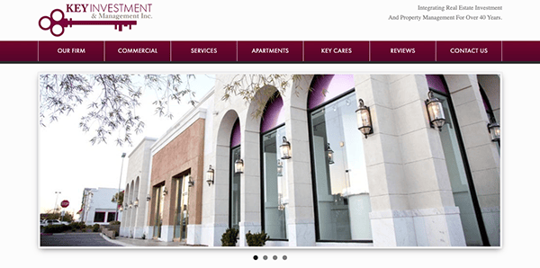
- Key Investment & Management Inc: The website’s design exudes simplicity and clarity, ensuring the content remains the focal point. A thoughtfully selected color palette conveys trust and reliability. The user-friendly layout facilitates easy navigation and information retrieval without overwhelming visitors. Notably, the website excels in presenting its services with meticulous detail. Whether it’s commercial real estate or tenant services, the site provides a comprehensive overview, enabling potential clients to grasp the entirety of what it can offer.
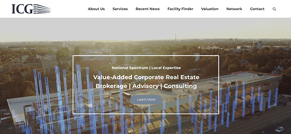
- ICG: The website is expertly crafted to convey the firm’s offerings and unique selling points in the corporate real estate industry. With an intuitive, polished design, the site ensures effortless navigation. Its content is comprehensive and tactically aligned to meet specific goals. A commitment to transparency is evident through the provision of key performance indicators, and the platform prioritizes fostering enduring relationships with clients. Notably, the website is a highly effective tool to cater to the needs of its intended audience.
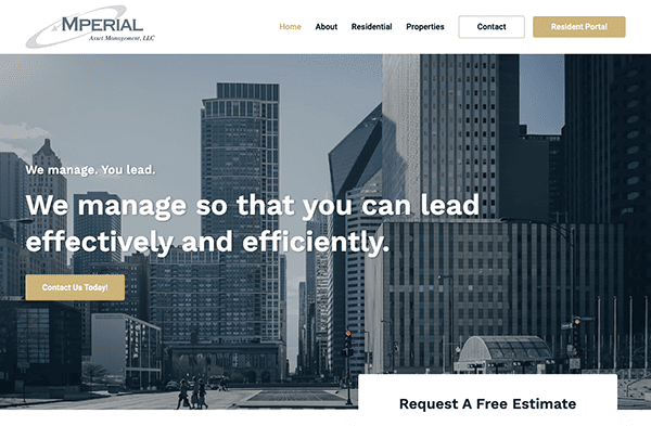
- Mperial: The website’s design is clean and straightforward, focusing on clear messaging. The tagline “We manage. You lead.” effectively encapsulates the company’s value proposition. The layout is intuitive, making it easy for visitors to navigate various service offerings, while client testimonials add a layer of credibility. Notably, the website excels in providing comprehensive details about its wide range of services, encompassing management and consulting services for community associations, as well as specialized services tailored to condominiums, townhomes, and homeowners’ associations. With a collective experience spanning over a century, its expertise is prominently conveyed, further bolstering the site’s trustworthiness and authority.
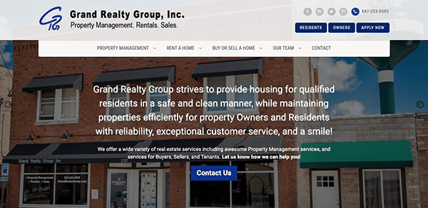
- Grand Realty Group Inc: The website offers a user-friendly and comprehensive platform for real estate services in Northern Illinois. Featuring a well-organized design and user-friendly navigation, it simplifies the process for visitors to delve into property management, home buying, and selling services. The prominently displayed contact information further enhances the website’s user convenience, ensuring accessible communication with prospective clients. Remarkably, the website excels in providing an extensive array of real estate services, fortified by the inclusion of testimonials from satisfied clients. This inclusion bolsters their offerings and instills a sense of credibility and trustworthiness in their services.
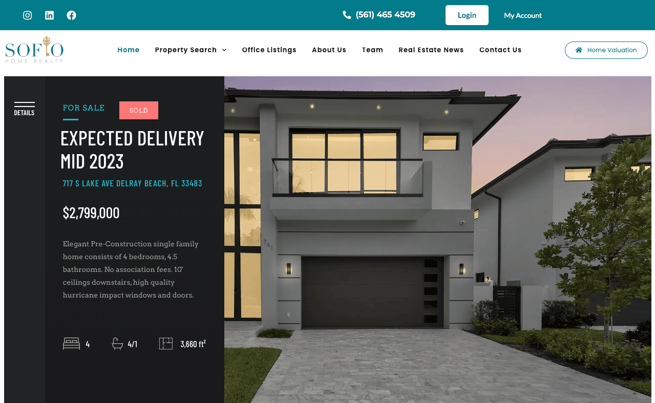
- Soflo Home: The website stands as a well-executed platform for real estate in South Florida, combining visual appeal with user functionality. Its sleek, contemporary layout is enhanced by user-friendly navigation, top-notch imagery, and valuable information. The content is systematically arranged and insightful, featuring comprehensive property listings and client reviews that bolster the site’s trustworthiness. Additionally, the platform offers valuable neighborhood insights, making it a crucial resource for prospective buyers.
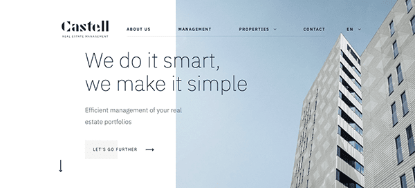
- Castell Management: As soon as you land on the website, you’re met with a harmonious fusion of style and practicality. The refined design, carefully chosen hues, and skillful integration of graphics and text establishes an aura of credibility and expertise, mirroring the company’s specialization in real estate management. The content is systematically arranged and insightful, offering comprehensive details about available services. Accessibility to contact information is seamless, and strategically placed call-to-action prompts such as “Let’s Go Further” effectively encourage user interaction.
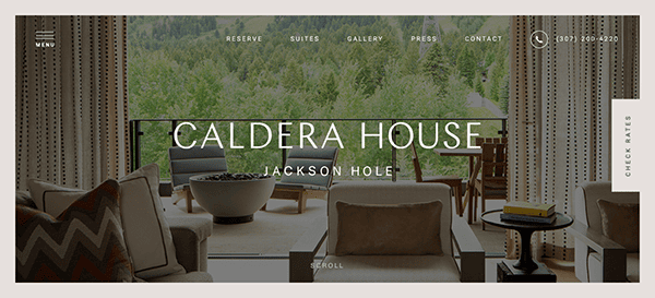
- Caldera House: The website’s design is visually stunning, employing a rich color palette that complements its luxurious offerings. High-quality images of the suites and surrounding landscapes are prominently featured, adding to the site’s visual allure. The layout is clean and elegant, making effective use of white space to highlight key information. The user interface is intuitive, with a well-organized menu that allows easy navigation to various sections. The content is meticulously curated to provide detailed information about the suites, amenities, and experiences. The inclusion of awards and affiliations adds an extra layer of credibility. Call-to-action buttons like “Check Rates” and “Learn More” are strategically placed to encourage user engagement.
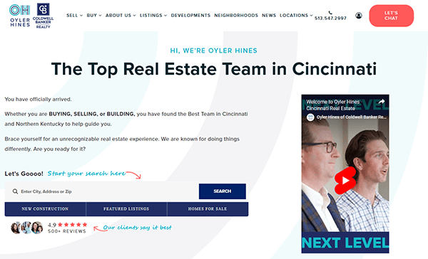
- Olyer Hines: The site’s design exudes a contemporary aesthetic, amplified by a carefully curated color palette that enhances its professional vibe. The strategic use of high-resolution imagery and graphics punctuates the text and captivates the viewer’s attention. Its minimalist layout ensures that users can concentrate solely on the content. An intuitively structured menu simplifies user navigation. The site’s content is rich in detail and meticulously arranged, covering the range of services, the expertise of the Oyler Hines team, and the areas they cater to. Adding testimonials from satisfied clients lends authenticity and offers potential customers a measure of the quality they can anticipate.

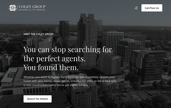
- Coley Group: The Coley Group’s website sets a standard for design excellence in the real estate industry. Its contemporary aesthetic and intuitive navigation system create an inviting platform that accommodates the needs of both buyers and sellers. The site gains added trustworthiness through captivating visuals, interactive features, and testimonials from satisfied clients. It offers a comprehensive display of real estate options, from in-depth property profiles to the company’s unique approach to real estate transactions. Regular updates with fresh insights into the real estate market make the website indispensable for those searching for premium real estate services.
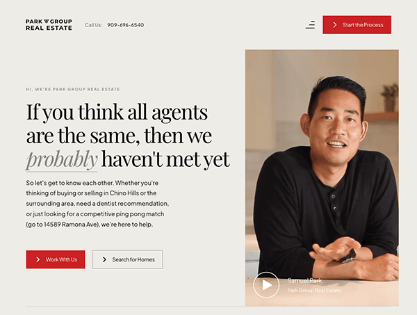
- Park Group Real Estate: The site welcomes visitors with a modern layout and a refined color palette, immediately establishing an atmosphere of trust and competence. The navigation is intuitive, featuring clearly labeled sections that guide users to essential information like featured listings, mortgage calculators, and marketing strategies. The website goes beyond just showcasing properties; it is a comprehensive resource for buyers and sellers. With high-quality visuals, informative content, and performance metrics, the site adds layers of transparency and credibility. Moreover, the website is mobile-responsive, ensuring a seamless user experience across various devices.
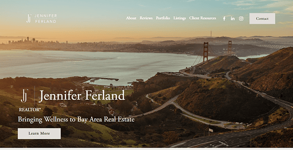
- Jennifer Land: The website showcases a seamless blend of professionalism and user-centric design, effectively highlighting her real estate skills in San Francisco and Marin. The homepage’s simple appearance and clear navigation make it easy to find crucial elements such as services offered, client resources, and property listings. The constant color palette and high-quality graphics show trust and refinement, complementing Jennifer’s brand identity. Client testimonials and success stories are prominently featured, adding credibility and offering visitors genuine insights into her commitment to client happiness.

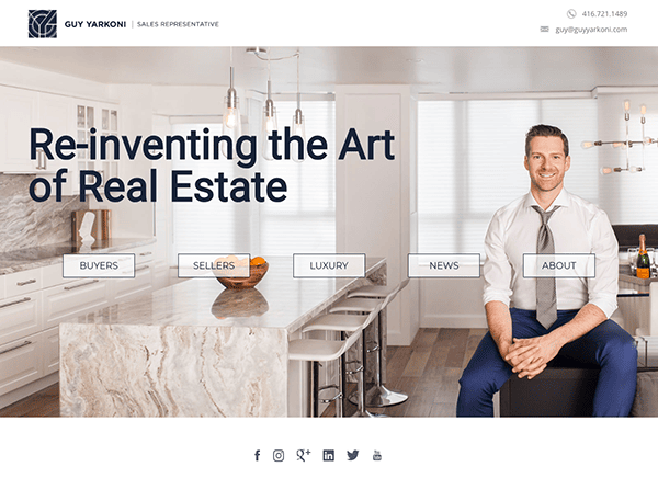
- Guy Yarkoni: Guy Yarkoni’s real estate platform is a skillfully designed digital resource tailored to meet the needs of high-end home buyers and sellers in Toronto. Its design is uncluttered and direct, facilitating a user-friendly experience with effortless navigation across key sections such as ‘Buyers,’ ‘Sellers,’ ‘Luxury,’ and ‘News.’ The site’s typography and layout exude professionalism, fostering an environment of trustworthiness and expertise. The tagline “Re-inventing the Art of Real Estate” is a distinguishing feature that succinctly communicates the brand’s unique selling point. Despite its minimalist approach, the website focuses on essential elements, rendering it effective and easy to use.
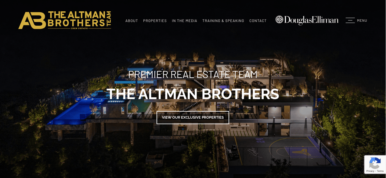
- The Altman Brothers: The site’s design is elegant and functional, offering an intuitive user experience that aligns perfectly with their luxury real estate market. The color scheme and typography are sophisticated, contributing to an atmosphere of exclusivity and professionalism. Interactive features like clickable property listings and integrated social media links heighten user engagement. The user interface is thoughtfully architected to provide a seamless and pleasurable browsing journey. Elements like dropdown menus, quick-access links, and easily accessible contact details are strategically positioned to streamline navigation. High-quality visuals encapsulating the luxury real estate experience elevate the site’s appeal. Incorporating professional photography highlights the properties and infuses the website with an added layer of refinement.
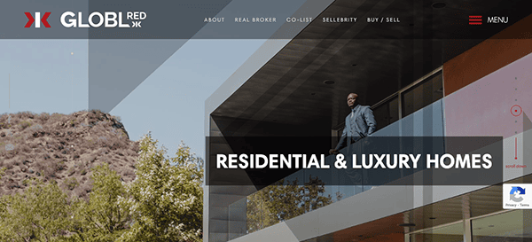
- GLOBL RED: The website’s sleek and modern design exudes professionalism, aligning perfectly with its luxury real estate specialist brand. The sophisticated color scheme enhances the overall user experience and the site’s luxurious feel. Engaging visuals and insightful content make it an invaluable resource for those seeking real estate guidance. The site is intuitively structured, making navigation effortless through various sections. The site goes beyond merely listing properties; it serves as a comprehensive resource for luxury real estate, complete with client endorsements and media appearances.
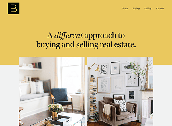
- Berdan Real Estate: The site’s layout is clean and straightforward, making navigation a breeze. The use of a minimalistic design approach focuses the visitor’s attention on essential information, such as the company’s unique selling proposition, “A different approach to buying and selling real estate.” The website also includes performance metrics, stating that they’ve helped buy and sell over $100 million of real estate, adding credibility and trust. Additionally, the site offers an inviting call-to-action with “Let us buy you a coffee,” which makes the company approachable.

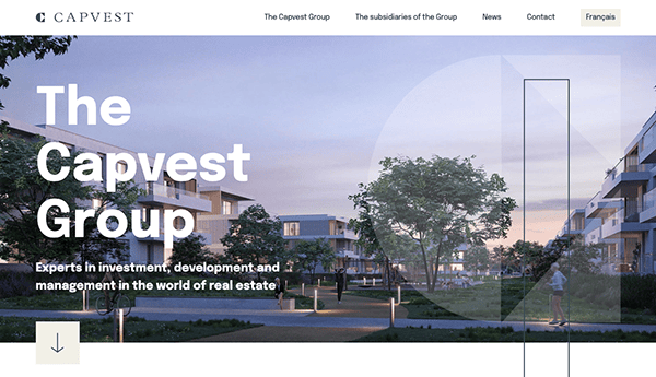
- The Capvest Group: The website effectively communicates expertise and value in the real estate investment sector. The site’s sleek and professional design offers an intuitive user experience that aligns perfectly with the brand’s focus on investment, development, and management in real estate. The color palette is sophisticated, adding to the site’s professional demeanor. A dedicated section outlining the company’s philosophy and core values enriches the brand’s depth and fosters trust among potential clients and investors. A notable highlight is the detailed showcase of the group’s various subsidiaries, offering an expansive perspective on their global operations. Additionally, the site’s multilingual capabilities extend its accessibility to an international audience.
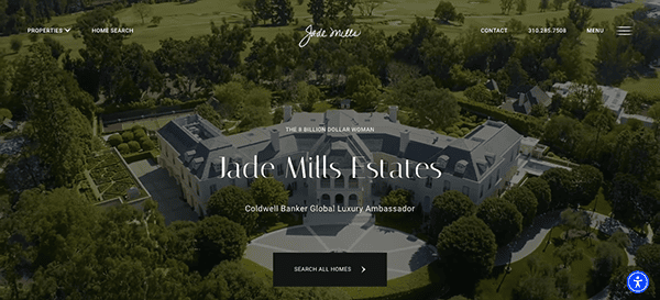
- Jade Mills: The site seamlessly marries aesthetics with functionality, offering a visually captivating and user-friendly experience. From the moment you enter, the elegant design, tasteful color palette, and high-quality visuals create an ambiance of luxury and sophistication, mirroring the company’s reputation in the high-end real estate market. The website’s user-centric navigation makes it effortless for visitors to explore the portfolio of luxurious properties and learn about Jade Mills Estates’ exceptional team. Engaging visuals, immersive property listings, and insightful content enhance the browsing experience and convey a deep understanding of the luxury real estate market.
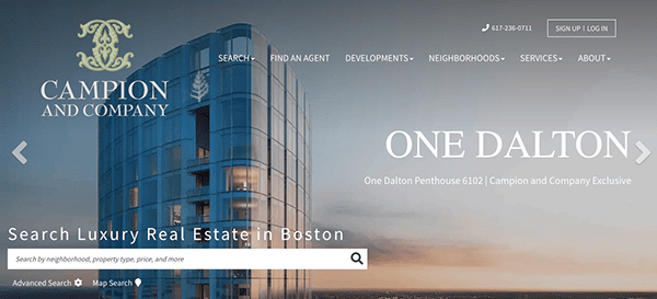
- Campion and Company: The website’s design artfully combines elegance with functionality, offering an intuitive user experience that aligns perfectly with the brand’s focus on luxury properties in Boston’s most desirable neighborhoods. The color palette is sophisticated, adding to the site’s professional demeanor. One of the standout features is the presentation of performance metrics, such as the amount of real estate the company sells and its rank in the Boston luxury market. These metrics add a layer of transparency and credibility, which is crucial in the high-stakes world of luxury real estate. The website also includes a section on luxury property developments and various Boston neighborhoods, serving as an invaluable guide for clients.
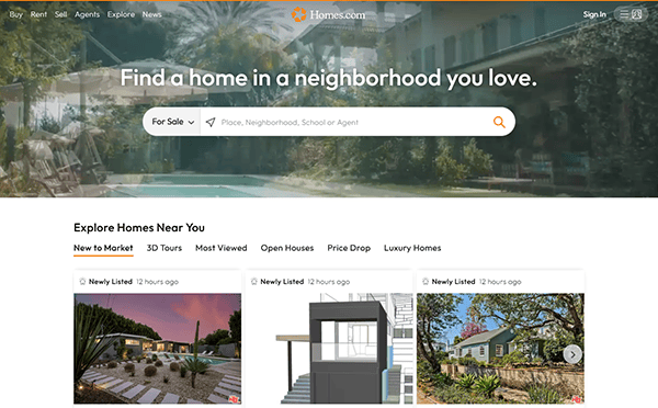
- Homes: Its website provides a great online experience through a modern and user-friendly design suited to purchasers, renters, and real estate enthusiasts. The homepage is visually appealing, with a clean layout and a visible search box for discovering properties. A warm and inviting color combination of blues and whites fosters trust and professionalism while providing visual comfort. High-quality property photos and interactive maps improve the user experience, making browsing pleasant and instructive. The site is geared for responsiveness, ensuring easy access and operation across all devices, including computers and smartphones.

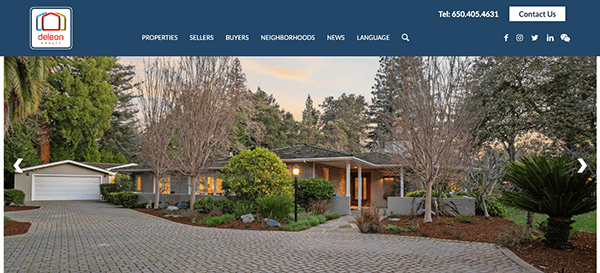
- DeLeon Realty: The design of its website strikes a balance between simplicity and engagement, effectively catering to its audience. It features a diverse range of properties, each represented by high-resolution images accompanied by essential details such as pricing and location. The homepage prominently displays a straightforward logo and navigation, while the featured listings command attention with their standout presentation on the web page. Additionally, the featured listings are visually striking, capturing immediate attention as they stand out on the webpage. The site incorporates interactive features to enhance user interaction, including clickable property listings and an events calendar. These elements increase user engagement and offer a more in-depth look into the services and events offered by the company.
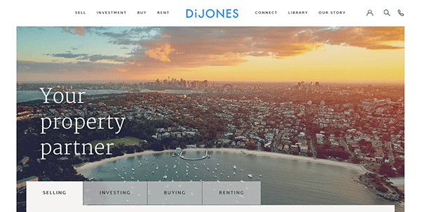
- Di Jones: The website’s design is aesthetically pleasing and minimalist, facilitating an intuitive user journey. As users arrive at the homepage, they are welcomed by a prominent search function in the hero section, inviting users to explore top-tier properties. The site’s content is thoughtfully structured, emphasizing in-depth real estate guides and valuable market insights. Interactive features are seamlessly integrated into the site, and the scroll-triggered animations further enrich the website’s visual appeal. Customer reviews contribute an additional layer of credibility and trustworthiness to the platform.

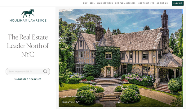
- Houlihan Lawrence: The site’s design is clean, modern, and highly functional, offering an intuitive user experience that aligns perfectly with the brand’s focus on luxury and community-based real estate. The color palette is sophisticated, adding to the site’s professional demeanor. One of the standout features is the “Suggested Searches” section, which offers quick links to various counties and market reports, making it easier for users to find what they’re looking for. Additionally, the site showcases a section dedicated to new and noteworthy listings, enriched with high-resolution images and comprehensive details, thereby serving as an invaluable asset for clients.
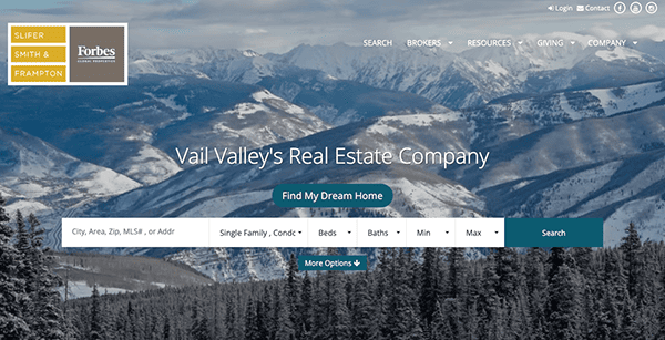
- Vail Real Estate: The website establishes an exceptional benchmark for design quality in the luxury mountain real estate sector. Upon entry, the site’s welcoming design, cohesive color scheme, and captivating visuals immediately immerse you in the awe-inspiring landscapes of Vail, perfectly mirroring the company’s specialization in this elite real estate sector. A distinguishing element is the “Start Your Search” feature, which empowers users to navigate a comprehensive selection of available properties effortlessly. The combination of engaging visuals, interactive property listings, and informative content elevates the user experience and demonstrates a deep expertise in the Vail real estate market.

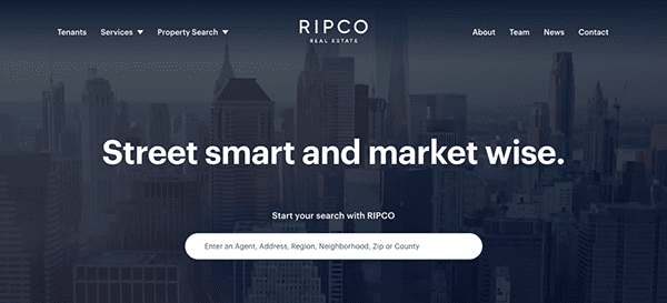
- Ripco Real Estate: The website’s sleek and professional design provides an intuitive user experience that harmonizes seamlessly with the brand’s ethos of offering “Street smart and market-wise” real estate solutions. The site is thoughtfully designed, emphasizing creativity, elegance, and innovation. As users arrive on the homepage, they encounter a refined search feature prominently situated in the hero section, flanked by an introduction to the brand’s identity. Featured listings are displayed in an eye-catching slider format, with each property individually highlighted for optimal visibility. Additionally, the site features a “News” section, keeping visitors abreast of the latest market trends and opportunities.
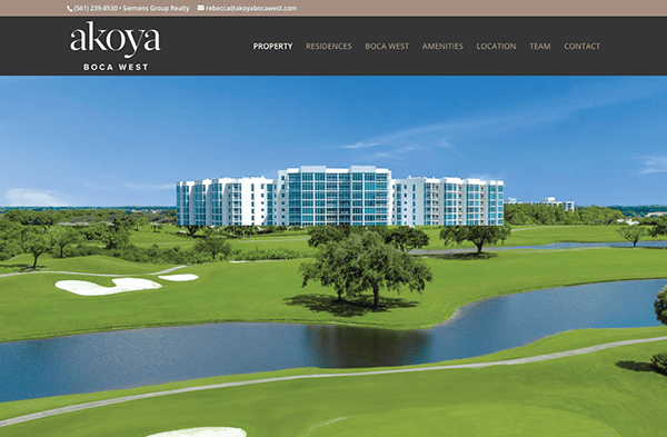
- Akoya Boca West: The website’s design exudes elegance and sophistication, delivering an intuitive user journey. It boasts sharp images, eye-catching headlines, high-definition videos, and seamless animations, all contributing to a visually compelling experience. The content is well-organized and logically structured, making it easy for visitors to absorb information. Both the header and footer are thoughtfully designed to include essential elements while maintaining aesthetic appeal, further enhanced by using a sticky header for expedited navigation. Although the site is primarily geared towards providing information, it thoughtfully includes vital contact details, improving user engagement and offering a deeper understanding of the luxurious lifestyle the website represents.
As we’ve explored some of the industry’s best real estate website designs, it’s clear that a well-crafted digital presence is more than just a trend—it’s a strategic necessity. These websites don’t just look good; they perform, convert, and meet the needs of their target audience. They offer a blend of visual appeal, functionality, and optimized content that sets them apart in a crowded marketplace.
If you’re in the real estate business, now is the time to evaluate your website critically. Does it meet the high standards set by the best in the industry? Does it offer a user experience that converts casual browsers into potential clients? If not, you’re likely missing out on valuable opportunities to grow your business and establish your brand.
Are you eager to take your real estate website to unparalleled heights? Don’t compromise on mediocrity when the pinnacle of excellence is attainable. Contact CyberOptik today for a free consultation about your real estate website. Our web design and digital strategy expertise can assist you in crafting a website that looks visually appealing and drives results. Let’s turn your digital presence into your most powerful asset.

