In the realm of mental well-being and holistic health, the significance of a meticulously crafted website is paramount. Professionals like therapists, counselors, and psychologists operate in a trust-based industry, and often, the website serves as the initial interface between a prospective client and the healthcare practitioner. A poorly designed or outdated website can inadvertently send the wrong message, causing visitors to question the professionalism and credibility of the therapist.
The digital landscape has evolved, and so have the expectations of clients seeking mental health services. They are looking for easily accessible information, seamless navigation, and a sense of connection—all of which can be facilitated through exceptional website design. In an industry where the nuances of human emotion and confidentiality are paramount, your website should serve as a virtual sanctuary that reflects your expertise, ethos, and the transformative journey you offer.
Moreover, a well-crafted website can serve as a powerful marketing tool. It can help you stand out in a crowded market, attract more clients, and expand your practice. The best therapist website design captures the essence of your practice and incorporates vital elements like SEO optimization, mobile responsiveness, and user experience to drive engagement and conversions.
Examples of the Best Therapist Website Designs
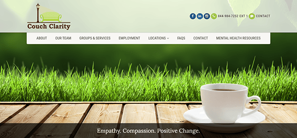
- Couch Clarity: Its website offers psychotherapy practice that provides a range of services, including individual, couples/family, and group therapy, as well as unique “walk & talk” sessions. The website employs a clean, professional design that aligns well with the healthcare industry. The color scheme is calming, which is fitting for a mental health service provider. Navigating through the site is a breeze, credit to the intuitive menu and well-placed call-to-action buttons. Whether you’re looking for services, team bios, or resources, everything is just a click away. The website does an excellent job of providing essential information without overwhelming the visitor. The contact number is noticeably displayed, and a direct link for scheduling an appointment enhances user accessibility.
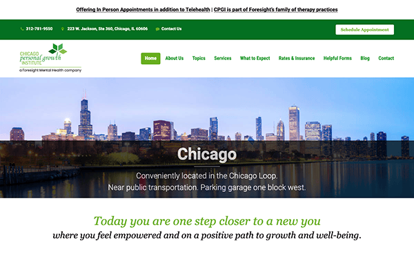
- CPGI: Its website serves as a comprehensive platform for individuals seeking therapy and personal growth services. It will greet users with its elegant and visually stunning design. The website achieves visual harmony by using green as a primary color, maintaining a consistent and visually appealing design throughout its pages. The navigation menu is designed for intuitive usability and is complemented by a streamlined, well-organized layout. Its content is concise yet impactful, efficiently communicating its expertise and approach. The website incorporates dynamic components like meticulously positioned call-to-action buttons and user-friendly contact forms to stimulate user interaction.
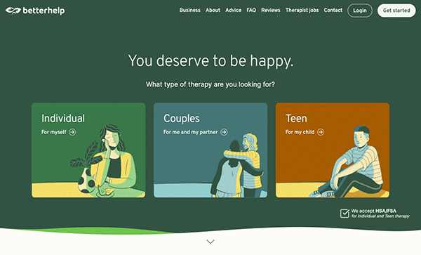
- BetterHelp: The design effectively captures the core attributes of the service, which are professionalism, accessibility, and confidentiality in mental health support. The unique pastel color scheme elevates the platform by creating a tranquil and calming atmosphere. A meticulously engineered menu and sub-menu system simplifies navigation, supported by a thoughtfully planned layout. Content elements, both textual and visual, are synergistically aligned to create a unified storytelling experience. User navigation from initial entry to final action is streamlined through strategically positioned call-to-action buttons.
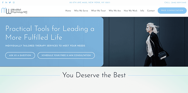
- Mindwell NYC: The layout design is sleek and intuitive, establishing users can navigate easily. The site’s captivating visuals and fluid animations encapsulate a nurturing ambiance, making it an ideal destination for those valuing their mental wellness. Its calming blend of blues and whites instills a feeling of peace and dependability, inviting those seeking guidance and insight. The website’s content balances depth and simplicity, offering abundant information without overwhelming its audience. Features like the FAQs, blog, and detailed service overviews stand out for their utility. Multimedia components, such as imagery and videos, amplify user engagement, potentially heightening their on-site duration.
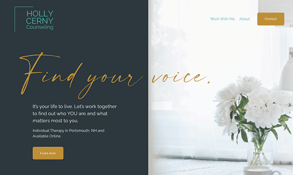
- Holly Cerny Counseling: The website possesses a gleaming and cohesive layout, ensuring an excellent browsing experience. It excels in delivering relevant and well-crafted content. Thoughtfully positioned images accompany the text, elevating the overall user experience. The simple menu and user-friendly navigation elements empower visitors to explore the platform, ultimately enhancing user engagement effortlessly. Additionally, strategically placed CTAs are eye-catching and unobtrusive, featuring clear messaging, encouraging user interaction, and prompting potential clients to act.
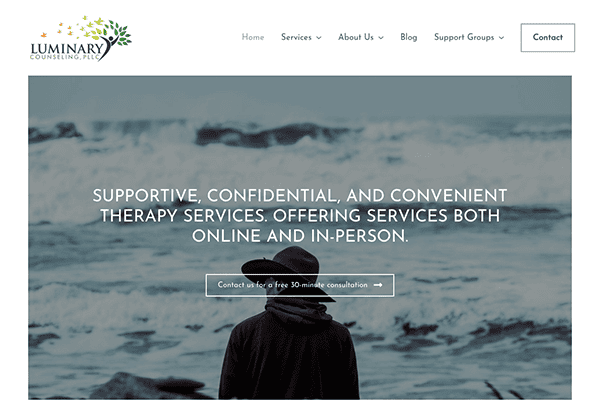
- Luminary Counseling: The website is a superb illustration of how a digital platform can effectively convey warmth, professionalism, and expertise within the field of mental health. It seamlessly blends intuitive design with rich and informative content. With a user-centric approach, it guides visitors through thoughtfully curated information, all against a soothing color palette. The platform’s carefully selected typography and responsive design guarantee excellent readability on a multitude of devices. Furthermore, well-placed CTAs beckon users to explore further, and the thoughtful inclusion of relevant visuals adds authenticity, bolstering user confidence.
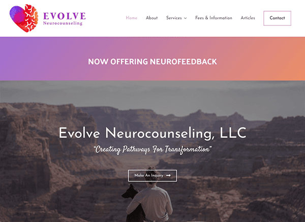
- Evolve Neurocounseling: The website’s layout is a testament to thoughtful design, prioritizing ease of navigation without compromising aesthetics. Drawing on a soothing spectrum of colors, the site emanates a serene atmosphere, resonating deeply with its mission to support and heal. The rational use of images in terms of quality and relevance amplifies this sense of tranquility and trust. The content, from service details to informational resources, is presented clearly, fostering an environment where visitors feel informed and understood. Through an adept balance of visual aesthetics and pertinent content, the website extends a genuine hand to visitors, establishing an immediate rapport.
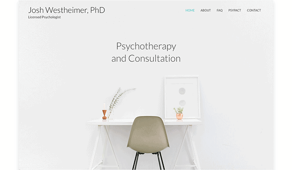
- Josh Westheimer, Ph.D.: The website is a prime example of how simplicity and precision drive effective website design. Tailored to serve the counseling and therapy niche, it expertly combines minimalistic aesthetics with substantive content. Its layout is refreshingly straightforward, delivering an intuitive user experience. Using a subdued and neutral color scheme induces a feeling of calm and introspection. Impressively, the site efficiently and concisely conveys essential information. Its minimalist design skillfully imparts a sense of tranquility, trust, and expertise, which are pivotal qualities in the sensitive therapy field.
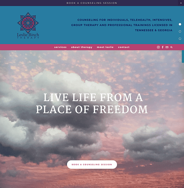
- Leslie Binch Therapy: The site’s layout welcomes users with modern simplicity, ensuring an uncomplicated yet enriching browsing experience. Its well-thought-out color palette conveys a sense of calm and approachability, with soft, muted tones creating a comforting digital environment. The site maintains a consistent, reader-friendly typography that harmonizes with its overall design. Its content is informative and genuine, giving visitors a transparent insight into its expertise and approach. The platform’s clear focus on the user, evident in its intuitive navigation and device responsiveness, further solidifies its position as a go-to resource for those searching for therapeutic guidance.
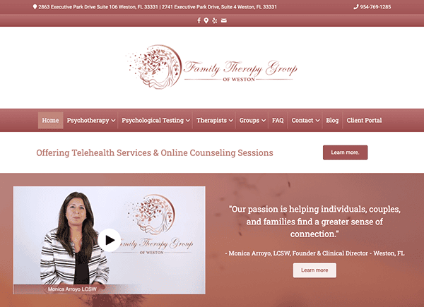
- Family Therapy Group: Upon arrival at the website, you’ll be captivated by its contemporary aesthetic. This design choice seamlessly aligns with the practice’s commitment to delivering empathetic and results-driven family therapy. The site showcases a meticulously organized layout, guaranteeing that users can seamlessly explore various sections. A standout element of the site is its color palette, defined by gentle red hues alongside neutral undertones. The website excels in presenting a wealth of information with brevity and transparency. Whether you’re delving into comprehensive service descriptions or perusing therapist profiles, every section radiates a commitment to clarity and authenticity.
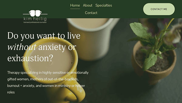
- Kim Heilig: One of the standout features of its website is its minimalist yet compelling layout. The design choices facilitate a user-friendly experience, ensuring visitors can effortlessly access essential information and navigate through the website’s sections. The site adopts a soothing and understated color palette, predominantly consisting of soft, neutral shades. Its typography strikes a perfect combination between style and legibility. Visitors are presented with detailed descriptions of the services available, allowing them to understand what to expect clearly. Its commitment to user engagement is evident with strategically placed CTAs (Call to Action buttons) that invite visitors to “Contact Me” and “Contact me for a free 15-minute consultation.”
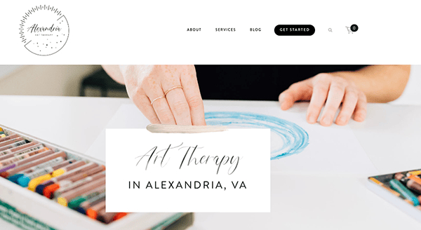
- Alexandria Art Therapy: The website employs a clean, modern design that aligns well with the therapeutic services. The color palette is calming and inviting, which is essential for a website in the mental health sector. An adept utilization of whitespace ensures a spacious and intuitive browsing experience. While abundant in content, the site maintains clarity and avoids information overload. Thoughtfully chosen images enhance the site’s appeal, blending seamlessly with textual elements and adding depth to the narrative. Furthermore, the call-to-action (CTA) components are strategically positioned and captivating.
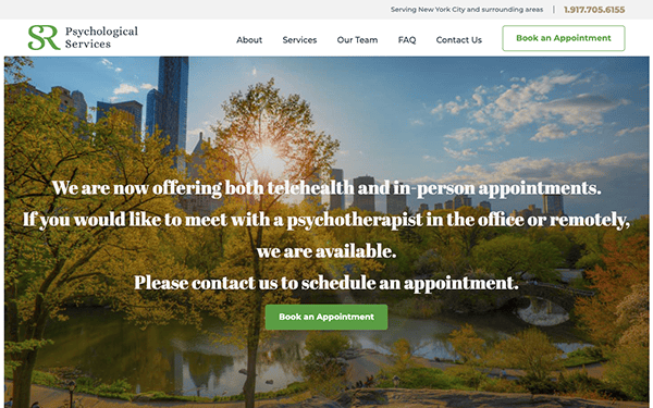
- SR Psychological Services: The website embraces a clean and professional design, presenting a soothing and neutral color palette that effectively sets the stage for a therapeutic journey. Content-rich and informative, the site offers in-depth insights into the services provided, areas of specialization, and the talented team of psychologists and psychotherapists. The integration of high-quality images enhances the visual appeal without causing distractions. User-friendliness is a vital feature in the intuitive navigation and straightforward menu. Thoughtfully placed call-to-action buttons, such as “Book an Appointment,” facilitate engagement. Furthermore, the website accommodates telehealth and in-person appointments, ensuring accessibility for a diverse audience.
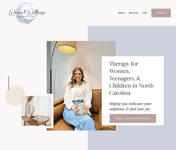
- Waves to Wellness Counseling: This website exudes a modern and clean design, elegantly enhanced by a neutral color scheme with delicate gold accents, creating a harmonious blend of professionalism and warmth. The content-rich website provides all the essential details about the services offered and the therapist’s approach. The information is systematically arranged and user-friendly, facilitating effortless navigation for visitors searching for specific information. User-friendliness is a hallmark, exemplified by prominent call-to-action buttons like “Submit a New Patient Inquiry” that expertly guide users through the process. The site’s navigation is intuitive, and its mobile responsiveness guarantees a seamless and consistent experience across various devices.
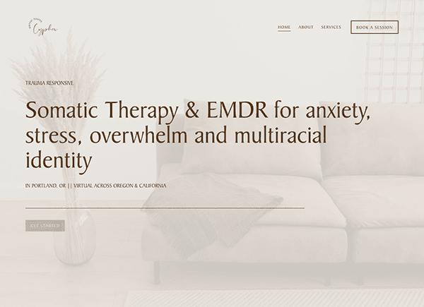
- EMDR Therapy: The design exudes a profound sense of tranquility through its muted color palette and warm, captivating imagery. The prominently displayed therapist’s photo adds a personal and relatable dimension, instantly fostering a sense of trust for potential clients. The site is user-friendly, with intuitive navigation. The menu is straightforward, and the call-to-action buttons like “Book a Session” are strategically placed. The accompanying text conveys a concise yet inclusive message, underlining the therapist’s unwavering commitment to serving a diverse range of clients and addressing their unique needs.
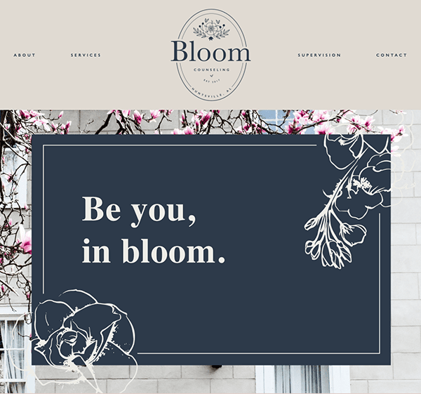
- Bloom Counseling: The site’s clean, modern design, complemented by a calming color palette and high-quality images, sets a therapeutic tone. The content is well-organized and detailed, offering insights into the services provided, the therapist’s background, and the practice’s focus on high-achieving teens, professionals, and athletes. The website is user-friendly, with intuitive navigation and strategically placed call-to-action buttons like “Book a Session.” It also offers additional resources for ongoing support between sessions. Thus, the website successfully combines aesthetic appeal with practical features, making it a valuable resource for those seeking therapy services.
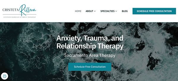
- Cristeta Rillera, LMFT: Its website provides a warm and informative platform for individuals seeking relational and trauma therapy services in California. The website’s design exudes professionalism and cleanliness, emphasizing the creation of a secure and welcoming space for potential clients. Its soothing color palette and the inclusion of high-quality images contribute to an overall sense of professionalism and warmth. The website is rich in content, offering essential details about its services, specializations, and contact information. The information architecture is logical, making it easy for users to find what they need. Additionally, strategically positioned throughout the site is a compelling “Schedule Free Consultation” call-to-action, expertly guiding users along the conversion path.
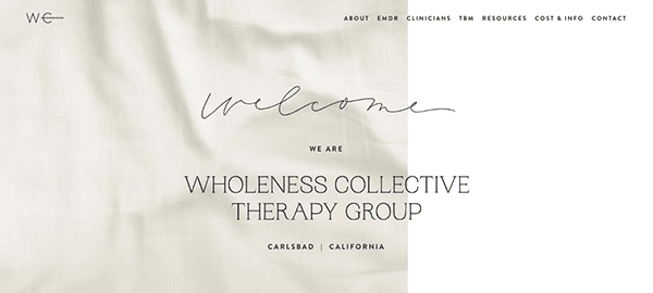
- Wholeness Collective Therapy Group: The website employs a clean and minimalist design, complemented by neutral colors and subtle animations, creating a calming atmosphere, which is essential for a therapy service provider. Intuitive navigation is evident with well-organized content, providing visitors with the essential information they need smoothly and efficiently. It offers a range of psychotherapy services, both virtually and in-person, specializing in various areas like trauma, co-dependency, grief, depression, anxiety, parenting, and relationship challenges. Including a contact form at the bottom of the page is a brilliant idea, allowing potential clients to reach out quickly and increasing conversion chances.
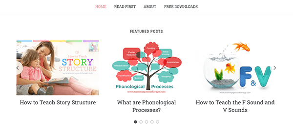
- Mommy Speech Therapy: Mommy Speech Therapy is a resourceful website focusing on speech and language development. It provides an array of insightful articles and valuable resources designed to assist parents and caregivers in this developmental journey. The website’s design is intuitively laid out, featuring a welcoming color palette that avoids sensory overload. The website is easy to navigate with a clear focus on content. Users can effortlessly locate relevant topics through the well-curated categories and archives. Additionally, the site thoughtfully highlights featured and recent articles, further simplifying the search for pertinent information.
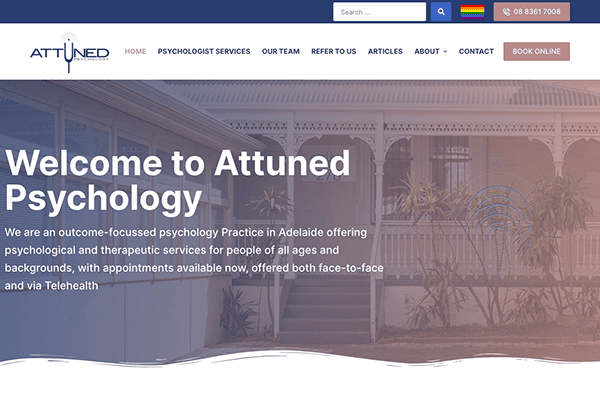
- Attuned Psychology: The website design is characterized by its pristine and professional aesthetics, featuring a calming color scheme that aligns well with the healthcare focus. Navigation is user-friendly, with clearly labeled sections and multiple contact options, including an online booking system. The content is meticulously organized and easily accessible, simplifying intricate psychological subjects for a broad audience. Beyond serving as an informative hub, the website significantly emphasizes its personalized approach to consultations, considering each client’s age and unique requirements. This commitment to tailoring services is a compelling feature, effectively showcased throughout the site.
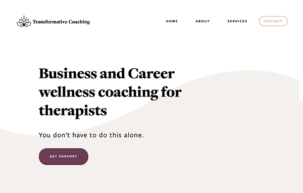
- Transformative Coaching: The website specializes in offering services to help sensitive therapists avoid burnout. Its design is simple and inviting, catering specifically to the needs of its intended audience. With easy-to-navigate sections like “Home,” “About,” “Services,” and “Contact,” the site ensures that users can effortlessly locate the information they seek. A complimentary consultation is available, highlighting the site’s commitment to client well-being. The content is thoughtfully organized and directly addresses the unique challenges faced by sensitive therapists, further enhanced by authentic testimonials. The soothing color palette aligns well with the site’s wellness and stress reduction focus.
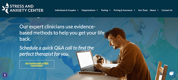
- Stress and Anxiety Center: Its clean, modern layout and calming color scheme create a serene atmosphere, aligning well with its focus on mental well-being. Navigation is straightforward, featuring clearly labeled sections and an online booking system for free consultations, emphasizing the site’s client-centric approach. Content is meticulously arranged to cater to the specific challenges and needs of individuals seeking stress and anxiety therapy. This includes comprehensive information on the various therapeutic services, profiles of the clinical team, and authentic testimonials for enhanced trustworthiness. A FAQ section further enriches the site by addressing frequent questions about insurance and treatment expenses, making it a one-stop resource for prospective clients.
As we’ve delved into, the architecture and user interface of a website for therapists is instrumental in forging a robust digital footprint and magnetizing the ideal clients. The highlighted exemplars epitomize the zenith of design innovation fused with technical mastery. These aren’t merely visually appealing sites; they deliver a user-centric experience harmonized with therapeutic services’ confidential and sensitive realm.
Attaining this caliber of digital presence necessitates a nuanced grasp of both the art of web design and the specialized requisites of the mental health field. The objective transcends mere visual allure; it encompasses creating a fortified, user-friendly, and inviting digital space that mirrors the ambiance of your physical practice. From compliance with healthcare regulations like HIPAA to curating valuable resource hubs for visitors, each component warrants scrupulous planning and flawless execution.
For those aiming to ascend their practice to new heights via a website that encapsulates these multifaceted attributes, CyberOptik stands ready to assist. Leveraging our proficiency in sculpting industry-defining digital platforms, we can equip you with a site that is not only aesthetically captivating but also tailored to meet the rigorous standards of the mental health profession. Reach out to CyberOptik for a free consultation regarding your therapist website today.

