In the competitive legal landscape, having an expertly designed, robust website is a non-negotiable asset for any law firm. It solidifies your firm’s credibility, acts as a platform for engaging potential clients, and promotes the depth and breadth of your legal services.
A standout law firm website highlights all lawyers within the firm, allows visitors to easily search attorneys based on their practice area, and provides readily accessible details on their credentials. At CyberOptik, we specialize in developing such websites, merging visual appeal with intuitive functionality to create an impactful online presence for your law firm.
As you plan your website design or redesign, examining industry leaders can provide invaluable insights and inspiration. In this post, we’ve selected some of the best law firm websites that excel in showcasing their attorneys, facilitating user engagement, and presenting their practice areas clearly.
Examples of the Best Law Firm Website Designs
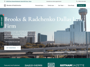
- Brooks & Radchenko: Brooks and Radchenko Law is a website for a professional law firm that emanates professionalism and experience. The clean and modern layout and the usage of excellent visuals create an appealing and professional impression. The text is simple and concise, providing vital information about the firm’s practice areas while enabling visitors to understand how its Group can assist them. Client testimonials are further displayed on the website, highlighting the firm’s track record of achievement and client satisfaction. Moreover, its website successfully presents its services and instills confidence in potential clients seeking legal assistance.
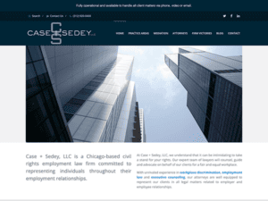
- Case & Sedey: Their website is a well-crafted platform that effectively presents the firm’s expertise and commitment to employee rights. The website’s crisp and modern design quickly draws attention and represents the firm’s professionalism. The navigation is simple, allowing visitors to quickly learn about the firm’s practice areas, attorneys, and actual case results. One notable feature is the comprehensive resources section, which provides a wealth of information on various employment-related topics, empowering individuals with knowledge about their rights.
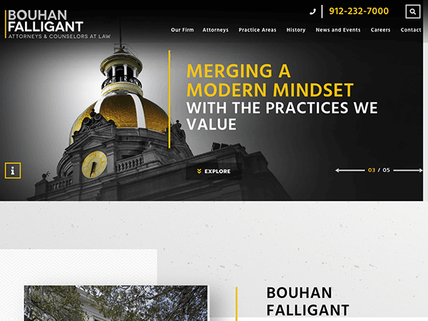
- Bouhan Falligant: The online presence of its website oozes with professionalism and knowledge of its law firm through the ages. The sleek and modern website style conveys an immediate feeling of professionalism and expertise. The homepage has a visually appealing design with fascinating pictures and concise descriptions of their practice areas, emphasizing the firm’s broad range of legal services. The website notably features an enthralling timeline highlighting the firm’s rich history and provides thorough information about the team’s vast skills, further reinforcing its reputation for delivering exceptional legal services.
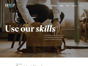
- BD & P: The website is well-designed, professional, and aesthetically pleasing, reflecting the firm’s expertise and commitment to client service. The navy blue and white color palette conveys sophistication and trustworthiness. The site highlights the firm’s primary practice areas and expertise through straightforward, attractive content. One notable feature of the website is the comprehensive attorney directory allowing users to learn more about the attorneys and quickly contact them for potential representation. Thus, their website effectively showcases the firm’s expertise, professionalism, and commitment to serving its clients and is a valuable resource for individuals and businesses seeking legal services.
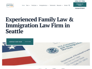
- Zafiro Law: With a striking hero image and a simple tagline, ” Shaping Your Tomorrow, Together,” emphasizing the firm’s focus on immigration and family law, the website homepage immediately grabs visitors’ attention. The color choice is clean and professional, exuding trust and dependability. The site’s navigation is simple, with a well-organized menu that lets users quickly learn about the firm’s services, attorney profiles, testimonials, resources, and contact. The content is informative and well-written, summarizing the firm’s practice areas and emphasizing the firm’s commitment to assisting clients in navigating complicated legal issues.
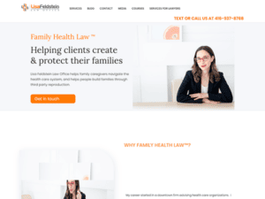
- Family Health Law: On their homepage, visitors will swiftly draw attention with its clear and concise introduction of the firm’s areas of competence and an engaging tagline emphasizing its commitment to assisting families in navigating legal problems. Using relatable images, such as families and medical professionals, offers an individual touch that is appealing to the target audience. The presence of relevant articles and information about health and family law is a standout feature of the website. These materials give individuals facing legal challenges in these areas valuable insights and guidance, establishing the firm as a competent and trustworthy authority.
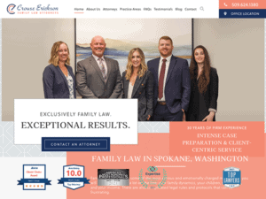
- Crouse Erickson Family Law: Crouse Law Group’s website offers a comprehensive and informative platform for individuals seeking family law services. Its clean yet professional website layout instills and greets visitors with a sense of credibility and trust. The clear and concise content overview of the firm’s law practice and expertise for 30 years brings confidence in its capabilities of rendering quality services. The website also provides detailed information about the firm’s approach to family law cases, highlighting their experience, knowledge, and dedication to achieving favorable client outcomes.
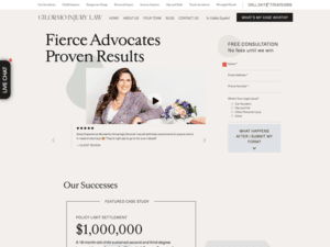
- Gilormo Injury Law: The website’s design is visually appealing, with a clean layout and a modern color scheme that exudes competence. Their website is a comprehensive and user-friendly platform for anyone seeking representation in personal injury circumstances. The firm handles numerous individual injury cases, such as vehicle accidents, child injuries, slip and fall accidents, and wrongful death, which is one of its notable features. This area assists visitors in rapidly determining whether the company can help them with their legal needs.
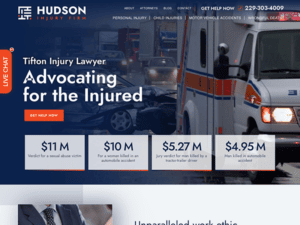
- Hudson Injury Firm: The website’s design is visually appealing, with a clean layout and a modern color scheme expressing professionalism and elegance throughout the site. The site quickly catches the viewer’s attention with a striking hero image highlighting the firm’s commitment to assisting clients with personal injury cases and a user-friendly interface that allows a seamless browsing experience for viewers. The usage of high-quality imagery throughout the site improves aesthetic appeal and aids in creating a connection with the audience. Including client testimonials and case results, which generate trust and highlight the firm’s track record of success, is a standout aspect of the website. This social proof gives prospective clients credibility and reassurance of its quality services.
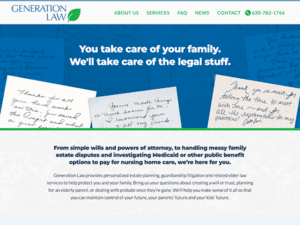
- General Law: Generation Law specializes in estate planning, guardianship litigation, and elder law. The website establishes professionalism and trust with its modern, welcoming design, clean layout, cool color scheme, and engaging high-quality imagery imposing positivity on first-time viewers. An accessible navigation menu is at the top, making visitors browse and navigate to different website sections easily. Its website stuns on its client-focused approach and highly emphasizes its commitment and compassionate services with care and understanding. Their website highlights feature the latest news, providing valuable information and educational resources related to estate planning and elder law. This feature demonstrates their commitment to keeping clients informed and empowered.
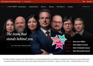
- Stracci Law Group: The website perfectly impresses and reflects the professionalism and expertise of the firm in the field of injury and criminal defense with its stunning hero page bringing its brand name on top with their rewards and honors to be voted as the Number 1 Injury Law Firm and Criminal Defense Law Firm throughout Northwest Indiana. The thoughtful organization of its content on the homepage communicates the firm’s mission and highlights its commitment to client success. The inclusion of testimonials adds social proof and instills confidence in potential clients. Thus, the website offers an outstanding user experience and represents the firm’s legal services, thanks to its modern design components, straightforward navigation, and significant resources.
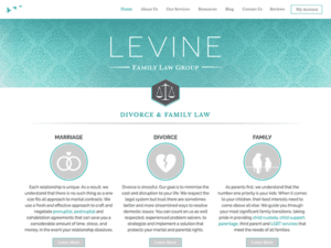
- Levine Family Law Group: The homepage immediately emphasizes the firm’s specialty in divorce and family law through captivating imagery and concise text. Potential clients’ attention is efficiently captured by using visually appealing graphics and well-crafted headlines, which create a sense of trust and understanding. One noteworthy feature of the website is the extensive practice areas section dedicated to divorce and family law matters. It covers various topics, including divorce, child custody, child support, spousal support, and more. Each practice area is complemented by informative explanations, allowing visitors to understand better the firm’s expertise and the unique legal services they provide.
- Hudson Injury Firm: The website of Hudson Injury Firm is a well-executed platform that effectively communicates the firm’s expertise in personal injury law. The website has an aesthetically clean and professional design, emphasizing delivering relevant information and help to potential clients. High-quality graphics, clear headlines, and strategic placement of call-to-action buttons grab users’ attention and encourage them to explore more. The website also features a dedicated page showcasing the firm’s notable case results and settlements, highlighting the firm’s successful track record. It instills confidence in potential clients, demonstrating their ability to achieve favorable outcomes.
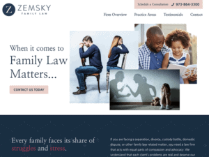
- Zemsky Family Law: The website displays professionalism, experience, and a solid commitment to serving clients in family law. The warm colors and compelling images create a welcoming and supportive environment. The website successfully highlights the firm’s skilled attorneys, emphasizing their qualifications, distinctions, and commitment to client advocacy. This personal touch assists prospective clients in developing trust and confidence in the firm’s capacity to handle their family law problems with care and professionalism. Contact information is prominently displayed across the site, making it simple for visitors to request a consultation. Including a contact form streamlines the process of making contact and provides a handy way for individuals to provide preliminary information about their situation.
- McLeod Law: A modern color scheme and a clean and well-organized layout add to a great user experience that emanates professionalism and trustworthiness to McLeod’s Law site. The website highlights the firm’s extensive practice areas, encompassing various legal services to fulfill their clients’ diverse needs. Client testimonials prominently displayed boost credibility and strengthen the firm’s reputation for offering outstanding legal services. Their website serves as an effective tool for individuals and businesses seeking comprehensive legal services and reliable legal representation.
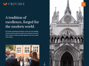
- Crucible: Crucible is a testament to a minimalist, cool-colored law firm and sophisticated website design that reassures readers while communicating the law office’s brand and professionalism. A fascinating and immersive experience is created using high-quality graphics, stylish typography, and subtle animations. Crucible Law’s practice areas are effectively highlighted on the website, demonstrating their wide variety of legal services. The navigation is simple, allowing visitors to navigate different sites and obtain the required information.
- Jlongting Law: The homepage features a clean, modern design with a cohesive color scheme that creates a sense of trust and professionalism. It successfully displays its law office as a dependable and professional legal practice, delivering vital insights and a solid envision of the firm’s skills to potential clients. It has a robust online presence due to its clean and modern design, easy navigation, and comprehensive content. The website thoroughly describes the firm’s practice areas, attorney profiles, and client testimonials, building trust in the firm’s expertise and track record.
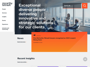
- McCarthy Tetrault: McCarthy Tétrault LLP’s website is a polished and professional platform representing the firm’s status as a top Canadian law firm. The site emanates credibility and knowledge through its elegant and modern design. The homepage and vertical menu have a simple design highlighting the firm’s primary practice areas and industry sectors, making it simple for users to explore and obtain relevant information. Including news and insights keeps the content fresh and reflects their dedication to remaining current with industry trends. The site is also mobile-friendly, delivering a consistent browsing experience across platforms.
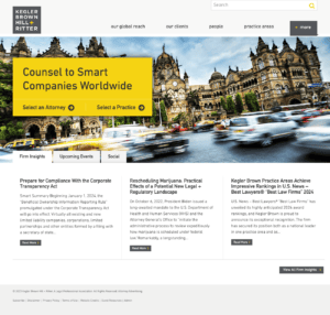
- Kegler, Brown, Hill & Ritter: Kegler Brown Hill + Ritter’s website is a well-designed platform that blends modern aesthetics with user-friendly functionality. Their homepage greets visitors with a clean and visually appealing style, including a dynamic image slider emphasizing the firm’s primary competence areas. The site’s color design is attractive and professional, instilling confidence and trustworthiness. One significant website component is the “Our Global Reach” page, which effectively exhibits the firm’s global capabilities and knowledge, offering vital information to clients and prospects seeking international legal services.
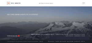
- Reese Marketos LLP: Their website homepage quickly draws attention with its clean and modern design, featuring a stunning video background and a simple navigation menu. Using a muted color palette offers a sophisticated and professional appearance, which keeps potential clients interested. The website is well-organized, with easy-to-find sections for services, attorney profiles, and contact information. The content is straightforward and comprehensive, providing an overview of the firm’s competence areas and emphasizing significant client benefits. The inclusion of the firm’s awards and recognition strengthens the firm’s reputation while adding credibility.
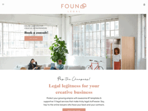
- Foundd Legal: Foundd Legal’s website has a modern, elegant style that immediately grabs attention. The website uses complementary colors, high-quality photography, and white space outcomes creating a visually engaging experience that emits a cozy and relaxing ambiance. The content is well-organized, including detailed information about the firm’s services, team, and areas of competence. Client testimonials and case studies increase credibility and reflect the firm’s track record of accomplishment. The website also includes interactive components like a chatbot for fast support and client queries.
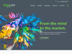
- Aeon Law: Aeon Law’s website is a professional and up-to-date platform for intellectual property and technology law services. The design is simple, clean, and user-friendly, with a vibrant color scheme, branding components, and simple navigation. The homepage has brief yet informative sections introducing visitors to the firm’s expertise and offerings. The website effectively showcases the firm’s core areas, such as patents, trademarks, and copyrights, while highlighting client testimonials and noteworthy case studies. A dedicated “Resources” section offers helpful articles and legal insights, demonstrating the firm’s commitment to providing valuable information to its audience.
These websites set the benchmark in law firm web design. They skillfully integrate expansive attorney bios, a robust blog for SEO, and detailed practice areas, ensuring a compelling and user-friendly experience. They make it simple for potential clients to find the information they’re looking for and understand the full range of services the firm offers.
Your law firm deserves a website that ticks all the right boxes: professional design, easy navigation, clear calls-to-action, a comprehensive blog for long-term SEO content, and extensive attorney bios.
At CyberOptik, we specialize in creating high-quality, user-friendly websites, tailored to meet the unique needs of the best law firms. We acknowledge the importance of making your firm’s attorneys easily searchable, highlighting their credentials, and integrating a robust blog for SEO — these are all vital components we incorporate into our designs.
We’re here to provide you with a world-class website that not only looks professional but also works effectively, helping your firm attract and retain clients. By merging aesthetic appeal with practical functionality, we’ll help you build a site that tells your firm’s story, connects with your audience, and demonstrates your legal prowess.
Get in touch with CyberOptik today. Let’s discuss how we can collaborate to make your online presence as impactful as your firm’s legal services. We’re eager to help your law firm thrive in the digital realm and make a powerful impact in the legal industry.

