The construction industry is evolving rapidly, and a solid online presence is crucial. These websites are more than just digital brochures; they are platforms that showcase the company’s capabilities, portfolio, and values. A well-designed website can be a game-changer in this competitive industry, from providing construction website examples to offering detailed insights into services.
Building construction websites serve as the first point of contact for many potential clients, investors, and partners. They offer an opportunity to make a strong first impression, reflecting the company’s commitment to quality, innovation, and excellence. Whether it’s residential, commercial, or industrial construction, a well-crafted website can significantly enhance visibility and credibility.
The construction industry is marked by complexity and precision. Building construction websites must mirror these attributes, offering straightforward navigation, detailed service descriptions, and compelling construction website examples. A website that resonates with the industry’s core values can foster trust and drive engagement, leading to more business opportunities and growth.
Examples of the Best Construction Website Designs
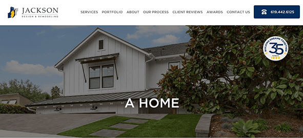
- Jackson Design & Remodeling: Jackson Design & Remodeling’s website exhibits a well-thought-out design that aligns with industry standards and the company’s branding. The website adopts a color palette that exudes professionalism, harmonizing seamlessly with the industry’s aesthetic standards. Using neutral tones with occasional pops of color creates a visually appealing experience without overwhelming the user. Consistency in font choices enhances readability and maintains a unified visual identity. Noteworthy strengths lie in its dedication to accessibility and the deliberate placement of call-to-action buttons. Moreover, the website successfully communicates the company’s proficiency and services, establishing itself as an invaluable resource for engaging prospective clients.
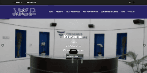
- Midwest Construction Partners: Midwest Construction Partners’ website boasts a sleek, sophisticated design that matches the company’s industry seamlessly. The visual aesthetics are captivating, and the user journey is intuitive and efficient. The seamless navigation features a well-defined menu structure that guides users effortlessly to pertinent details about the company, services, projects, clients, and contact details. Dropdown menus further enhance user convenience. Content is thoughtfully structured, neatly categorizing various company offering dimensions. As a result, the website effectively showcases Midwest Construction Partners’ prowess in commercial real estate construction and project management, making it a pivotal asset for engaging potential clients.
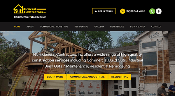
- NCH General Contractors: The website employs an elegant and polished color palette, primarily featuring hues of yellow, black, and white. This selection harmonizes seamlessly with the construction field’s visual standards and imparts an aura of confidence and dependability. Branding elements and the logo blend seamlessly into the design, representing the company’s distinct identity. A prominent call-to-action prompts visitors to initiate discussions about projects strategically positioned to foster user interaction. The website’s design effectively communicates its industry offerings, particularly its commercial and industrial construction proficiency, enticing potential clients to explore its services further.
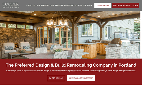
- COOPER Design Build: COOPER Design Build’s website showcases an elegant and polished design that adeptly communicates the company’s proficiency in home remodeling. A sophisticated color palette of red, white, and gray, complemented by top-notch images of diverse remodeling ventures, evokes professionalism harmonizing with the home remodeling sector. The navigation is user-friendly, featuring a well-organized menu leading visitors to details about services, portfolios, testimonials, and contact information. Integrating client testimonials and the company’s accolades provides compelling social validation, reinforcing credibility and effectively captivating potential clients seeking its services.
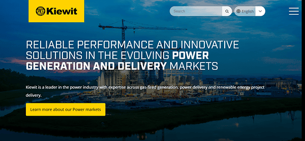
- Kiewit: Its website has a sleek and professional design representing the company’s position as a construction and engineering industry leader. A bold yet polished color scheme, high-quality photos, and compelling videos effectively highlight the company’s large-scale projects and experience. The sticky menu bar allows visitors to navigate easily between services, careers, and corporate information. Strong call-to-action buttons and well-structured content lead users smoothly around the site, increasing user engagement. Subtle animations and interactive components offer a dynamic touch to the browsing experience, increasing engagement.

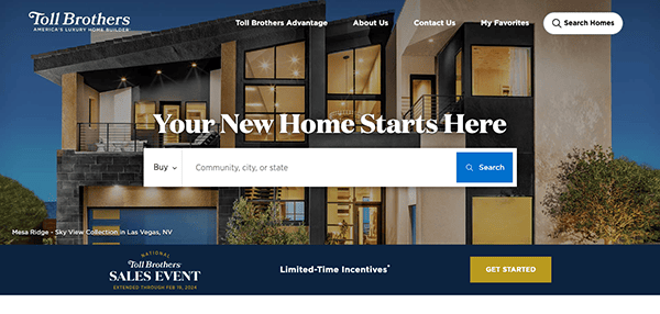
- Toll Brothers: Toll Brothers’ website acts as an entrance to luxurious new construction homes, presenting a diverse array of choices while underlining their dedication to excellence, variety, and customer contentment. The platform prominently highlights the customization avenues, enabling purchasers to exhibit their individual styles. With its refined and sophisticated design, the website captures users’ instant interest through the use of high-quality background images. It effectively operates as a gateway to explore its offerings, gain insights into its distinctive architectural approach, and discover the remarkable customer journey it offers.
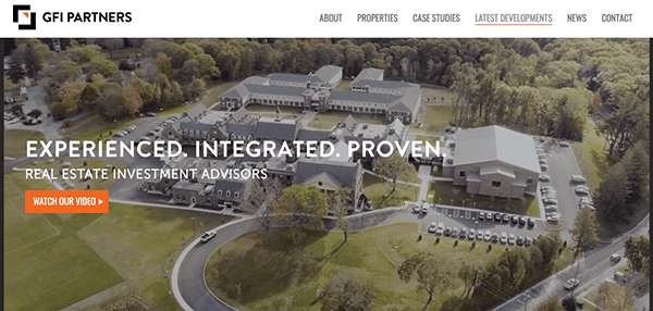
- GFI Partners: GFI Partners’ website functions as a dynamic platform to exhibit their extensive real estate investment prowess cultivated for 25 years. This highlights their profound experience, innovative mindset, unwavering dedication to excellence. The website boasts a sophisticated and captivating design, featuring intuitive navigation and in-depth examinations of properties and case studies. The website employs harmonious color combinations, premium photography, and strategic white spaces. The website crafts a visually immersive journey that radiates professionalism and exceptional achievements across projects and innovations.
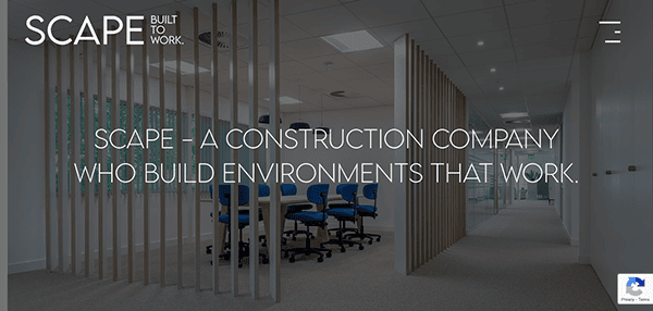
- Scape Construct: The website welcomes visitors with a striking, high-resolution image that promptly establishes a polished and welcoming ambiance. This feature is complemented by a harmonious blend of images and text, enriched by subtle hover effects, resulting in an aesthetically gratifying encounter. Scape Construct is a leading specialist in commercial fit-outs, refurbishments, and furniture contracting, spanning diverse sectors like office, education, healthcare, retail, leisure, and industry. Its mission is to deliver building projects on time, within budget, and to the highest quality. This resounding commitment and dedication resonate with potential clients, as showcased adeptly on their website, underlining their expertise and excellence.
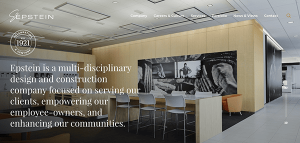
- Epstein Global: Epstein Global is a multi-disciplinary design and construction company focusing on serving clients, empowering employee owners, and enhancing communities. From the outset, the website exudes professionalism. The sophisticated design and muted color palette confer a sense of authority and expertise. The layout and navigation are well-organized, contributing to an inviting user experience and assisting visitors in swiftly locating pertinent information. The website’s provision of detailed service and project information, coupled with its steadfast commitment to remaining relevant in the industry, constructs a compelling platform for potential clients, partners, and job seekers.
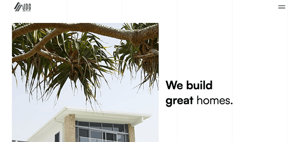
- JDG Constructions: The website utilizes an intuitive navigation system and a clean, minimalistic design, fostering a professional and focused atmosphere. The imagery selected, combined with a harmonious fusion of neutral tones and vibrant accents, delivers an aesthetically pleasing encounter that resonates with the construction sector’s aesthetics. The presentation of projects, including images and descriptions, provides potential clients with insights into the quality and style of their work. The website’s value is amplified by articles that delve into bathroom trends, essential aspects of kitchen renovation, and a spectrum of exterior cladding options. This resourcefulness extends a valuable touchpoint, offering inspiration and pragmatic guidance to visitors contemplating renovation endeavors.
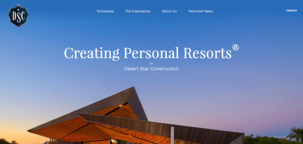
- Desert Star Construction: The Desert Star Construction website offers a sophisticated and immersive user experience that adeptly highlights their upscale construction services. The site’s color scheme resonates with the company’s luxurious and professional identity. Incorporating neutral tones and strategic accent colors yields an elegant and visually captivating atmosphere. Navigating the website proves intuitive and user-centric. The arrangement is well-structured, with clear divisions for services, projects, news, and contact details. Hence, the website appears meticulously designed, providing a visually pleasing and informative platform for prospective clients and visitors.
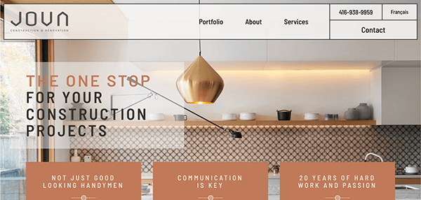
- JOVA Construction: JOVA Construction’s website design reflects a professional and customer-oriented image, emphasizing their custom building and renovation expertise. The website’s visual design employs a clean and professional layout, utilizing neutral tones of color, modern typography, and high-quality images that create an exciting and appealing experience for viewers. The navigation is user-friendly, with transparent sections for portfolio, about, services, and contact information. Intuitive menus and links guide users to explore the company’s offerings and projects. Including client testimonials adds credibility and offers various perspectives on the company’s professionalism, quality, and customer service.
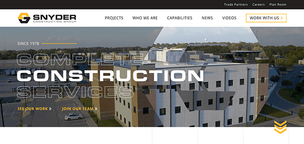
- Snyder Construction Group: The website for Snyder Construction Group offers a sleek and professional platform that effectively showcases their leadership within the commercial construction industry for more than 40 years. Visitors arriving on their homepage are welcomed by a refined and contemporary design that exudes professionalism. The strategic use of high-quality images and a harmonious color palette contributes to an inviting and aesthetically pleasing encounter. The layout is organized, with distinct sections for services, projects, philosophy, and contact information. The site highlights their commitments to high quality, on-budget, on-schedule, safety, and relationship focus, valuable resources for potential clients to get involved in their capabilities.
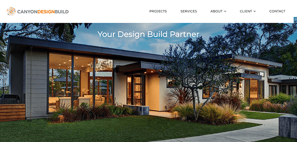
- Canyon Design Build: Canyon Design Build’s website design reflects a professional and customer-oriented image, emphasizing its expertise in design and construction. The website’s clean and professional use of color scheme reflects elegance that aligns with the construction and design industry. Including high-resolution images portraying diverse projects underscores Canyon Design Build’s unwavering commitment to creativity, excellence, and ethical standards. This visual facet elevates aesthetics and serves as a testament to their capabilities. Its user-friendly navigation system, well-organized content layout, and information presentation align with the company’s focus on quality, innovation, and client satisfaction. Combining these elements crafts an online presence that resonates with professionalism and underscores Canyon Design Build’s prowess in their field.
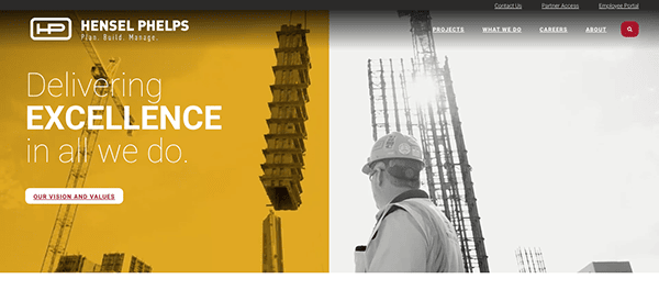
- Hensel Phelps: The website boasts a professional and pristine design centered around visual components that elegantly display the firm’s projects and services. The navigation is intuitive, and the content is meticulously arranged, ensuring visitors can effortlessly access the information they seek. The homepage prominently features three pivotal domains: Plan, Build, and Manage, encapsulating the company’s construction philosophy. These areas underscore their commitment to ingenious planning, conscientious construction, and confident management. The website offers a holistic understanding of its offerings by incorporating case studies, timely news highlights, and in-depth insights into its construction methodology.
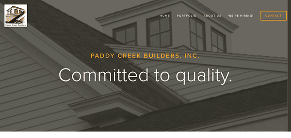
- Paddy Creek Builders: The website’s design is straightforward and user-friendly. The main navigation includes sections for the portfolio, about us, hiring information, and contact details. The portfolio is neatly divided into sections showcasing renovations, restorations, and new constructions, enabling visitors to delve into particular projects of interest. The website delivers a transparent understanding of its offerings, portfolio, and endorsements from satisfied clients. The customer testimonials section presents authentic customer feedback, highlighting the company’s honesty, artistry, precision, and adept communication.
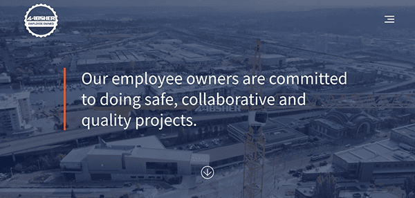
- Absher Construction Company: The website’s design exemplifies both simplicity and functionality. The utilization of a clean color palette and a well-structured layout adds to the creation of an aesthetically pleasing interface. The main navigation includes sections for featured projects, portfolios, careers, subcontractor opportunities, awards, team introduction, culture, history, and contact information. This direct approach ensures seamless access to crucial information without overwhelming the user. The website’s sleek and efficient design guarantees a smooth navigation journey, guiding visitors through the company’s range of services, accomplishments, and fundamental principles.
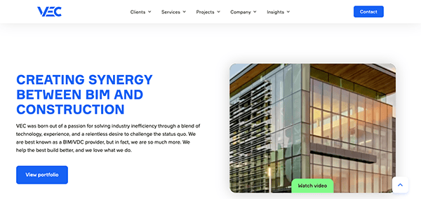
- VEC: Upon arrival, visitors are welcomed by an elegant and polished design that emanates an aura of trustworthiness and expertise. The primary navigation encompasses categories like a company overview, services, insights, projects, and contact information. Incorporating videos and visually engaging elements contributes significantly to the site’s allure. VEC’s website is a proficient platform highlighting its services and construction technology prowess. The website’s distinct navigational structure, detailed service explanations, and unwavering dedication to sustainability are commendable.
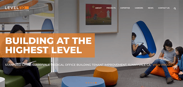
- Level 10 Construction: The website’s design is a symphony of elegance and modernity. From the moment visitors land on the homepage, they are treated to a visual experience that exudes professionalism and creativity. The harmonious blend of imagery, typography, and white space creates an aesthetic that reflects the high standards of Level 10’s work. The engaging project display, informative industry insights, and the emphasis on openness with career details and contact information collectively enhance the user journey. Level 10’s website successfully establishes a benchmark for online platforms within the construction industry.
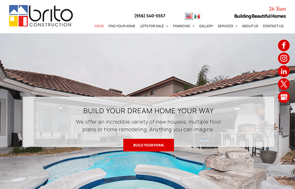
- Brito Construction: The website welcomes visitors with a clean and functional design that conveys a sense of professionalism and reliability. The color palette is understated, allowing the content to take center stage. Although the design is straightforward, a touch more visual flair or imagery could elevate the overall visual impact. The main navigation includes sections for finding homes, lots for sale, financing, gallery, services, remodeling projects, about us, and contact information. As the website employs an uncomplicated design, user-friendly navigation, and informative content, the website offers visitors a comprehensive understanding of Brito Construction’s competencies and unwavering commitment to excellence.
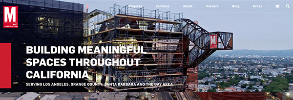
- Matt Construction: The website’s design is professional and visually appealing, clearly focusing on their projects, awards, and construction philosophy. The website design captures the essence of the construction industry while maintaining a modern and inviting aesthetic. Incorporating sliders, images, and videos enhances the website’s visual allure, contributing to a captivating experience. Navigating the site is seamless, thanks to straightforward navigation and a structured presentation of information. The website highlights Matt Construction’s proficiency and unwavering dedication to delivering outstanding projects by skillfully blending design, content, and usability.
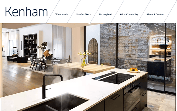
- Ken Ham Building: Kenham Building’s website design skillfully channels focus toward diverse projects, embodying their dedication to top-tier craftsmanship. The harmonious blend of vivid project images, in-depth case studies, and articulate descriptions craft a visually stimulating exhibition of their work. The chosen color palette and typography exude a sophisticated aesthetic that resonates with the construction industry’s professional benchmarks. With its uncluttered layout, intuitive navigation, and compelling content, the website effectively communicates its mastery, inviting potential clients and partners to explore and engage with its services.
A constant pursuit of growth, innovation, and quality marks the construction industry. The best construction website examples reflect these attributes, offering visitors an immersive experience beyond mere visuals. They provide detailed insights into the company’s projects, methodologies, and values, connecting with the audience on a deeper level.
In a world where online engagement is vital, construction website examples that stand out offer a seamless blend of design, functionality, and content. They showcase the company’s technical capabilities and build trust and credibility. A skillfully designed website can be a powerful tool in lead generation, client retention, and brand building in the construction industry.
Investing in building construction websites that resonate with the industry’s dynamic nature is not just a trend but a necessity. Reach out to CyberOptik for a free consultation about your construction website. With our expertise in web design and deep understanding of the construction industry, we can create a digital platform that truly represents your brand and drives your business forward.
Contact CyberOptik today for a free consultation about your construction website. Let us help you build a digital presence that mirrors your construction projects’ quality, innovation, and excellence. Your success is our mission, and we’re committed to crafting a website that distinguishes you within the industry.

