In an industry as competitive as tree services, having a top-notch website is not just a luxury—it’s a necessity. Your website acts as your business’s online facade, offering a first impression that can either make or break a potential customer’s decision to engage with your services. In today’s digital age, consumers increasingly turn to the internet to find and vet tree service providers. A well-designed, user-friendly website can significantly boost your credibility, showcase your expertise, and ultimately drive more business your way.
The importance of a great website in the tree service industry extends beyond mere aesthetics. It’s about functionality, user experience, and conversion optimization. Your website should look good and make it easy for visitors to understand the range of services you offer, from tree removal and trimming to stump grinding and emergency services. High-quality images, compelling copy, and clear calls to action are essential elements that contribute to a website’s effectiveness in converting visitors into paying customers.
Moreover, a well-optimized website is crucial for search engine visibility. Given that many people start their search for tree services online, your website needs to score highly on search engines for keywords relevant to your business. This is where SEO-friendly design and content come into play. By incorporating industry-specific keywords like “tree service websites,” you can improve your site’s SEO, making it easier for potential customers to find you.
Examples of the Best Tree Service Website Designs
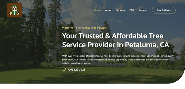
- Fernandez Tree Service: The website boasts a minimalist design that harmonizes with the corporate brand’s color palette. This simplicity is a strength, enabling users to concentrate on the available content and services. Navigation is straightforward and user-centric, elevating the overall user experience. Content is presented in a concise manner, articulating the variety of services on offer effectively. Subtle yet impactful calls-to-action (CTAs) are integrated into the site, guiding users to engage with the company without being intrusive. These CTAs are strategically positioned to complement the design and enhance user interaction.
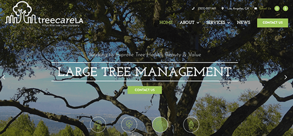
- TreeCareLA: The website’s design is modern and visually appealing, using excellent color contrasts and high-quality images to create a visually stimulating experience. Its streamlined and user-friendly layout facilitates effortless navigation and immediate access to key information. Using original photographs adds a layer of authenticity that resonates well with visitors. The content is well-crafted and informative, providing valuable insights into the company’s services and the tree care industry as a whole. Strategically positioned throughout the site are persuasive calls-to-action that are both lucid and impactful, guiding the user toward meaningful engagement, be it reaching out for a consultation or exploring the services in greater detail.
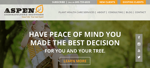
- Aspen Arboriculture: Its website is an exemplary digital platform in the tree care industry, effectively merging design elements, user experience, and informative content. Its design exudes a refined visual appeal, achieved through a harmonious color palette and sharp, high-quality imagery, resulting in a welcoming visual environment. The site’s structure is thoughtfully laid out and user-friendly, facilitating smooth navigation and quick access to essential details. Using genuine, high-resolution photos lends an added layer of trustworthiness that is sure to connect with site visitors. The content is expertly crafted and informative, thoroughly exploring the company’s offerings and the broader tree care industry. The written material is compelling and easily digestible, appealing to a diverse readership ranging from industry professionals to residential homeowners.
- Grizzly Tree Experts: The website’s design exudes sophistication and visual allure, thanks to a meticulously selected color scheme and sharp, high-definition imagery. This results in a visually engaging atmosphere that instantly captures visitors’ attention. The site’s structure is cleverly arranged and user-friendly, facilitating effortless navigation and quick retrieval of essential details. Additionally, the website incorporates understated animations on menu options and calls-to-action, serving as eye-catching elements and intuitive guides for user engagement. Comprehensive data about the range of services offered, from tree removal and pruning to other specialized tree care, is available on the site.
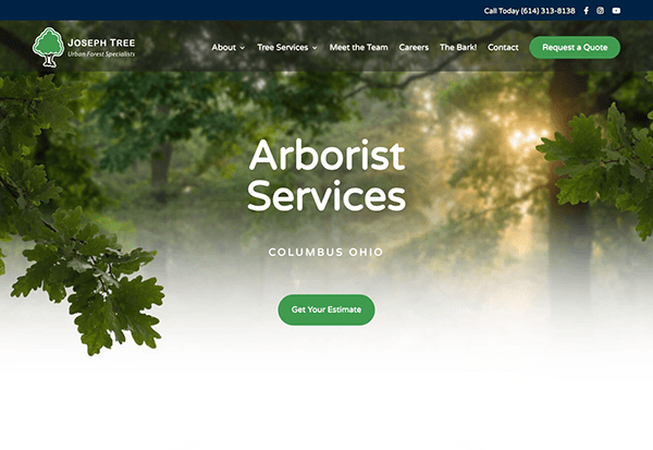
- Joseph Tree: The website’s design is refined and visually engaging, achieved through a carefully chosen color scheme and high-definition images. This results in a visually captivating atmosphere that immediately engages visitors. The site’s navigation is intuitively structured and easy to navigate, guiding users to quickly find the information they’re looking for. The website provides comprehensive and enlightening content, offering an in-depth look at the company’s array of services, from tree removal and pruning to additional specialized tree care solutions. Skillfully designed calls-to-action are strategically placed throughout the site, capturing user focus effectively. These CTAs are lucid persuasive, and adeptly steer users toward meaningful actions, whether scheduling a consultation or delving deeper into the available services.
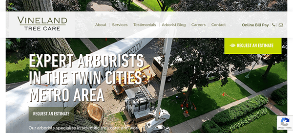
- Vineland Tree Care: The website establishes a benchmark in the tree care sector through its outstanding web design, skillfully integrating innovative design elements, user-focused features, and comprehensive content. Utilizing modern techniques such as parallax scrolling, subtle animations, and a carefully curated color palette and typography, the site delivers a visually captivating and engaging user experience. Its responsive and user-friendly layout, complete with strategically positioned calls-to-action and easy-to-use forms, culminates in a unified and effective digital presence.
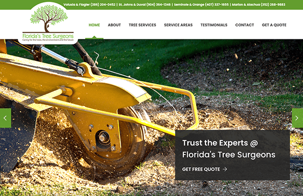
- Florida’s Tree Surgeons: The site masterfully integrates modern design elements like high-quality images, subtle animations, and a well-curated color scheme to create an engaging user experience. Its responsive and intuitive layout uses white space and a clear visual hierarchy that guides the user’s attention to key elements such as the company logo and primary services. The website’s design choices are aesthetically pleasing and functional, contributing to its effectiveness as a digital asset. User Interface components like buttons and forms are designed for maximum usability, and the site maintains a unified look and feel throughout.
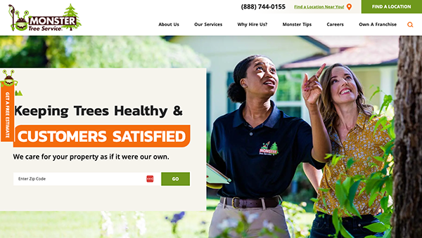
- Monster Tree Service: The website utilizes contemporary design elements that significantly elevate the user’s experience. High-resolution imagery, especially in the hero section, lends the platform a sense of depth and visual allure. Additionally, the site features dynamic components such as slide-in animations and hover effects, most notably on navigation menus and calls-to-action buttons. These features grab the user’s focus and intuitively steer interactions. The sleek and modern typography adds to the website’s polished and professional demeanor.
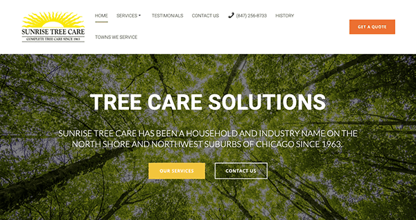
- Sunrise Tree Care: The website greets users with a sleek and welcoming layout, featuring a white backdrop enriched by vibrant color accents that align with tree services’ eco-friendly and natural focus. The chosen color scheme is both calming and industry-appropriate. Crisp, high-quality images of trees, landscapes, and other services offered enhance the site’s visual allure, serving as a testament to the company’s proficiency and work quality. The site boasts an intuitive navigation structure with prominently placed, persuasive call-to-action buttons that facilitate user engagement and potential client conversion. The platform adeptly showcases its services on specialized pages, each accompanied by comprehensive descriptions that clarify the extent of the offerings.
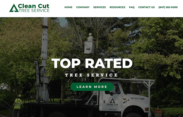
- Clean Cut Tree Service: The site employs a clean layout, simplifying the experience for users to navigate through various sections like “Company,” “Services,” “Resources,” and “FAQ”. Its color palette is tastefully muted yet exudes a professional vibe that harmonizes with the environmental focus of the services provided. High-resolution imagery and videos effectively highlight the company’s expertise, adding a layer of credibility. The content is meticulously curated to align with the services, aiding potential clients in making well-informed choices. Multiple avenues for contact, including phone, email, and a dedicated contact form, are strategically positioned for easy visibility, ensuring that visitors can conveniently initiate inquiries, request quotes, or schedule appointments.
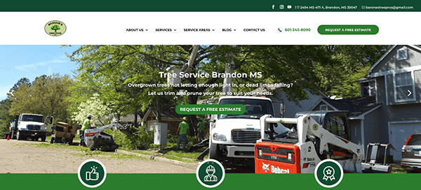
- Barone’s Tree Pros: The site is visually appealing, featuring high-quality images showcasing the company’s services and exuding professionalism and expertise. The color scheme is well-chosen, subtly echoing the outdoor and environmental focus of the business. One of the standout features is the detailed breakdown of services offered, complete with comprehensive descriptions. Beyond being a source of information, the site is designed for user engagement, featuring easily noticeable calls-to-action and transparently displayed contact information for effortless outreach. Additionally, the website goes above and beyond by spotlighting the company’s impressive track record and qualifications, such as over four decades in the industry and the employment of a certified tree surgeon.
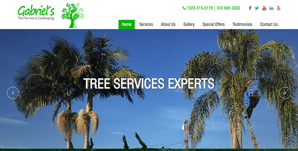
- Gabriel’s Tree Services & Landscaping: The website is a straightforward and functional platform that provides essential information about the company’s services. Its navigation is intuitively laid out, featuring key sections like Home, Services, About Us, Gallery, Special Offers, Testimonials, and Contact Us. Strategic use of whitespace enhances readability, elevating the site’s visual appeal. The site offers a concise yet comprehensive overview of the services, including tree removal, landscaping, and demolition. Including high-resolution images of past projects acts as a compelling visual portfolio, offering a more impactful representation of the company’s skills than text alone could achieve. Additionally, subtle animations enrich the site’s aesthetic without detracting from its content.
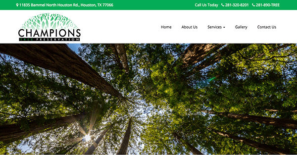
- Champions Tree Preservation: The website is a prime example of effective web design, seamlessly blending functionality, aesthetics, and user experience. Its intuitive navigation menu, consistent earthy color scheme, and strategic use of whitespace contribute to an easily navigable and visually pleasing platform. High-quality images serve as a compelling portfolio, while subtle animations add a touch of sophistication without distracting from the core content. The website goes beyond aesthetics to offer a comprehensive yet concise overview of services like tree preservation, tree removal, and plant healthcare. Strong calls-to-action guide users through the conversion funnel, and including safety measures add an extra layer of trust.
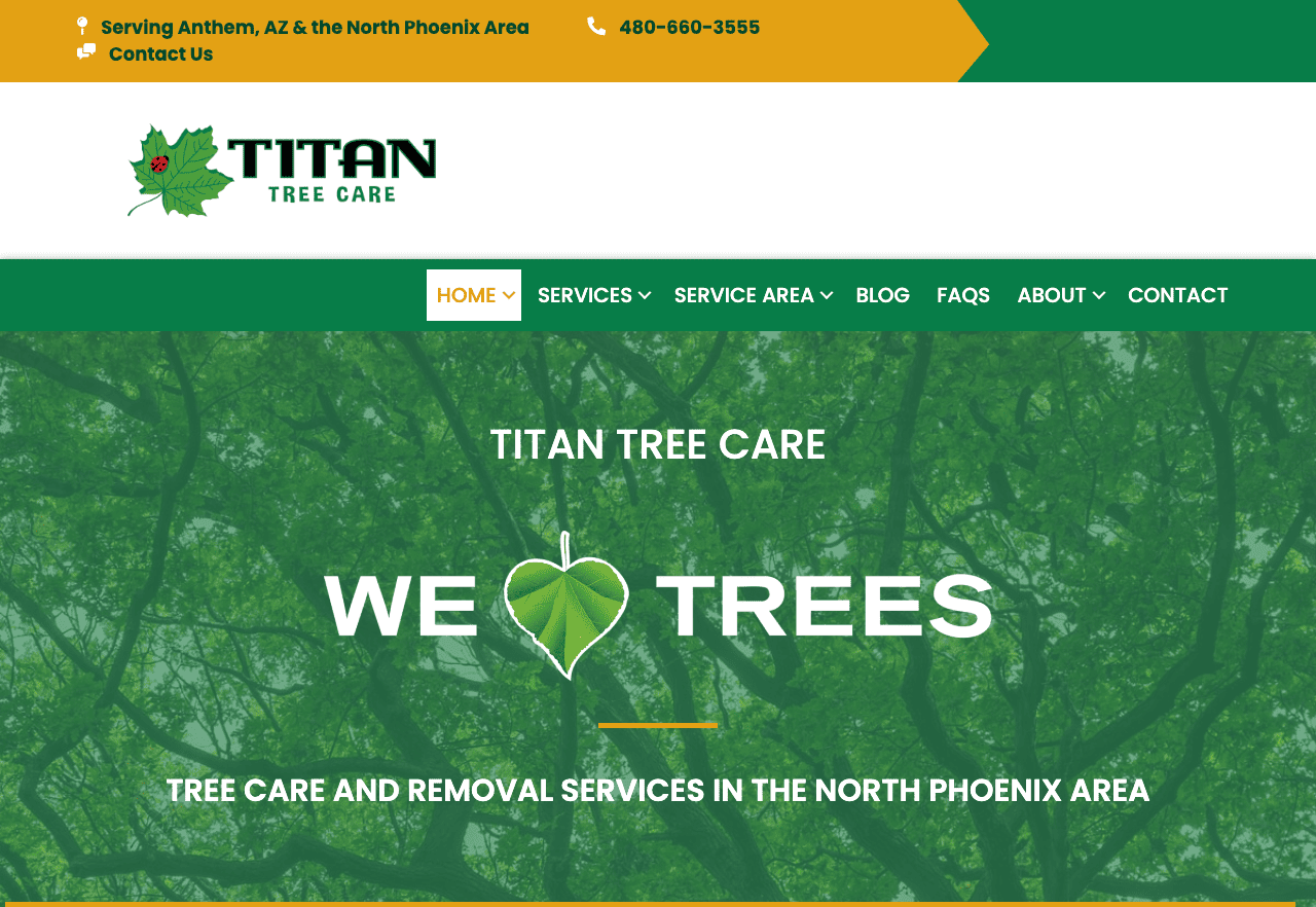
- Titan Tree Care: The site employs a clean, modern, and straightforward layout, making it easy for users to navigate through various services such as tree pruning, stump grinding, insect &disease treatment, tree & shrub planting, and fertilization. The use of earthy tones complements the nature-centric theme of the business, creating a cohesive visual experience. The site also incorporates strong calls-to-action like “Request an Estimate,” guiding users effortlessly through the conversion funnel. Additionally, customer testimonials and Google reviews add a layer of credibility, increasing the likelihood of engagement from prospective clients.
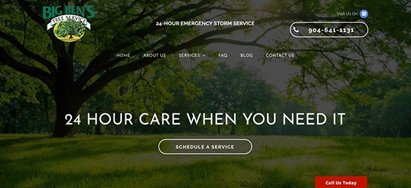
- Big Ben’s Tree Service: The website is a well-crafted digital platform that balances functionality and aesthetics effectively. Its color palette is understated but exudes professionalism, perfectly complementing the company’s nature-centric ethos. A standout feature is the prominent display of the 24-hour emergency contact in the header, a thoughtful design element considering the time-sensitive nature of tree services. Additionally, the site enhances its credibility by featuring a “Before and After” gallery, serving as a compelling visual testament to the quality of their work.
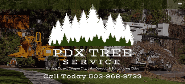
- PDX Tree Service: The site’s layout is highly intuitive, using a sticky header that always keeps the navigation menu visible. The typography is clean and legible, with headings and subheadings that are clearly defined, making it easier for users to skim through the content. In the “Services” segment, premium images function as a visual resume, offering a more dynamic representation of the company’s skill set than mere text. Additionally, the strategic use of whitespace boosts text legibility and contributes to the site’s overall minimalist aesthetic. Conversion-driving elements like “Contact Us” buttons are visually prominent and optimally positioned, enabling a seamless user journey through the conversion process.
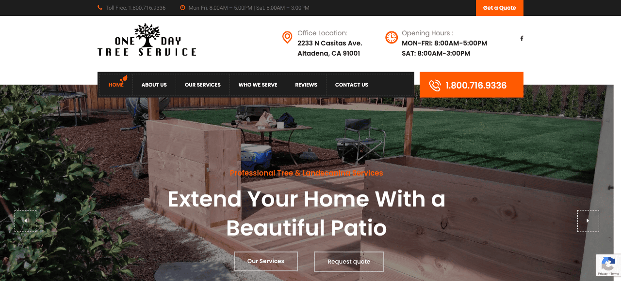
- One-Day Tree Service: The website has an effective web design and layout, striking a harmonious balance between functionality and visual appeal. The website makes excellent use of visual hierarchy. The most essential elements, like the emergency contact number and primary services, are prominently displayed, drawing the user’s attention immediately. In addition, the site excels in fostering a sense of reliability and credibility. A dedicated “Client Reviews” section showcases authentic testimonials from Yelp, subtly bolstering its reputation. The display of operational hours and various contact methods further solidifies user confidence.
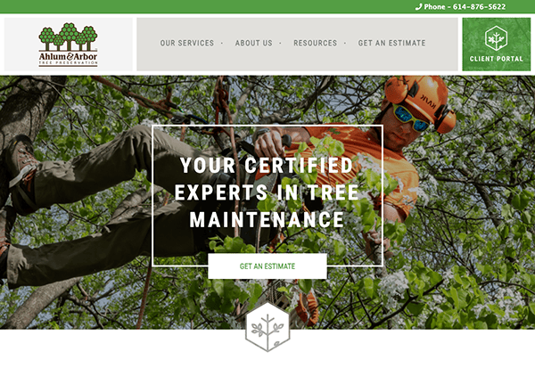
- Ahlum & Arbor Tree Preservation: The website’s design harmoniously blends visual elements and functional features. The color palette, dominated by shades of green, aligns with the company’s focus on tree services and creates a calming and inviting atmosphere. The site’s layout is well-structured, with clearly defined sections that guide the user’s eye in a logical flow. This is further enhanced using high-quality images and icons that break up text and provide visual interest. Additionally, the site employs hover effects on interactive elements like buttons and hyperlinks, imparting a sense of dynamism without becoming intrusive. The well-organized footer offers quick links to essential pages, social media icons, and contact information, making it a functional and valuable site.
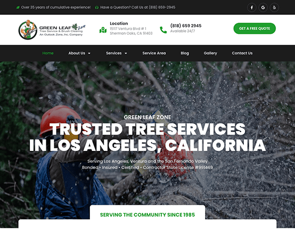
- Green Leaf Trees: One of the first things that catch the eye is the use of high-quality images that serve as both a visual treat and a portfolio of the company’s capabilities. These images are not just static but are part of a rotating carousel, adding dynamic elements to the homepage. The site’s typography is crisp and easily readable, harmonizing well with the overall design and providing a clear contrast against the background hues. In terms of content organization, the website offers detailed pages for each of its services, including tree trimming, stump grinding, and brush clearing, providing a thorough understanding of what the company has to offer.
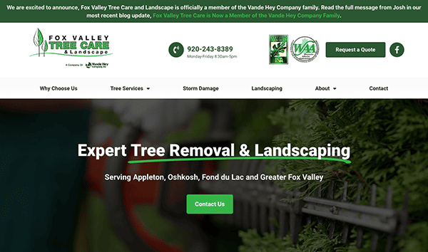
- Fox Valley Tree Care & Landscaping: The website effectively blends eye-catching imagery, an earth-toned color scheme, intuitive navigation, and in-depth explanations of the services offered. Its header is exceptionally crafted, boasting a fixed navigation bar that stays visible for easy access as users explore the site. The choice of typography is well-considered, featuring a clean, easy-to-read font that harmonizes with the site’s overall design, ensuring readability against the backdrop colors. Moreover, the site enriches its content with a “News & Tips” section, offering valuable insights while keeping it up-to-date. Elements like customer reviews and available financing options further bolster user confidence and promote interaction.
As we’ve explored, a top-tier website is an invaluable asset for any tree service business. It establishes your online presence and is an influential promotional instrument that substantially affects your financial outcomes. The examples above demonstrate what’s possible when excellent web design meets industry expertise. They incorporate all the essential elements—from user-friendly navigation and high-quality images to compelling copy and strong calls-to-action—that make a website effective in attracting and converting customers.
However, achieving this web design and functionality excellence level isn’t a DIY project. It requires a deep understanding of the tree service industry and the latest trends in web development. This is where professional help can make a world of difference. By partnering with experts who specialize in creating industry-specific websites, you can ensure that your online presence is not just good but exceptional.
Ready to take your tree service website to the next level? Contact CyberOptik today for a free consultation about your tree service website. Our team of specialists is dedicated and committed to delivering a website that looks great and drives measurable results for your business.

