In the fast-paced world of staffing and recruitment, a top-tier website is far from a luxury—it’s an essential asset. Your website acts as the digital face of your staffing agency, delivering an initial impression that can either forge or fracture prospective business partnerships. As competition within the sector intensifies, a strategically designed website offers a distinct advantage by facilitating a user-friendly experience and articulately conveying your brand’s ethos and offerings.
The importance of a top-notch staffing website design cannot be overstated. It’s not just about aesthetics but functionality, speed, and, most importantly, user engagement. A meticulously crafted website has the potential to be a potent asset for job seekers and employers, offering a seamless platform for job postings, candidate searches, and industry resources. Your website should act as a dynamic, 24/7 salesperson, always ready to engage and convert visitors into loyal clients.
Additionally, in an era where the recruitment sector is undergoing digital evolution, it’s imperative to have a website that’s aesthetically pleasing and fine-tuned for SEO and mobile responsiveness. This guarantees that you connect with your intended audience, regardless of their location—whether in a corporate setting or transit—thereby amplifying your likelihood of immediate conversions and sustained prosperity.
Examples of the Best Staffing Website Designs
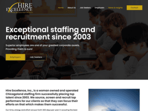
- Hire Excellence, Inc.: With a sleek and business-oriented design that perfectly aligns with its professional staffing and recruitment services, the website speaks volumes about its commitment to excellence. Established in 2003, the platform effectively communicates the company’s unwavering dedication to identifying, vetting, and placing top-tier talent for its client organizations. Its well-organized layout and user-friendly interface enhance navigation, ensuring a seamless experience. Modern typography and a harmonious color palette elevate its visual appeal and underscores its professionalism. The website provides compelling social proof of its efficacy by featuring endorsements from employers and job seekers. Far from merely an online brochure, the site is a valuable resource for employers and job candidates.

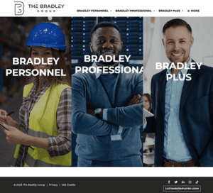
- The Bradley Group: The site’s modern design features a well-organized layout and a sophisticated color scheme that instills a sense of trust and expertise. Navigation is intuitive and straightforward, capturing attention immediately. The content is succinct and impactful, effectively showcasing the company’s extensive knowledge in the field. User engagement is significantly boosted by the chat box feature, which provides real-time solutions to queries and enhances customer service. Additionally, the website skillfully directs users through strategically positioned and clearly marked call-to-action buttons like “Find Work” and “Find Talent,” making the user journey dynamic and purposeful.

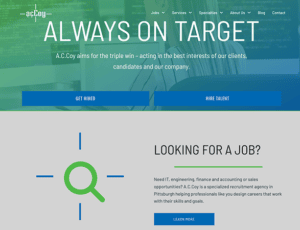
- AcCoy: The site exudes high professionalism and authority through its contemporary design elements, organized layout, and refined color scheme. Its content is brief yet powerful, highlighting the company’s expertise and range of services. User navigation is made effortless by well-defined categories such as “Jobs,” “Services,” “Specialties,” “About Us,” and “Blog.” The blog section serves as a rich resource, providing actionable advice on topics like effective LinkedIn outreach and optimizing the hiring process. The testimonials add to the website’s trustworthiness, which gives a window into the satisfying experiences of clients and employees.

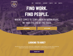
- Tiger Labor: The clean and minimalistic design allows users to focus on essential information without feeling overwhelmed. Its catchy tagline, “When it comes to temp labor in Baton Rouge, we have the eye of the tiger,” injects a unique flair that captures attention. Navigation is intuitively designed, highlighting essential sections for easy access. The emphasis on offering safety-trained personnel elevates the platform’s reliability and instills confidence among employers. A particularly engaging feature is the understated animation that comes into play as users scroll down the homepage, adding a layer of modern sophistication to the browsing experience without becoming a distraction.

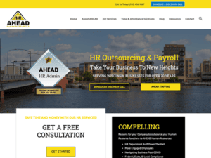
- AHEAD Human Resources: The website acts as an all-encompassing hub for HR outsourcing and payroll solutions, specializing in catering to Wisconsin-based businesses for over two decades. Upon landing on the homepage, visitors are promptly greeted with a call-to-action to schedule a discovery call, providing immediate access to the company’s offerings. The site excels in articulating its range of services and advantages through straightforward and impactful language. It persuasively outlines the benefits of HR outsourcing for businesses, shedding light on aspects like cost savings, regulatory compliance, and enhancing employee engagement. The website gains added trustworthiness while showcasing positive client experiences by featuring endorsements from high-ranking professionals like Presidents and Supervisors.

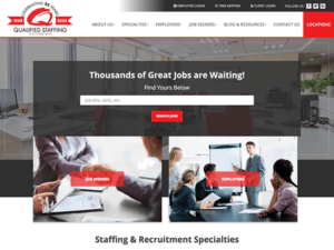
- Qualified Staffing: The website boasts a streamlined and well-structured layout that immediately grabs the visitor’s attention with a prominent call-to-action, inviting them to explore “Thousands of Great Jobs.” This serves the dual purpose of engaging the audience and guiding them toward potential job opportunities. The site effectively conveys its services and differentiators through clear and persuasive language. Its navigation is user-friendly, and the site also persuasively outlines the benefits of its staffing solutions, shedding light on its expertise in various sectors like commercial, professional, IT, and education. Additionally, the presence of social media icons for platforms like Facebook, Twitter, and LinkedIn at the footer enhances the avenues for user engagement and information dissemination.

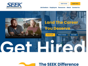
- Seek Careers/Staffing: The site presents a crisp, systematic design ensuring intuitive access to information. Its navigation bar is strategically positioned at the top, facilitating swift entry to core areas. The choice of a harmonious color palette featuring shades of blue and white radiates a sense of authority and reliability. Such colors, recognized for their soothing properties, are frequently adopted in business to foster trust. The site employs top-tier imagery that aligns well with its intended audience’s preferences. Throughout the platform, well-placed CTAs steer users to take key steps, whether it’s job applications or reaching out to the organization.

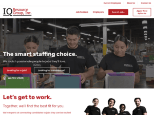
- IQ Resource Group: The site possesses a neatly structured and efficient design, guiding users effortlessly through its offerings. Its layout is up-to-date and prioritizes user experience, making it straightforward for visitors to locate and digest the content they’re interested in. Embracing a color palette predominantly featuring red, white, and gray hues, the design exudes a professional and dependable aura. The typography chosen is a fusion of contemporary style and clarity, ensuring visual appeal without compromising readability. Notably, interactive elements like the job search tool enhance user interaction, facilitating the discovery of relevant job listings. Moreover, the platform’s well-defined CTAs lead visitors to take pivotal steps, whether applying for positions or contacting the organization.

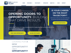
- Top Sourced Talent: The website boasts a pristine and integrated design, effortlessly leading users through its various features. Its layout blends elegance and user-friendliness, allowing visitors to access the details they desire naturally. The color palette, dominated by deep blue, white, and gold shades, exudes an aura of luxury and credibility. Crisp, top-tier visuals enhance the platform’s visual allure. Content is methodically arranged into specific categories, facilitating smooth navigation and understanding. Interactive elements, such as the responsive contact form and the lively testimonials segment, enrich the user journey, cultivating engagement and confidence.

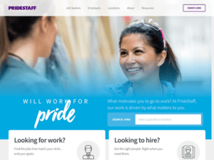
- Pride Staff: The website unfolds with a well-structured and efficient design, channeling users naturally through its diverse sections. It combines a sense of modernity with user-friendliness, ensuring visitors can easily traverse and retrieve the information they seek. The chosen fonts are contemporary and easily legible, harmonizing style with user readability. The selected typography melds modern flair with clarity, ensuring a blend of visual appeal and user-centric legibility. Upon entry, the site captivates users with dynamic video sliders, powerfully conveying its core mission. Content is neatly organized into well-defined sections, simplifying navigation and information absorption. Notably, the platform prioritizes inclusivity with its “Enable accessibility for visually impaired” feature prominently displayed, making the site welcoming to all users.

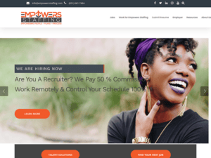
- Empowers Staffing: The website’s layout is clean and modern, with a visually appealing color scheme and well-structured content. This design decision greatly enhances user navigation, making it a breeze for visitors to locate the required information. Furthermore, the site is a valuable resource hub for job seekers and employers. Job seekers can tap into a wealth of resources, including resume tips and interview guidance, while employers have the opportunity to delve into a comprehensive array of staffing services. Additionally, a dedicated blog section adds extra value with its collection of pertinent articles. The website also integrates client testimonials and affiliations with industry organizations to bolster trust and credibility.

- Premier Staffing & Talent: The website presents a sophisticated yet welcoming design complemented by a color palette that radiates refinement. Its intuitive navigation facilitates users in effortlessly accessing desired sections, be it exploring job openings or delving into hiring solutions. Additionally, including a dedicated segment for blogs and news offers invaluable perspectives on the recruitment realm and the staffing domain. The presence of a chat functionality underscores the platform’s commitment to fostering user interaction and prioritizing customer support. Well-crafted and thoughtfully positioned CTAs punctuate the site, guiding users towards pivotal actions, such as delving deeper into offered services or initiating contact.

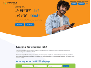
- The Advance Group: The website showcases a methodically structured design accentuated by a professional blend of blues, whites, and yellows. Its layout prioritizes user accessibility, featuring a streamlined navigation bar that grants immediate access to key areas such as job listings, services, and valuable resources. The selection of contemporary typography and pertinent high-resolution visuals elevates the user’s browsing experience. The site’s responsive nature ensures adaptability across different devices, and the uniform design approach from the homepage to subsidiary pages strengthens the brand’s identity. Noteworthy interactive elements, including the job search tool and an informative blog, encourage user immersion and provide bespoke resources. The all-inclusive footer is a hub for essential links, contact information, and social media connections, ensuring users have vital details.

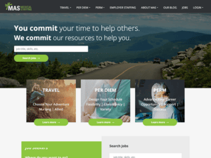
- MAS Medical Staffing: The design layout is streamlined and well-structured, facilitating effortless navigation for users. Effective utilization of white space contributes to improved text readability. A dominant green color scheme resonates with themes of health and well-being, making it a fitting choice for a healthcare staffing platform and elevating its professional tone. User experience is finely tuned, with an intuitive menu and well-placed call-to-action buttons that guide user interactions seamlessly. The content is concise, articulate, and enlightening, offering a transparent overview of available services. Adding a chat box and various interactive elements enhances functionality and user engagement.

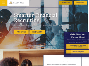
- Alliance Resource Group: The website immediately captivates visitors with its sleek, expertly crafted, intuitive layout, instilling a sense of reliability and authority in the staffing and recruiting sector. A straightforward menu and strategically positioned call-to-action buttons facilitate seamless user navigation. The site enhances engagement through compelling visuals, interactive features, and insightful content, further bolstered by authentic testimonials. The chosen color palette resonates with professionalism and aesthetic appeal, harmonizing perfectly with the industry it represents.

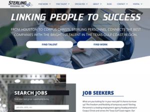
- Sterling Personnel: Upon entering the site, you’re immediately struck by its crisp, streamlined design. The layout invites curiosity without overwhelming the senses. The strategic use of white space isn’t merely aesthetic; it reflects the company’s straightforward approach to staffing solutions. The color palette is understated but impactful, resonating with the professionalism inherent in the staffing and recruiting sector. User experience is top-tier, featuring an intuitive menu and cleverly positioned call-to-action buttons that anticipate the next move. Rather than merely describing its services, the site goes a step further by showcasing testimonials, adding a dimension of credibility.

- Lingo Staffing: The website’s streamlined design and layout clearly reflect the company’s focus on efficiency and professionalism. Navigating the site is effortless, thanks to strategically positioned call-to-action buttons and a user-friendly menu catering to employers and job seekers alike. The chosen color palette does more than please the eye; it resonates with the professionalism inherent in the staffing sector, enhancing the site’s credibility. Awards, recognitions, and authentic testimonials contribute to a sense of trust. Additionally, the website boasts a content-rich blog section, offering invaluable advice and insights for hiring and those looking to be hired.

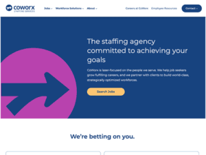
- CoWorx Staffing Services: The website boasts a modern, clean, and well-structured layout that not only elevates its visual appeal but also enhances the overall user experience, ensuring intuitive navigation. Thoughtfully positioned call-to-action buttons are strategically placed to effortlessly guide users through their respective journeys, whether they are employers seeking staffing solutions or job seekers exploring opportunities. The meticulously selected color scheme evokes professionalism and fosters trust, seamlessly aligning with the staffing industry’s ethos. Furthermore, including awards, affiliations, and testimonials within the design serves a dual purpose: it adds visual interest and offers compelling social proof, further enhancing the website’s credibility.

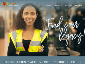
- Legacy Employment Solutions: The website’s design artfully combines modern elements with a clean, organized layout, boosting its aesthetic charm and user-friendliness. The navigation is uncomplicated, featuring a straightforward menu, and the call-to-action buttons are cleverly situated to steer employers and job seekers to their intended outcomes seamlessly. The chosen color scheme emanates an air of professionalism while building trust. Testimonials are skillfully woven into the design, offering visually engaging social proof that enhances credibility. Additionally, the footer is meticulously crafted to include quick-access links to key pages and social media handles, inviting further user interaction.

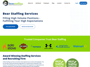
- Bear Staffing: The layout is meticulously crafted, offering a harmonious blend of modern design elements, clean lines, and strategic organization. The navigation menu is intuitively designed, making it effortless for users to find what they want. The call-to-action buttons are strategically placed, serving as effective signposts that guide both job seekers and employers to their desired destinations. The color scheme is subtle yet impactful, radiating a sense of professionalism that instills trust in the visitor. What distinguishes this site is the ingenious incorporation of accolades, affiliations, and client testimonials into its layout. These components enrich the visual experience and serve as potent social proof, bolstering the site’s overall credibility.

As we’ve explored, the role of a well-designed website in the staffing industry is multi-faceted. It serves as your brand’s digital identity, a resource hub, and a powerful sales tool, all rolled into one. The examples above showcase exceptional design and functionality that enhances user experience, thereby setting a high standard for what a staffing website should be.
In an industry where time is often of the essence, a well-designed website can significantly streamline the recruitment process. From automated application forms to integrated CRM systems, the correct design elements can make your website a one-stop solution for all staffing needs. This saves time and positions your agency as a leader in the field, someone who understands the nuances of the digital age.
If you aspire to propel your staffing agency into a higher echelon of success, investing in a premier website is your starting point. Keep quality high when the pinnacle of excellence is attainable. Reach out to CyberOptik for a complimentary consultation regarding your staffing website design. Leveraging our proficiency in crafting websites that excel in performance and aesthetics, we can provide the competitive advantage you aim for.

