In the fiercely competitive landscape of the roofing business, a first-rate website is far from being a mere extravagance—it’s an absolute imperative. Acting as your company’s virtual facade, your website often delivers the initial impression prospective clients have about your enterprise. An expertly crafted roofing website does more than display your offerings and completed projects; it establishes essential trust and credibility, pivotal elements in a customer’s decision-making process when selecting a roofing contractor.
The internet has transformed how consumers seek out services. Gone are the days when people relied solely on word-of-mouth or Yellow Pages to find the best roofing company. Today, a quick Google search can yield hundreds of results, and your website needs to stand out to capture that essential market share. Incorporating elements of excellent roofing website design can make the difference between a site that converts visitors into customers and drives them away.
Moreover, a high-quality website can serve as a powerful marketing tool. Search engine optimization can enhance its visibility, simplifying the process for prospective clients to discover you. Additionally, it can be seamlessly linked with social media networks, offering extra avenues for engaging with customers. In essence, your website is the hub of all your online marketing efforts, and investing in its design and functionality can yield significant returns.
Examples of the Best Roofing Website Designs
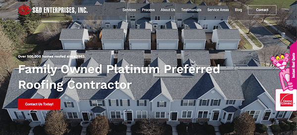
- S&D Enterprises, Inc.: When you arrive on the homepage, it’s clear that SD Roofing’s website is a cut above the typical roofing site. Visitors are immediately welcomed with visually striking images and videos that highlight the company’s high level of skill, effectively building both trust and authority from the get-go. A notable strength of the website lies in its exceptionally intuitive navigation. The menu is thoughtfully organized, facilitating a seamless user experience as visitors easily locate services, past projects, or client testimonials. Additionally, the website excels in its strategic use of persuasive calls-to-action (CTAs). These CTAs are cleverly dispersed across the site to guide users toward meaningful engagement, whether seeking a quote or initiating direct contact with the company.

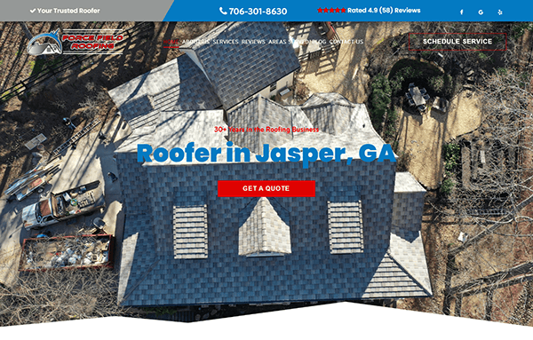
- Force Field Roofing: The website’s design immediately captures the eye with its compelling visuals. The hero slider, featuring the text “Creating an experience worthy of your expectations,” offers prospective clients a glimpse into the company’s dedication to high-quality work. The menu items are intuitively labeled, making it simple to find information about services, products, and the company itself. The website is rich in valuable information presented in an easy-to-digest format. Adding to its credibility are client testimonials and displayed awards, which lend an air of authenticity to the company’s assertions. Throughout the website, contact details are conspicuously placed alongside persuasive calls-to-action, facilitating accessible communication and boosting user engagement.

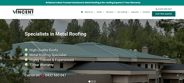
- Vincent Roofing: The website greets visitors with a refined and elegant design. The use of calming green and white boasts professionalism and trustworthiness. A particularly useful feature is the sticky menu at the top, which remains accessible as users scroll, ensuring effortless navigation throughout the site. The site’s credibility is further bolstered by showcasing high-quality images of completed roofing projects, client testimonials, and industry accreditations. What sets this website apart from merely good ones is its calculated deployment of calls-to-action (CTAs) and Free Quote Forms. These elements are strategically placed to prompt specific actions, such as requesting a free quote or making an inquiry, thereby enhancing user engagement.

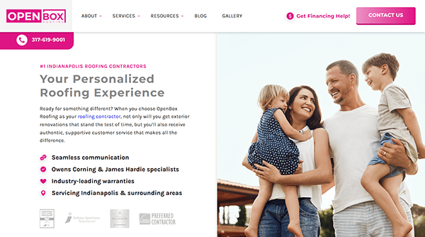
- Open Box Roofing: Upon landing on their website, you’re immediately struck by the harmonious fusion of aesthetic appeal and functional design. The carefully selected color scheme speaks volumes about their meticulous attention to detail, while the layout underscores their focus on user experience. The layout is a testament to their user-centric approach. It’s easy to navigate, with distinct sections that take you through their services, projects, and the all-important ‘Contact Us’ page. What truly sets its website apart is its ability to blend aesthetic excellence with practical roofing knowledge. Not only do they flaunt their remarkable projects, but they also offer transparent insights into their roofing techniques.

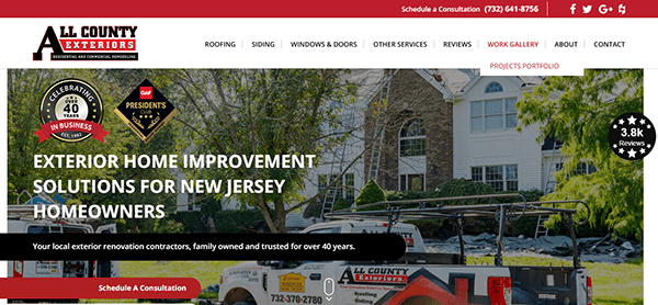
- All County Exteriors: The website’s design is a testament to the company’s eye for elegance and attention to detail, mirroring their craftsmanship. A refreshing color palette fosters a sense of reliability and professionalism, a welcoming canvas that invites you to explore further with its user-friendly navigation. The ‘Work Gallery’ section showcases their projects in stunning detail. It’s not just about roofing; it’s about transforming homes and elevating aesthetics. The website is rich in valuable information, from in-depth service descriptions to an informative FAQ section; the content is structured to enlighten and captivate the viewers. The audience further solidified its company as an industry authority.

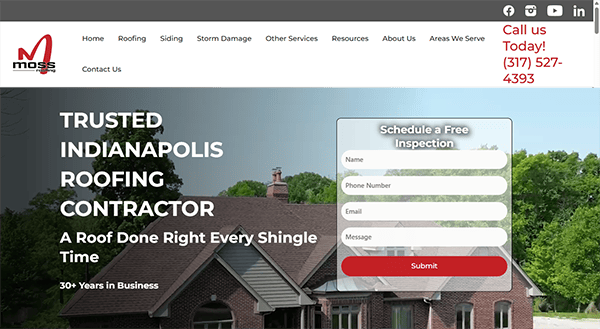
- Moss Roofing: As you enter their homepage, you’re greeted with a dynamic video slider that breathes life into their roofing projects. It’s more than just an image gallery; it’s a vibrant showcase of their craftsmanship in motion. The website is engineered for optimal user experience, featuring a layout and navigation system that intuitively leads you through various sections. A standout feature is the chat box, providing instant, real-time engagement for any queries, advice, or project discussions you may have. As you navigate the site, you’ll encounter strategically positioned Calls to Action (CTAs) that encourage you to engage further, be it exploring their range of services, perusing their project portfolio, or initiating contact.

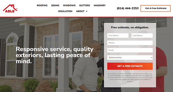
- Able Roof: The website is a captivating blend of traditional roofing craftsmanship and contemporary design, with a striking color palette of bold red and crisp white. The navigation menu is logically structured and user-friendly, facilitating quick access to key information such as services, customer testimonials, and ways to connect. Clear and concise headings further streamline the browsing experience. The site offers various helpful information on the company’s range of services, the materials employed, and the overall roofing process, aiding prospective clients in making well-informed choices. Contact avenues, including a phone number and a readily available contact form, are conveniently placed, making it simple for visitors to initiate communication.

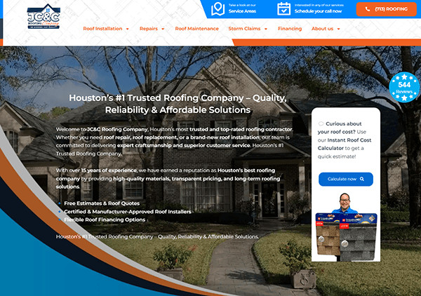
- JC&C Roofing: When you land on the homepage, you’re met with a visually striking design that radiates professionalism and expertise. The high-resolution images of finished roofing projects are a compelling visual endorsement of the company’s dedication to quality craft. The color palette, featuring a blend of soothing blues and dynamic orange, creates a memorable and bold visual impact. The site’s aesthetic elements, including top-notch images, a balanced color scheme, and carefully selected fonts, offer a visually delightful experience that seamlessly aligns with the brand’s identity. Regarding navigation, the website excels with its user-friendly, well-structured menu, making it effortless for visitors to locate essential information. Strategically positioned Calls to Action (CTAs) are dispersed across the site, encouraging you to delve deeper into their services, browse their project gallery, and initiate contact.

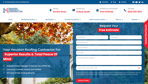
- Houston Roofing and Construction: Its website welcomes visitors with a clean and modern design that seamlessly blends aesthetics with functionality. Its navigation is as smooth and reliable as a well-constructed roof that withstands the elements. The site’s information is neatly arranged, facilitating easy exploration of its various sections. Content is delivered in a structured and captivating way, featuring easily readable fonts, distinct headings, and well-organized paragraphs. Including visual aids like videos and infographics adds engagement to the content. Houston Roofing Online shines in this regard, with thoughtfully positioned Call to Action (CTA) buttons that invite visitors to opt for a “Free Roof Inspection” or to “Call Today.”
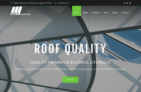
- D&L Roofing: The website greets visitors with a chic, contemporary design featuring a restrained color scheme of white, gray, and green, creating an inviting atmosphere. Information is systematically arranged, facilitating effortless exploration of various sections. The user-friendly navigation menu smoothly directs visitors to essential areas, ensuring a fluid browsing experience. Thoughtfully positioned Calls to Action (CTAs) are dispersed across the site, prompting users to delve deeper into their services and initiate contact. The ‘Contact’ section is conveniently situated for easy accessibility, streamlining the process for visitors to kick-start their roofing projects. A distinguishing element that elevates this website is its built-in chat box, a real-time communication feature that significantly enhances user engagement and experience.

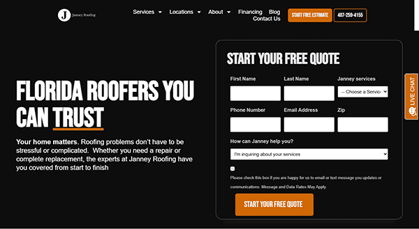
- Janney Roofing: The website employs an elegant and modern web design with its monochrome color scheme. Its hero page stands out with a video slider that offers a behind-the-scenes look at the roofing process, coupled with an enticing free quote form. This innovative approach serves the dual purpose of grabbing attention and educating visitors about the company’s expertise. The layout and navigation have been meticulously crafted with user experience in mind. The company’s dedication to engaging its audience is apparent through interactive elements like client testimonials and featured recent projects displayed on the homepage. Various contact methods and compelling Calls to Action (CTAs) are strategically placed, facilitating effortless and straightforward communication.

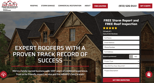
- Infinity Roofing and Siding: Its website welcomes visitors with an elegant monochromatic color palette, predominantly featuring black and white with striking red that exudes professionalism and trustworthiness. The website’s design reflects its dedication to quality roofing, and it introduces innovative elements that enhance the user experience. The layout and navigation are designed with a focus on user accessibility. The content is neatly structured, readable, and engaging, with the strategic use of headings, imagery, and white space contributing to an enhanced presentation. The site also includes well-defined Calls to Action (CTAs) and user-centric forms designed to facilitate conversions.

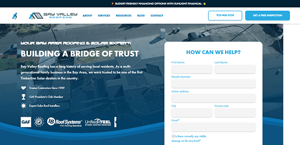
- Bay Valley Roofing: The website presents a visually striking design tailored for a roofing company, efficiently offering a wealth of information about its materials, services, and team expertise on its elegantly designed main page. From this central hub, visitors can quickly request a quote, initiate contact, and view an abundance of resourceful information. Thanks to the well-organized sticky navigation menu at the top, users can easily locate what they need without unnecessary scrolling or searching. The uniformity of design elements, coupled with a captivating color palette and streamlined typography, serves to strengthen the company’s brand identity, making it memorable in the minds of users.

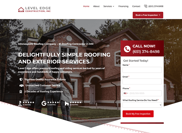
- Level Edge Construction: The website draws the user’s attention with its clean and modern design. It is complemented by a color palette that predominantly features soothing reds and clean whites that blend simplicity with sophistication. The user experience is elevated through an intuitive navigation menu and well-organized layout, making it effortless for visitors to explore various services, view completed projects, learn about the company, and access contact details. High-quality imagery and graphics are strategically used to enrich the user experience and project a sense of professionalism. The site is content-rich, offering in-depth explanations of services, the company’s methodology, and even a section for frequently asked questions. The addition of customer testimonials lends authenticity and serves as compelling social proof of the company’s service quality.

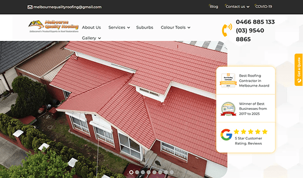
- Melbourne Quality Roofing: The website effectively highlights the company’s expertise in roof restoration and repairs as it features its awards and recognition over the years of service. The site is designed with user experience in mind, featuring easy navigation, clear and informative content, and a visually appealing layout. A prominent display of contact information and customer testimonials adds to its credibility. They are excelling in elaborating on the range of services provided—from roof restoration to repairs and painting—the site’s transparent approach to pricing and experience, along with a visual gallery of past projects, positions it as a dependable resource for prospective clients.

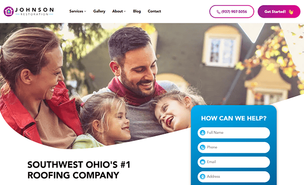
- Johnson Restoration: The website instantly grabs the viewer’s attention with its polished and expertly designed interface, highlighting the company’s skills in roofing, siding, gutters, and additional services. Prioritizing user experience, the site incorporates a mobile-friendly design, a color palette that is both professional and in line with the brand identity, as well as legible font choices. The chosen colors are neither flashy nor dull, striking a good balance that enhances readability and user engagement. Thoughtfully positioned call-to-action buttons streamline the user’s journey, and the site’s well-organized layout ensures that pertinent information is readily available. Moreover, the website distinguishes itself by showcasing high-resolution imagery and authentic customer reviews, enhancing its visual impact and trustworthiness.

- Piney Orchard Roofing: Upon entering the website, visitors are greeted with a visually stunning design. The color palette predominantly features warm earthy tones, which evoke a sense of trust, reliability, and a natural connection – highly sought after in the roofing industry. The website is an adept digital platform, spotlighting the company’s specialized skills in roofing installations and replacements. With a layout and navigation scheme that is meticulously crafted to enhance user experience, the site offers intuitive navigation and strategically located call-to-action buttons. These elements work in tandem to guide visitors smoothly through the website, while the detailed content provides invaluable information about the company’s services and quality commitments. The presence of client testimonials acts as a robust trust-enhancing feature.
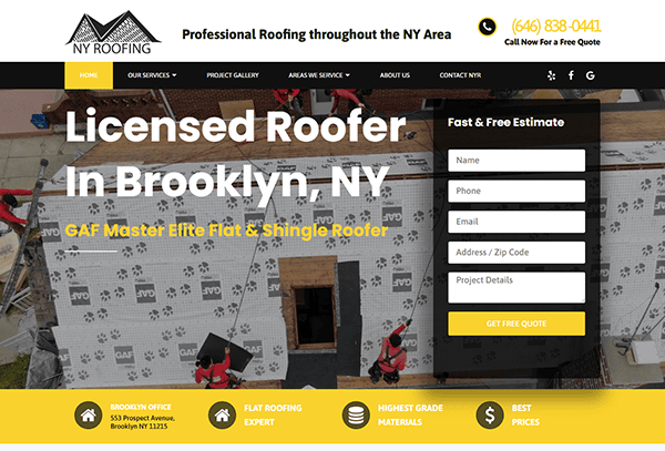
- NY Roofing: The website’s design is a perfect blend of professionalism and trustworthiness. Just as a sturdy roof protects from the elements, this website provides seamless navigation. Its user-centric design features intuitively arranged content, allowing visitors to navigate various sections with ease. High-resolution images are strategically used to elevate the site’s visual allure while offering a detailed look at the company’s roofing projects. Multiple avenues for communication are available to users, including a prominently displayed “Call Now” button for immediate inquiries. The homepage also features a blog section, providing an informative hub for existing clients and those interested in the roofing industry.

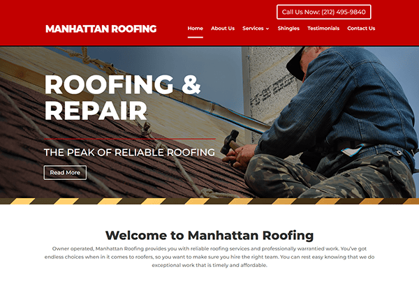
- Manhattan Roofing: The website’s minimalist design effectively elevates the digital footprint of the roofing company. Its color palette, featuring deep reds with whites, lends an air of warmth and refinement to the site. The typography is carefully chosen for readability, successfully retaining user attention and enhancing content comprehension. The site’s layout is intuitively organized, facilitating easy navigation for users seeking specific information. Transparency is another strong suit, as the website openly provides free on-site estimates and assessments, a feature likely to attract potential customers. Additionally, strategically positioned call-to-action buttons like “Call Us Now” and “Submit my Request” adeptly guide users through their journey on the site.

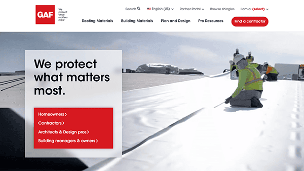
- GAF: The website immediately captures the user’s attention with an immersive hero section. It features high-quality images of various roofing products and installations, showcasing GAF’s commitment to quality and aesthetics. The website is crafted for easy navigation, showcasing quick-access links to key areas such as “Residential Roofing,” “Commercial Roofing,” “Find A Contractor,” and more. This user-centric design makes it easy for visitors to locate the information they need. Additionally, the website is transparent about its offerings and enriches the user experience by providing valuable articles and tips. The use of high-resolution images serves a dual purpose: it elevates the site’s visual allure while vividly illustrating the company’s roofing projects.
Having delved into examples of top-tier roofing company websites, it becomes evident that an effectively designed website transcends the limitations of a mere digital pamphlet. It serves as a vibrant hub capable of enlightening your target audience, flaunting your specialized skills, and, crucially, driving lead generation. Key features that set these exemplary websites apart—like intuitive navigation, persuasive calls-to-action, and visually striking imagery—could tip the scales in your favor when a prospective client is weighing their options between you and a competitor.
However, achieving this level of design and functionality isn’t a DIY project. It requires a deep understanding of both web design principles and the specific needs of the roofing industry. This is where professional help comes into play. A specialized agency can tailor your website to cater to the technical requirements of your enterprise, guaranteeing that you not only match your competitors but outperform them.
If you’re looking to elevate your online presence and create a website that not only looks great but performs exceptionally well, then it’s time to get in touch with CyberOptik. We offer a free consultation to discuss your roofing website design needs, providing you with a tailored strategy to achieve your business goals. Don’t settle for mediocrity; aim for excellence.
Ready to transform your roofing business through a stellar website? Contact CyberOptik today for a free consultation about your roofing website design needs.

