In an industry as competitive as lawn care, having a compelling online presence is not just an option—it’s a necessity. A well-designed lawn care website serves as the digital storefront of your business, offering potential customers a glimpse into the quality and professionalism they can expect from your services. It’s not just about aesthetics; an excellent lawn care website design incorporates user experience, functionality, and SEO optimization to ensure that you attract visitors and convert them into loyal customers.
The digital landscape is ever-evolving, and lawn care businesses must adapt to stay ahead. A visually captivating website effortlessly navigable and optimized for search engines can significantly impact your business’s success. It can attract more visitors, convert leads into loyal customers, and ultimately increase revenue. In short, investing in a top-notch lawn care website design is an investment in the future of your business.
Moreover, the best lawn care websites go beyond the basics. They offer valuable content, from lawn maintenance tips to seasonal guides, that positions the business as an industry expert. This improves your website’s search engine rankings and builds trust and credibility with your audience. When you offer value beyond your services, you create a lasting impression that keeps customers returning.
Examples of the Best Lawn Care Website Designs
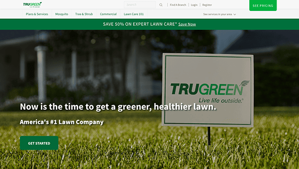
- TruGreen: The website is an exemplary digital platform, seamlessly blending user-centric design with its profound lawn and outdoor care expertise. When you arrive on the homepage, you’re met with a visually pleasing design that captures the vitality of flourishing lawns. Utilizing a color scheme dominated by soothing greens and clean whites, the site instantly connects with visitors, invoking feelings of peace and wellness. The website’s well-structured layout facilitates effortless navigation, catering to prospective clients searching for services and existing customers looking for resources. In the services section, the integration of high-resolution imagery and comprehensive content effectively conveys the wide range of services it provides, from lawn maintenance to pest management. The strategic placement of authentic customer testimonials further personalizes the user experience, reinforcing their dedication to client satisfaction.
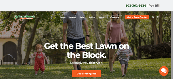
- Grass Person: The website boasts a sleek, contemporary, and meticulously structured design. Its color scheme, a harmonious blend of varying hues of green and orange, aptly captures the spirit of outdoor landscaping and lawn care. This deliberate selection of colors evokes feelings of vitality, wellness, and organic beauty, resonating perfectly with their services. Navigation is intuitive and straightforward, thanks to a user-centric interface complemented by compelling, clear calls to action. This ensures that users can easily traverse the site’s diverse sections, whether inquiring about lawn care solutions, exploring other programs, or seeking specialized guidance. Incorporating authentic customer reviews from the user experience underscores Grass Person’s unwavering commitment to client satisfaction. This effectively articulates their dedication to crafting lush, aesthetically pleasing outdoor environments, making the website an invaluable asset for prospective and existing clients seeking top-tier lawn care services.
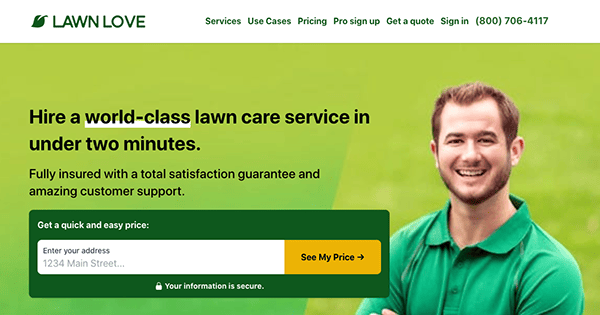
- Lawn Love: The website is designed to offer a seamless user experience, from getting an instant quote to scheduling lawn care services. With its minimalist and aesthetically appealing layout, the website effectively utilizes white space to maintain a clean appearance. Its intuitive navigation features a toggle menu, streamlining the user’s search for information. The platform excels in articulating its unique offerings, setting itself apart from traditional lawn care solutions and setting clear expectations for customers. As a fully insured entity, it instills confidence in new users by offering a comprehensive satisfaction guarantee and strong customer support. It also uses satellite mapping technology for instant, personalized quotes, showcasing its high-tech approach.
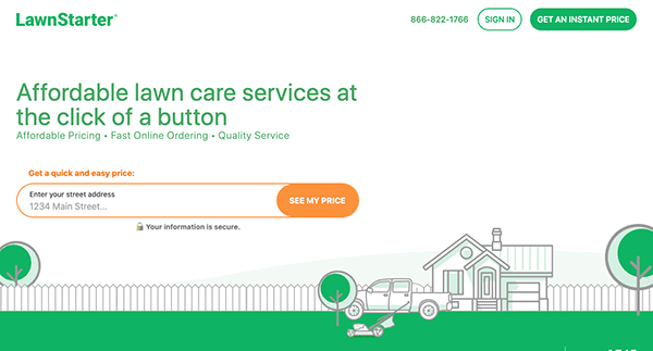
- Lawn Starter: The site boasts a sleek, contemporary design that captures the eye. The color palette is well-chosen, complementing the lawn care and outdoor services theme. Its website outlines its services, the setup process, and why customers should choose it over traditional lawn care providers. The site also features hundreds of positive reviews, adding a layer of credibility and trust. The website offers a quick and easy price estimation feature, a significant advantage for users looking for immediate information. Additionally, the platform provides a dedicated app to keep users informed about their lawn care activities, underlining its dedication to modern convenience and user-centric solutions.
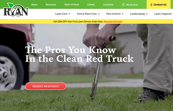
- Ryan Lawn: Ryan Lawn & Tree is a dedicated platform for a diverse array of services, including lawn maintenance, tree and plant health care, and exterior pest management. The site’s design is modern and visually captivating, offering a seamless and intuitive user experience from browsing services to obtaining a quote. Its color palette is well-coordinated, resonating with outdoor care and landscaping themes. The website excels in detailing its service offerings, onboarding procedures, and the distinct advantages it holds over conventional lawn care solutions. Furthermore, the platform enriches the user experience by offering educational content and expert insights, underlining its dedication to customer knowledge and ease of use.
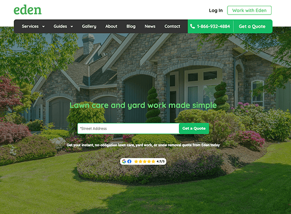
- Eden: Eden App is a comprehensive hub for lawn maintenance, landscaping, yard chores, and snow removal services. The website has a modern, clean aesthetic that immediately grabs attention. It offers a user-friendly navigation system featuring a straightforward menu that effortlessly helps users find the needed services. The journey from obtaining a quote to availing services is well-thought-out and intuitive. The website outlines its services, the setup process, and why it stands out from traditional lawn care providers. Additionally, the site enriches the user experience by offering educational blogs and guides, thereby establishing a strong sense of credibility and trust. Multiple avenues for contact, including a toll-free number, underscore the platform’s dedication to customer service.
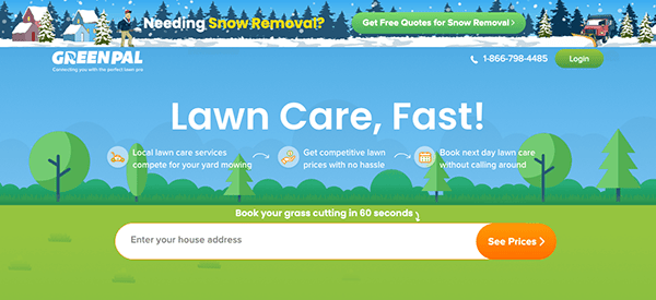
- GreenPal: The site greets users with a polished, professional aesthetic. The homepage adeptly articulates the brand’s unique selling points, highlighting the ease and dependability of using YourGreenPal to connect with reputable lawn care experts. The navigation menu is intuitive, and call-to-action buttons are optimally positioned for maximum impact. Vivid, high-resolution images of lush lawns and impeccably landscaped areas are displayed prominently. The website excels in offering comprehensive and transparent details about its service offerings. Users can swiftly grasp the platform’s mechanics, including locating and scheduling lawn care services. Customer testimonials and reviews enhance the site’s credibility and foster trust. This social proof is persuasive for potential customers, influencing their choice to engage with the platform.
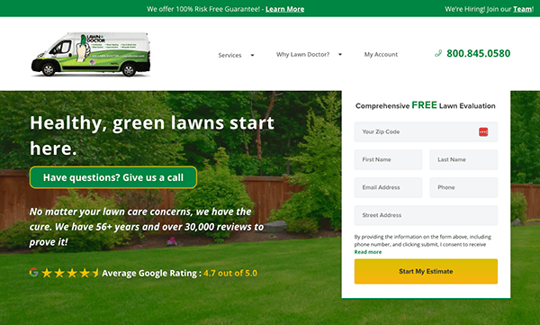
- Lawn Doctor: The website radiates a sense of reliability and expertise, which is crucial for a lawn care company. Boasting more than half a century of experience, the platform is intended to offer a thorough, science-based approach to lawn maintenance. The site provides an intuitive navigation system featuring a straightforward menu that aids users in quickly finding what they need. The call-to-action buttons are strategically placed, guiding the user from obtaining a free lawn evaluation to availing services. Adding to its credibility, the website is fully insured and offers a “No Nonsense Guarantee,” a significant trust factor for new visitors. If you’re not 100% satisfied, they promise to make it right by returning at no charge or refunding the total costs of your last application.
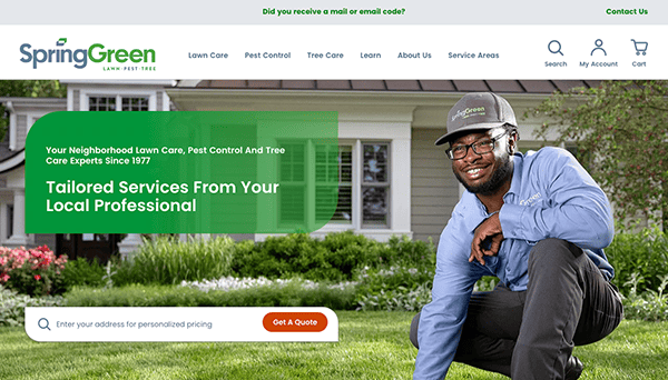
- Spring Green: The website’s design adeptly conveys the essence of its brand. Uniformity in color palette, typography, and logo across all web pages establishes a unified aesthetic that enhances brand awareness. The interface is user-friendly, with interactive components such as buttons and forms easily accessible and functional. The site’s visual elements are both cohesive and captivating. Using high-resolution images coupled with strategically positioned call-to-action buttons enhances the site’s visual allure, aligning well with the brand’s core message. The inclusion of the “Find Your Service Provider” functionality stands out as an innovative feature, enabling users to find location-specific services. This introduces an element of customization and ease, making the website highly focused on user needs.
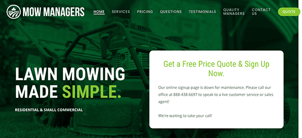
- Mow Managers: The website is designed to offer a simplified experience for both residential and small business clients seeking lawn care services. Its visual elements are compelling, featuring high-resolution images that align well with the brand’s ethos. Effective use of white space contributes to the site’s clean and professional appearance. Navigation is made easy with a well-structured menu and a clutter-free layout, enabling users to locate information effortlessly. The platform excels in delivering comprehensive details about its offerings. A notable feature is the “Instant Quote” section, which provides immediate cost estimates, which significantly benefits users. Additionally, including lawn care advice and resources enhances the website’s credibility and trustworthiness.
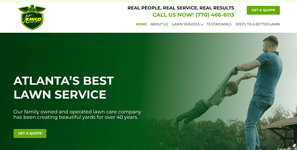
- Kemko Lawn & Shrub: The website’s design is clean, professional, and aligned with the landscaping industry’s visual expectations. It successfully combines aesthetic appeal with functionality, providing an excellent user experience. The chosen color scheme, mainly green and white, instantly connects the site to lawn care and outdoor maintenance. Striking images of verdant lawns, impeccably landscaped areas, and contented clients are displayed prominently, reinforcing the brand’s dedication to quality service. Well-positioned call-to-action buttons prompt visitors to engage by seeking a complimentary quote, booking a service, or exploring career options. These CTAs effectively shepherd users along their customer journey.
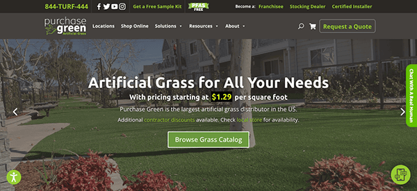
- Purchase Green: The website’s visual elements are captivating, featuring high-resolution images that align seamlessly with the brand’s ethos. Its color scheme, primarily green and white, instantly connects the platform to outdoor and lawn care services. The thoughtfully organized navigation menu allows users to traverse through various sections effortlessly. Well-defined headings and straightforward labels contribute to a user-friendly navigation experience. The platform stands out for its comprehensive and transparent presentation of product information. A notable feature is the “Get Free Samples” section, providing a valuable resource for users seeking to make well-informed choices. Additionally, including installation guides and an informative blog enhances the website’s credibility and trustworthiness.
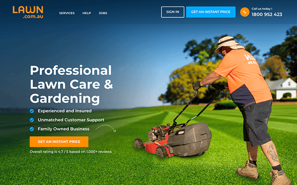
- My LawnCare: The website welcomes visitors with a clean, uncluttered design that immediately conveys a sense of professionalism and expertise in lawn care. The chosen palette of green and orange resonates well with the site’s focus, evoking a sense of tranquility and natural beauty. The navigation is straightforward, with clearly labeled sections that guide the user through the available services, customer reviews, and booking process. The content is systematically arranged and readily understandable. The website provides all the essential information a customer might need, from service offerings to customer testimonials. A notable highlight is the “Instant Price” feature, which enhances interactivity and acts as a compelling call-to-action by offering immediate quotes to users.
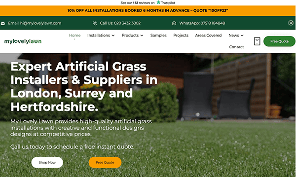
- My Lovely Lawn: The website showcases a sleek, contemporary design that seamlessly complements the brand’s emphasis on excellence and visual appeal. It offers a comprehensive and well-structured content layout, covering everything a prospective customer would require—from the variety of installation options to the quality of materials and client testimonials. The presence of Trustpilot reviews further bolsters the brand’s credibility and instills confidence in potential customers. A notable highlight is the “Free Quote” button, strategically positioned at the top of the page. This compelling call-to-action introduces an interactive dimension to the user experience. Additionally, the site features an intuitive online quote request system, streamlining the process for users to obtain pricing estimates.
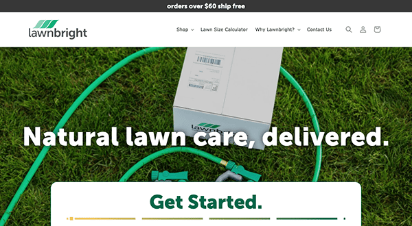
- Lawnbright: The website’s platform stands out for its specialized subscription model dedicated to natural and organic lawn care solutions. Its visual aesthetics are contemporary and uncluttered, featuring a color scheme that resonates with the brand’s commitment to environmental sustainability. The user interface is engineered for user-friendliness, ensuring smooth and effortless navigation. A notable highlight is the interactive “Lawn Size Calculator,” which offers users a tailored service experience. Moreover, the presence of a chat box feature elevates customer service by providing immediate, real-time support to visitors.
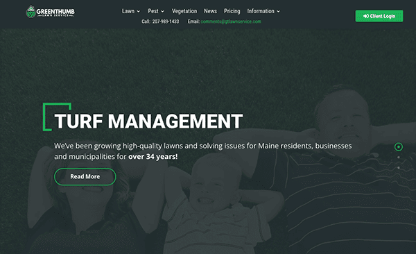
- GreenThumb Lawn Services: The website features a clean, uncluttered layout that facilitates smooth navigation while being visually pleasing. Its color palette is simple but impactful, exuding a sense of professionalism that resonates with its services. Leveraging more than three decades of industry experience, the platform is a robust resource for homeowners and businesses in Maine. The content is meticulously organized, offering all the vital details a prospective client would require. A notable highlight is the “Request a free inspection & Quote” function, which enhances interactivity and acts as a compelling call-to-action. The website transparently showcases its service offerings, with focus percentages like 90% for Lawn Care Services and 45% for Pest Management Services.
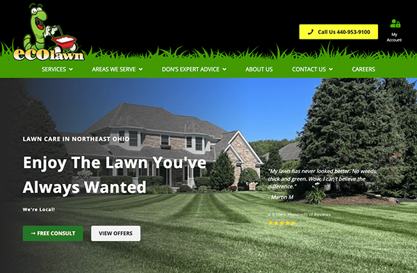
- EcoLawn Solutions: The visual design of its website is a study of effective simplicity. The color scheme is visually appealing and aligns with the brand’s eco-friendly ethos. The judicious use of white space enhances readability and minimizes user fatigue; while the inclusion of high-resolution, pertinent images amplifies the site’s visual allure without overshadowing the text. The layout follows a logical flow, with each section leading naturally to the next. In terms of interactivity, the website excels by integrating features that captivate the user’s attention. The “Free Consult” button serves a dual purpose: it acts as a compelling call-to-action and opens the door to further interaction, likely through a form or chat, thereby boosting user engagement.
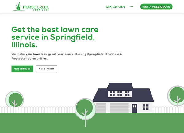
- Horse Creek Lawn Care: The website’s visual design skillfully marries minimalist elegance with a professional tone. Its subdued color palette resonates well with the brand’s specialization in lawn care. Including premium images featuring verdant lawns and meticulously cared-for landscapes not only complements their service offerings but also inspires a sense of aspiration, effectively showcasing the caliber of their work. The content is methodically structured, providing all the vital details a prospective client would require. Regarding interactivity, the website excels; the “Get a Free Quote” button is a compelling call-to-action and an interactive gateway, likely leading to a form or chat feature that enhances user engagement.
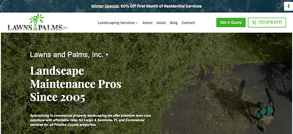
- Lawns Palms: The website showcases a minimalist design ethos, emphasizing visual elements through the strategic use of imagery and video content. Its color scheme is meticulously curated to align with the brand’s identity while fostering a welcoming environment for visitors. The site shines in content structuring, offering information in a well-organized format that facilitates easy comprehension. This is further enriched by including premium visual assets that elevate the site’s aesthetic and authentically depict the services offered. A highlight of the website’s design is the prominently positioned “Schedule an Estimate” form, ingeniously located in the hero banner area to capture immediate user attention.
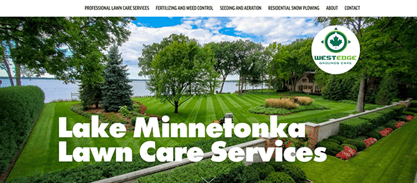
- Westedge Grounds Care: Its website is a well-crafted digital platform that effectively showcases its complete lawn care and property maintenance services. With its intuitive navigation and polished, professional layout, the site excels in user experience. Its color scheme is deliberately selected to align with the brand’s ethos while setting a welcoming tone for visitors. Skillful utilization of white space contributes to the site’s clean and organized appearance. As a result, the website masterfully blends visual appeal with practical functionality, culminating in a platform that is both visually engaging and highly effective for business.
As we’ve explored some of the best examples in lawn care website design, it’s clear that a well-crafted website is more than just a digital business card. It’s a multifaceted platform that can educate, engage, and convert visitors into customers. Whether through an intuitive layout, compelling calls-to-action, or valuable content, the top lawn care websites set a high standard for what potential customers should expect from your services.
However, achieving this level of excellence in website design is a significant feat. It requires a deep understanding of the lawn care industry and the digital landscape. This is where expertise in both realms becomes invaluable. Each detail is crucial in creating a website that looks good and performs well, from SEO optimization to mobile responsiveness.
If you’re looking to elevate your online presence and create a lawn care website that stands out from the competition, CyberOptik is here to help. With years of experience in crafting high-performing websites across a diverse range of sectors, we comprehend the distinct challenges and opportunities that come with lawn care website design. Contact us today for a free consultation and take the first step in transforming your digital landscape.
Ready to make your lawn care website the best in the industry? Contact CyberOptik for a free consultation about your lawn care website today.

