In the vibrant and ever-green landscaping industry, a well-designed website is not just a luxury but a necessity. Potential clients will often have initial engagement with a landscaping business through its website. Here, they form their initial impressions, gauging the level of professionalism, creativity, and expertise that a company brings to the table. Therefore, having a website that stands among the best landscaping websites is vital in attracting and retaining clients.
A great landscaping website should be a virtual garden of creativity, where vivid imagery meets compelling content to offer a glimpse into the transformative potential of a landscaper’s skill set. It should be a place where the meticulous attention to detail that landscapers bring to their physical projects is mirrored in a digital space, showcasing a portfolio that speaks volumes and testimonials that build trust. Integrating SEO strategies with a user-friendly interface can ensure your website ranks high in searches, drawing more eyes to your offer.
Moreover, in an industry where the visual speaks louder than words, incorporating interactive elements such as video testimonials, virtual tours of completed projects, and a regularly updated blog with tips and insights can set a landscaping website apart. Through this digital window, landscapers can convey their passion for transforming spaces, commitment to sustainability, and expertise in bringing visions to life.
Examples of the Best Landscaping Website Designs
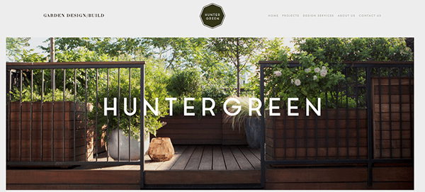
- Hunter Green: Using artistic visuals, such as illustrations and photography, immediately captivates the viewer’s attention. These visuals effectively convey the brand’s creative and innovative spirit, setting the tone for the visitor’s overall experience. While the website incorporates artistic elements, it adheres to a clean and minimalist layout. The strategic use of white space allows the content to breathe, ensuring a clutter-free and user-friendly experience. The color palette, featuring unconventional yet distinctive shades of green and muted earth tones, harmoniously aligns with the brand’s name, “Hunter Green.” Impressively, despite its artistic and unconventional design, the website’s navigation remains remarkably intuitive.
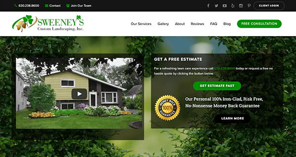
- Sweeney’s Custom Landscaping: The website immediately captures attention with its visually stunning layout. High-quality images of lush gardens, meticulously designed landscapes, and vibrant flowers instantly connect with Sweeney’s Landscaping’s core services. The content is eloquent and systematically organized. Every service is elaborated upon, giving prospective clients a comprehensive view of the landscaping options available. Menu categories are straightforward, complemented by an intuitive navigation structure. The “Blog” and “Review” sections augment the site’s value, addressing prevalent landscaping issues and showcasing superior landscaping services. The website adeptly steers visitors towards engagement with well-positioned call-to-action buttons. The overall design exudes professionalism, reinforcing that Sweeney’s Landscaping is a trusted partner for creating outdoor havens.
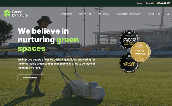
- Green by Nature: The website delivers a fresh and inviting design that perfectly aligns with its sustainability-focused mission. A calming green color scheme and high-quality nature imagery create an eco-friendly and visually appealing aesthetic. The well-structured layout and intuitive navigation make it easy for users to explore services and initiatives. A sticky menu bar enhances accessibility, ensuring smooth browsing across all pages. Engaging content, including informative sections and call-to-action buttons, encourages visitors to learn more and take action. With a responsive design that adapts beautifully to all devices, the site offers a seamless and user-friendly experience.

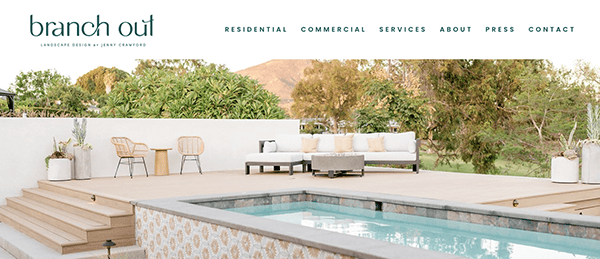
- Branch Out: Upon landing on the website, the hero section captures attention. The bold statement “CREATING COMPELLING OUTDOOR SPACES & OPPORTUNITIES TO GATHER” resonates with the essence of outdoor living, immediately setting the tone for the brand’s offerings. High-quality images of beautifully landscaped gardens, outdoor living spaces, and thriving plant life create an instant connection with its expertise. These visuals highlight the company’s past projects and spark creativity in visitors for their outdoor endeavors. The chosen color palette, dominated by natural hues like greens and browns, complements the landscaping theme, invoking serenity, nature, and outdoor elegance. The “DESIGN PROCESS” segment offers a clear roadmap from the consultation to the final installation.
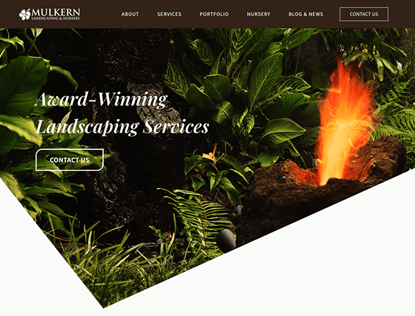
- Mulkern Landscaping & Nursery: The website presents a dynamic hero section highlighting their rich legacy with the proclamation, “Designing Oahu’s Gardens Since 1975.” Vibrant colors are employed to draw the viewer’s attention. Every page is adorned with clear, standout images, offering a quick insight into the company’s services. The content is meticulously structured, shedding light on their extensive landscaping services. Their 40+ years of expertise in crafting and upkeeping landscapes across diverse Oahu locations solidify their trustworthiness and underscore their longstanding community ties. With its well-organized content, striking visuals, and authentic client feedback, the website offers an enriching user experience, positioning itself as a go-to platform for those searching for landscaping services in Oahu.
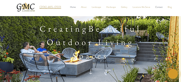
- GMC Landscapes: The hero section stands out with its declaration, “Creating Beautiful Outdoor Living Spaces,” aptly conveying the company’s primary expertise. The site’s content is organized intuitively, ensuring effortless navigation. A spotlight on the owner, Elias Ramos, lends a personal touch, fostering trust among potential clientele. The “SERVICES” segment is straightforward, highlighting their key services like landscaping and hardscaping. Their awards further attest to their proficiency and standing in landscaping. The website ensures a fluid browsing experience, accentuated by distinct call-to-action cues, such as “Contact Us Today To Get Started!” The chosen color palette aligns well with the landscaping theme, delivering a visually cohesive experience.
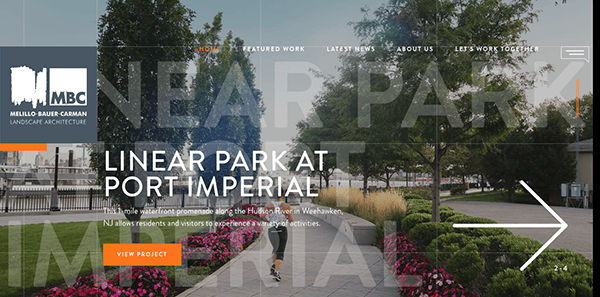
- MBC: The website presents a modern and creative design that effectively showcases their expertise in landscape architecture. Animated graphics, lively hues, and interactive features come together to offer a captivating user journey. Such visuals underscore the company’s imaginative take on landscape architecture, leaving a lasting impression on visitors. The site’s layout reflects the company’s dedication to originality and fresh ideas. Despite its unique structure, the website ensures smooth navigation. Its menu and navigational tools are designed for ease of use, facilitating effortless exploration of various site sections. Engaging components, like hover effects and animations, further elevate the user’s interaction with the site.
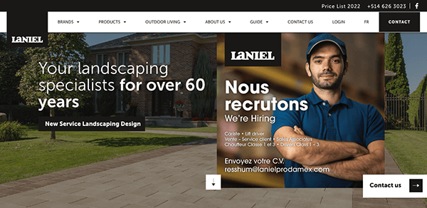
- Laniel: Laniel website is another landscaping website that ingeniously employs a black-and-white color scheme, bringing elegance to the landscaping industry’s essence. High-quality photography and captivating visuals abound, showcasing the company’s unwavering commitment to crafting beautiful outdoor spaces. What sets this website apart is its distinctive and unique layout. It boldly emphasizes creativity and originality while maintaining an intuitive navigation system and a user-friendly interface. The website serves as an inspiring showcase of its portfolio and commitment to creating exceptional outdoor spaces, leaving a profound and lasting impression on potential clients and peers within the industry and reinforcing its reputation as a creative force in landscaping.
- JT’s Landscaping: The striking contrast of green hue against a stark white backdrop makes its website stand out, immediately exuding professionalism and reliability within the landscaping industry. High-quality images and videos of their landscaping projects take center stage, showcasing the company’s skill in transforming outdoor spaces into works of art. The site offers intuitive navigation, with a methodically organized menu directing users to various services and showcased works. The main page acts as an engaging introduction, shedding light on their offerings, ethos, and unparalleled work quality. A notable element is the comprehensive portfolio, enabling visitors to delve into their previous undertakings.
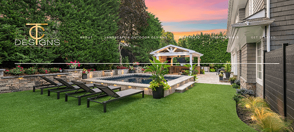
- T&C Designs: The website is a delightful representation of their landscaping prowess and design finesse. From the very first glance, it’s apparent that this is where the artistry of landscaping and the beauty of nature converge seamlessly. Large, straightforward navigation that’s legible without being overly pronounced is evident on its website. The website’s layout is well-organized, striking a balance between creativity and functionality. One of the website’s highlights is the portfolio section, which showcases their past projects in detail. Combining high-quality images and detailed descriptions creates an immersive journey, offering potential clients a vivid preview of the remarkable possibilities when choosing TC Landscape Design.
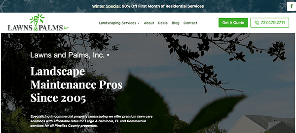
- Lawns and Palms: The website radiates vitality and is a testament to its leadership in landscaping. The website’s layout is thoughtfully structured, maintaining a perfect equilibrium between creative expression and practicality. The website boasts a spacious and uncluttered design, emphasizing a user-friendly experience. A dedicated section displaying client reviews and logos amplifies its trustworthiness and domain expertise. The prominently placed contact form is a commendable feature, and the consistent branding across pages, highlighted by the tasteful color choices, enhances its appeal.
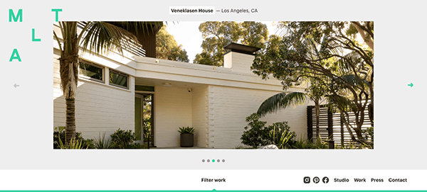
- Mark Tessier: The website boasts a clean and modern design, with a harmonious color palette that is pleasing to the eye and aligns well with the brand’s identity. Its effective use of whitespace gives the content room to stand out, ensuring a clutter-free experience. The site’s navigation is straightforward, backed by a well-defined menu that aids visitors in swiftly locating their desired information. The content layout is well-organized, with distinct headings and subheadings directing users seamlessly. High-resolution imagery and graphics elevate the content’s appeal, captivating the audience. Furthermore, subtle interactive features like hover transitions and animations are incorporated with discretion, offering a lively flair without overdoing it.
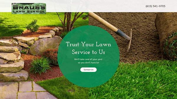
- Brauss Lawn Services: Upon entering the website, it’s immediately apparent that landscaping is at the heart of this company’s mission. The color palette’s vibrant greens and natural hues align seamlessly with their specialization. A standout feature is the comprehensive portfolio section, offering a deep dive into their previous works. One can truly appreciate the precision and artistry they infuse into each project through crisp images from the client’s galley. The website is designed for ease of use, with prominent call-to-action prompts such as “Contact Us” and “Get A Free Quote,” facilitating swift interaction for visitors.
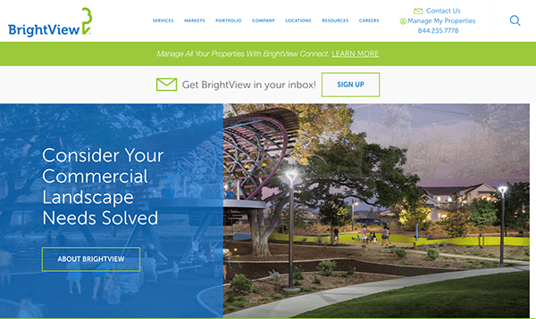
- Bright View: The website’s color scheme, predominantly featuring lush greens and clean whites, perfectly aligns with their field of expertise, creating a natural and refreshing ambiance. The content effectively showcases the company’s comprehensive range of services, from design to maintenance, emphasizing its position as the nation’s leading commercial landscape company. The portfolio segment provides a window into their previous endeavors, fostering confidence among prospective clients. Notably, the website’s market-specific categorization, catering to commercial, education, and healthcare sectors, ensures visitors’ tailored experience. The site also prioritizes transparency, evident in its forthright cookie policy, and the easily visible contact information bolsters user convenience.
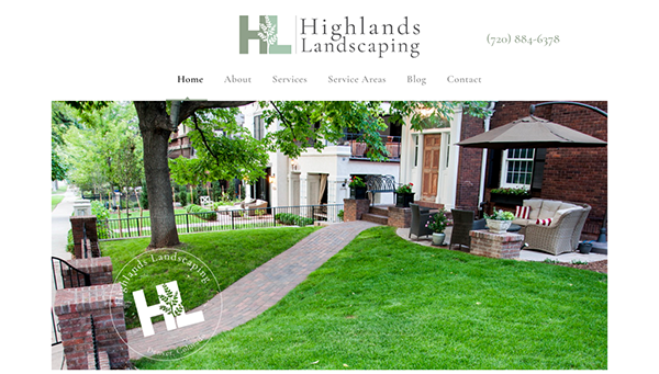
- Highlands Landscaping: The website exudes professionalism with its nature-inspired design, perfectly reflecting its landscaping services. The site’s user-friendly navigation and clear sections detailing services and testimonials offer visitors an informative experience. Prominent contact details and the mention of cities serviced enhance accessibility, while the inclusion of custom work showcases the brand’s adaptability. Although comprehensive, adding a visual portfolio or insights section could further elevate the user experience.
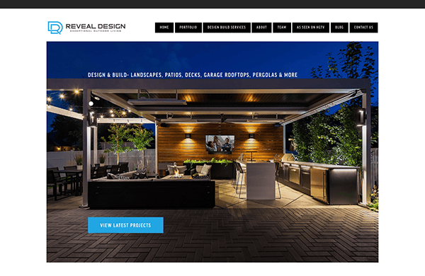
- Reveal Design: The website emerges as a stellar representation of contemporary and refined web design, specifically crafted for the landscaping and exterior design sector. Its homepage instantly draws visitors in with sharp imagery and concise content, highlighting the company’s prowess in landscaping endeavors. The chosen color scheme exudes grace and warmth, harmonizing seamlessly with their eco-focused services. The site’s navigation is user-friendly, smoothly leading users through various projects, team introductions, and informative blog posts. Authentic client feedback enriches the site, reflecting genuine admiration for the company’s artistry and commitment. Additionally, the prominently displayed contact details make initiating communication straightforward for prospective clients.
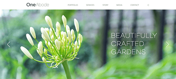
- OneAbode: The website embodies the principles of simplicity and refined elegance. Its design is sleek and free from distractions, letting the content take center stage. Easy-to-navigate menus ensure visitors find what they’re seeking effortlessly. The tagline “Beautifully Crafted Gardens” perfectly conveys the brand’s dedication to top-tier garden designs. Though understated, the chosen colors and font styles leave a lasting impression, exuding a sense of class and serenity. Despite its concise content, the site effectively portrays the brand’s mission and values. Every website design element resonates with the company’s devotion to producing exquisite gardens, underscoring its focus on quality and meticulous craftsmanship.
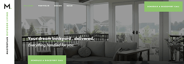
- MasterPlan: Its website is a brilliant showcase of modern web design, seamlessly blending functionality with aesthetic appeal. High-quality visuals and succinct descriptions paint a vivid picture of the brand’s capabilities in creating stunning outdoor living spaces. The color scheme is both contemporary and inviting, setting a tone of professionalism and creativity. The website’s navigation is intuitive, guiding users effortlessly through portfolios, design processes, and completed projects. A standout feature is the “Before-Design-After-Celebrate” progression, offering a comprehensive view of the company’s approach and results. Including client testimonials adds credibility and reinforces the brand’s commitment to excellence. Furthermore, the prominent “Schedule Your Design Meeting” call-to-action ensures potential clients have a clear path to engagement.
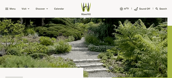
- WaveHill: The website is a delightful blend of elegance and functionality, capturing the essence of a public garden and cultural center. The homepage immediately immerses visitors in the garden’s wonders, with vivid visuals and engaging content highlighting upcoming events, such as the “Gardeners’ Party 2023.” The color palette is soothing and natural, reflecting the serene ambiance of the gardens. The intuitive navigation ensures smooth exploration of various sections. Wave Hill’s dedication to nature, culture, and community resonates through the site’s rich content. Furthermore, the diverse range of educational offerings, spanning from adult programs to youth internships, underscores the garden’s commitment to fostering continuous learning and nurturing community ties.
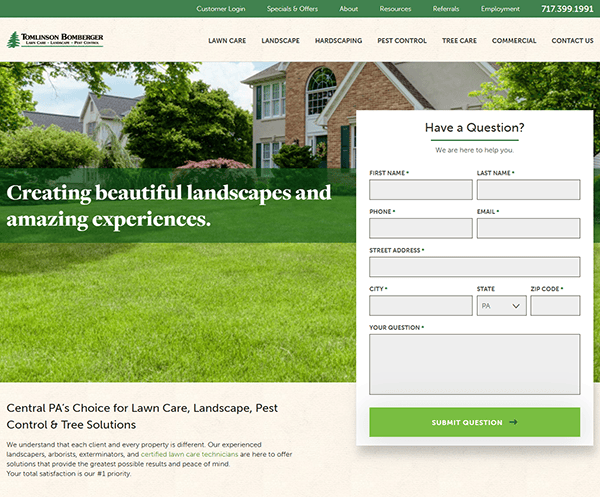
- Tomlinson Bomberger: The homepage is inviting, emphasizing “Creating beautiful landscapes and amazing experiences.” The vibrant visuals resonate with the company’s dedication to outdoor beautification. The color scheme is harmonious, reflecting the natural essence of their services. A notable feature is the inclusion of testimonials from satisfied customers, reinforcing trust and the company’s commitment to excellence. The contact form is prominently positioned at the page’s outset, serving as a clear and accessible call to action. Additionally, the website features large, legible text and a user-friendly navigation system, ensuring visitors can effortlessly navigate to their desired sections.

As we navigate through the digital gardens showcased in the best landscaping websites, it becomes evident that a well-crafted website is more than just a business card. It is a dynamic space that tells a story, a portfolio that showcases expertise, and a platform that facilitates connection. The landscaping industry is one rooted in transformation, and a website should reflect this, offering potential clients a journey from conception to realization, illustrating the potential lying dormant in their own spaces.
In a world where online presence is synonymous with business identity, having a website that stands tall in the competitive landscape is non-negotiable. It is not just about showcasing beautiful gardens and landscapes; it is about building a narrative, a story of transformation, a testimony to the skill and dedication that goes into creating each unique space. It is about offering a seamless user experience where potential clients can easily find the information they are looking for, be it service details, portfolio showcases, or contact information.
As we cultivate digital landscapes, a well-designed website becomes increasingly central in sowing the seeds of successful client relationships and nurturing business growth. If you are ready to elevate your landscaping business to new heights, it is time to invest in a website that reflects your commitment to excellence. Connect with CyberOptik for a free consultation about your landscaping website, and let us help you create a digital space that is as vibrant, dynamic, and unique as the gardens you craft.
Ready to cultivate a digital garden that blooms with potential? Contact CyberOptik for a free consultation about your landscaping website and watch your online presence flourish.

