In the highly competitive HVAC market, possessing an exceptional website is crucial for acquiring and maintaining consumers. As more people turn to the internet to find services, your HVAC business needs an online presence that stands out. A well-crafted website can be a 24/7 marketing tool, showcasing your expertise and reliability.
An excellent HVAC website goes beyond aesthetics; it must be functional, user-friendly, and informative. Potential customers visit your site for specific information about your services, pricing, and contact details. By presenting this information clearly and succinctly, you can establish confidence and motivate visitors to select your services over those offered by competitors.
Additionally, the best HVAC websites are optimized for search engines (SEO), ensuring they rank high in search results. This visibility is essential for attracting organic traffic and generating leads. Incorporating SEO optimization techniques increases your digital presence and helps you reach a larger audience by improving the appearance of your website.
Examples of the Best HVAC Website Designs
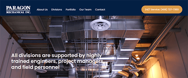
- Paragon Mechanical Inc.: The company’s website stands out for its clean and professional design, which reflects its experience and dedication to quality. The site’s sleek and modern design, with a balanced usage of white space, improves readability and overall user experience. The structure is simple, allowing visitors to quickly navigate through divisions, including HVAC, Piping, Architectural Sheet Metal, and Services. The site extensively uses professional photographs and graphics to showcase the company’s projects and skills effectively. Contact information and call-to-action buttons are carefully positioned, encouraging visitors to get in touch effortlessly. The website is completely responsive, ensuring an ideal browsing experience on various devices, including desktop computers and mobile phones.
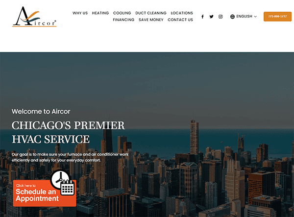
- Aircor Heating and Cooling: The website has a clean, neat, and modern design with a well-organized layout, which makes navigating effortless and straightforward. High-quality photos and engaging visuals are utilized across the site to improve its professional appearance and make the content more appealing. The content is clean, brief, and helpful, giving visitors all the information they need regarding services like heating and cooling system installations, repairs, and maintenance. It includes customer reviews, establishing credibility, and building confidence with new clients by demonstrating the company’s commitment to quality service. The deliberate placement of visible call-to-action buttons consistently encourages consumers to contact the company or make an appointment.
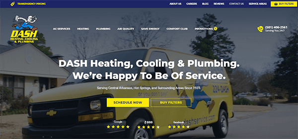
- Dash Heating and Cooling: The website has a welcoming and professional design, enhanced by a harmonious color palette of blue and yellow. The layout is simple, clean, and well-organized, with a logical flow that leads users smoothly around the site. The primary sections—services, pricing, and contact—are easily accessed via the top navigation bar. The usage of high-quality photos and hero page videos improves the visual appeal while also communicating its services with professionalism and dependability. The homepage emphasizes their extensive experience spanning a century and their commitment to ensuring client happiness, thus strengthening their trustworthiness. The website has interactive components such as contact forms, service request forms, and noticeable call-to-action buttons, which enhance interaction and promote user engagement.
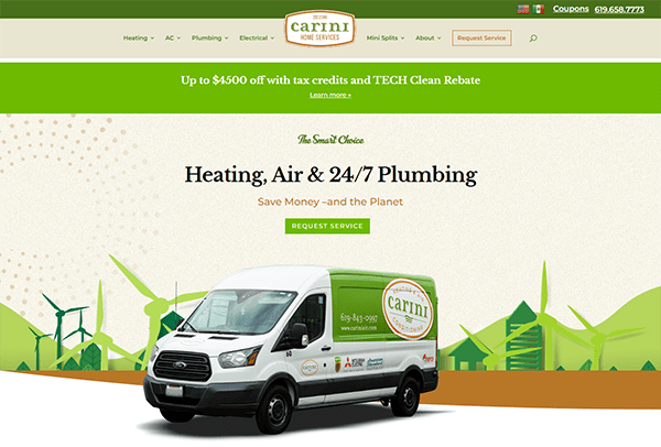
- Carini Heating And Air Conditioning: The website effectively employs a relaxing color scheme of mild browns, greens, and whites, producing an appealing and earthy atmosphere with a tranquil style, suggesting a sense of dependability and environmental care. The style is simple and well-organized, allowing users to quickly access crucial information such as services, contact information, and customer reviews. The homepage clearly communicates the company’s offerings, which include HVAC, plumbing, and electrical solutions, with clear calls to action like “Request Service.” The site’s well-organized style makes obtaining information about specific services, such as heating repair, air conditioning maintenance, and plumbing issues, easy. Customer testimonials, financing alternatives, and an extensive blog contribute to the overall user experience.
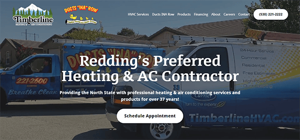
- Timberline Heating & Air Conditioning: Its website features an appealing and professional design that prioritizes usability and accessibility. It also excels in design with its clean and modern aesthetic. The homepage greets visitors with an eye-catching banner and simple navigation options. Essential services are displayed, each with detailed explanations and eye-catching graphics, allowing visitors to access essential information quickly. The usage of high-quality photos and a consistent color scheme improves the site’s professional appearance. The website prominently displays client feedback, including positive testimonials that foster confidence and authenticity. Awards and recognitions are also prominently displayed, highlighting the company’s industry reputation and dedication to quality. Additionally, the website has a user-friendly contact form that enhances the overall user experience, making it both practical and welcoming.
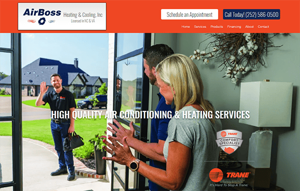
- Airboss Heating & Cooling: The website excels in providing a clean, user-friendly experience. The homepage is appealing, with a straightforward and structured style emphasizing their high-quality HVAC services. Customer testimonials are displayed, demonstrating good feedback and increasing trust. Awards and recognitions are emphasized to illustrate the company’s industry expertise. The website is simple, with straightforward navigation and detailed service descriptions. High-quality photos and a consistent color palette give the website a professional appearance, making it both informational and visually appealing. An outstanding aspect of its website is its quick response via the text contact form, which offers immediate support and improves user engagement, guaranteeing visitors timely assistance.
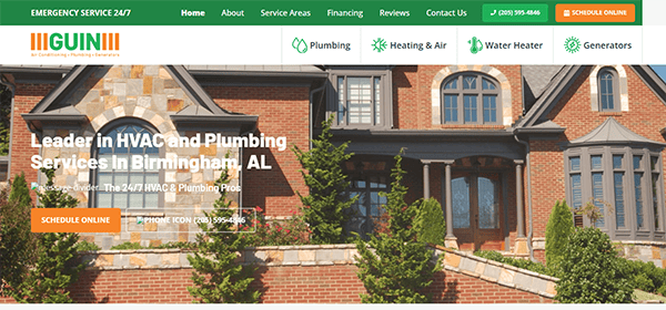
- Guin Service: The website is notable for its modern and aesthetically beautiful design. The color design is professional and appealing, with shades of green, oranges, and white conveying trust and dependability. The design is expansive and organized, enabling the content to display and be readily understandable prominently. The homepage has a well-organized header that provides quick access to significant areas, including services, about, and contact information. The information is clear and straightforward, with well-written content promoting the company’s capabilities and services. Strategically positioning contact forms and call-to-action buttons promotes user interaction and generates leads. The site also runs well across all devices, giving a consistent experience whether on a laptop, tablet, or mobile device.
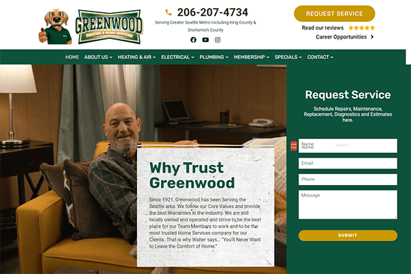
- Greenwood Heating: The company’s website design is sleek, professional, and easy to navigate. The website uses high-quality HVAC-related pictures and iconography. Whitespace improves readability and makes crucial elements stand out. The homepage welcomes visitors with a well-organized and user-friendly structure. Navigation is simple, with a well-placed navigation bar that gives quick access to all essential parts. The website’s content is educational and well-written, giving visitors detailed information about the company’s services, products, and expertise. Effective calls to action (CTAs) are carefully placed across the website, urging users to contact the company for additional information or to arrange a service. This improves the conversion of website visits into leads.
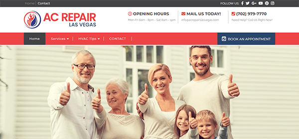
- ACS: Its website is well-designed and user-friendly, catering nicely to its target audience. The homepage welcomes viewers with a clean and professional appearance, making locating important information at a glance simple. The color scheme, which consists primarily of calming blues, reds, and whites, evokes a sense of trust and dependability, which is essential for a service-oriented organization. The navigation is straightforward and intuitive, resulting in a fluid browsing experience. The website offers clear and extensive information about their services, which include air conditioning repair, installation, and maintenance. Each service is clearly defined, allowing visitors to understand what they offer and how they might benefit. The appointment scheduling process is simple. A noticeable ‘Book an Appointment’ button opens a user-friendly form.
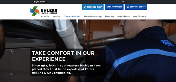
- Ehlers Heating & Air Conditioning: The design is sleek, modern, and visually attractive. The color palette is relaxing and professional, which is essential for a company in the HVAC industry. High-quality photographs improve the overall appearance and make the page more interesting. The website has user-friendly and straightforward to navigate. The homepage clearly outlines the available services and how to get further information. The well-organized menu makes it easy to discover precise needed information. The presence of a contact form and a conspicuous call-to-action button allows visitors to take the next step in contacting them for their services. It clearly shows certificates, affiliations, and customer testimonials, which helps to establish confidence with potential consumers. The existence of reviews and testimonials from delighted customers lends legitimacy and assurance.
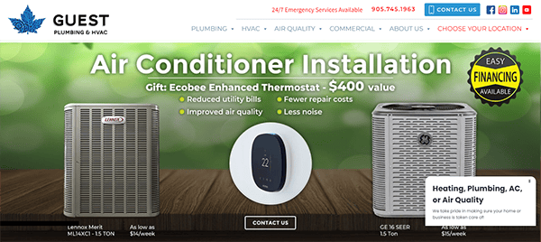
- Guest Plumbing & HVAC: The website’s design is modern and visually appealing. The color palette of blue and white is refreshing and appropriate for the plumbing and HVAC sectors. The homepage’s clean look and simple menu immediately strike a friendly tone. The menu is laid out, making it easy for visitors to find important information. The use of simple headings and intuitive organizing guarantees a seamless user experience. The content is well-written, short, and valuable. It communicates the company’s services, competence, and commitment to customer pleasure. Each part is meant to answer prospective consumer questions, making it an invaluable resource. Links to their social media profiles are readily available, allowing customers to connect with them on platforms where they are present. This integration helps develop a community and retain involvement outside the website. Contact information is also prominently displayed, making it easier for clients to reach out. Multiple contact options, including phone, email, and a contact form, are available to accommodate varied user preferences.
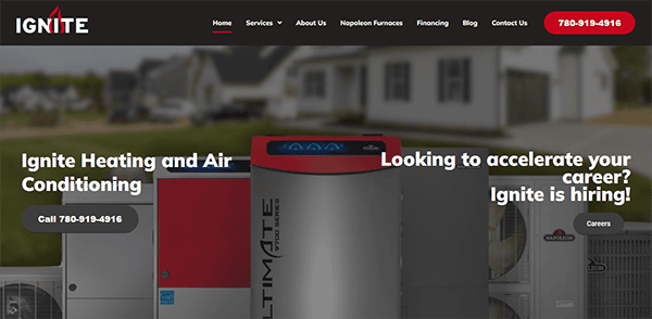
- Ignite Heating: The website’s clean, modern style immediately captures visitors’ attention. High-quality photos and icons increase visual appeal and create an inviting environment. The navigation is simple and user-friendly, with a well-organized menu. The arrangement ensures that the most essential information is easily accessible. The content is well-written, educational, and entertaining, appealing to potential clients seeking services and those seeking information on heating solutions. The presence of customer feedback and reviews on the homepage and service pages increases credibility and reassures potential customers about the company’s expertise and outstanding service. Call-to-action buttons are positioned around the site to direct visitors to the following actions: booking a service or getting a quote.
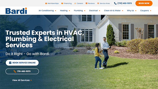
- Bardi: Its website provides an excellent user experience thanks to its intuitive design. As an HVAC provider, we serve Norcross and the surrounding areas in Georgia. Its website is immediately appealing for its clean and professional appearance. The homepage is nicely designed with a modern aesthetic that prioritizes ease of navigation and accessibility. The site’s well-organized layout makes it easy to navigate. Visitors can explore the numerous services, including 24-hour air cooling, heating, and plumbing solutions. The website has a prominent, sticky header that stays visible as you scroll, enabling quick access to critical information and services. This header features unique hover effects that elevate the browsing experience, making the site useful and visually appealing. The website also includes a simple and user-friendly form that allows visitors to request service or schedule an appointment quickly.
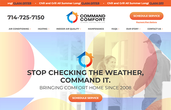
- Command Comfort: The website’s design is refreshingly simple and intuitive. The combination of blue and white with orange accents conveys dependability and professionalism. These colors are expertly employed throughout the site to highlight essential aspects like calls-to-action (CTAs) and service details. Navigation is simple, under a well-organized menu that walks customers through the numerous services available. Its site offers high-quality graphics and simple language immediately grabbing the reader’s attention. Scrolling down, interactive elements like hover effects and subtle animations increase user interest while not distracting from the content. Furthermore, the website is performance and accessibility optimized, resulting in a seamless and responsive experience across all devices and browsers.
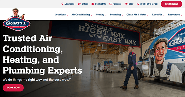
- Goettl: Its website features a clean, modern style that exudes professionalism and dependability. A bright color palette paired with high-quality branded graphics creates a visually appealing and memorable experience. Navigation is simple and easy, with a well-organized menu allowing users to access the information they require quickly. The layout is well-balanced, so there is lots of information available. Important contact information and calls to action are carefully placed across the site, making it simple for visitors to get in touch or request support. The content is straightforward, concise, well-written, and appealing to new buyers and those seeking more technical information. The website’s blog area is frequently updated with relevant articles, solidifying its position as a thought leader in the HVAC sector.
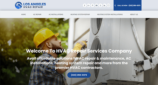
- Los Angeles HVAC Repair: The website has a clean and modern design with a professional color scheme that instills trust in visitors. The style is straightforward, making it simple to browse even for individuals unfamiliar with HVAC services. High-quality photos of HVAC systems offer visual appeal without overpowering the page. The website is straightforward, emphasizing usability and clearly structuring the necessary information. The webpage includes clear calls to action, allowing users to easily contact them for help or learn more about their offers. Service specifics are clearly presented, and a helpful FAQ area answers frequent customer questions. The website is customer-focused, emphasizing potential clients’ needs and concerns. It has contact information that is prominently displayed on each page, along with comforting remarks about their dedication to quality service and client happiness.
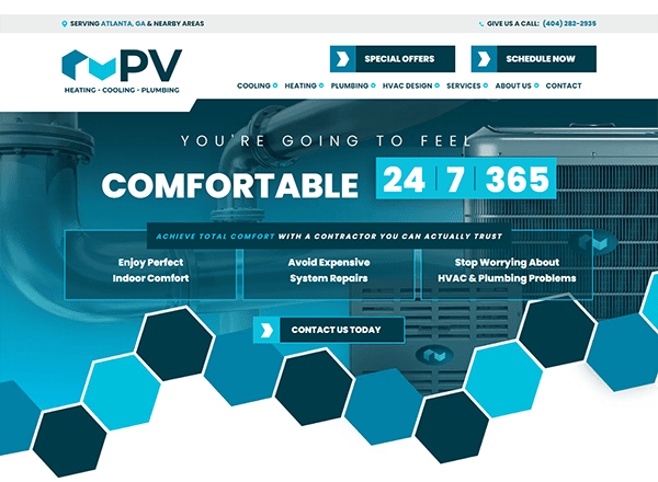
- PV Heating & Air: The website has a modern and clean design, with a relaxing color palette that pleases the eye and works well with the HVAC sector. The layout is simple, with a well-organized structure that seamlessly directs the user through various areas. The website maintains a mix of glances and practicality. High-quality photos of HVAC systems and team members improve the overall professional appearance, while subtle animations and transitions give a touch of interaction without overpowering the viewer. The website contains detailed information about its services, competence, and dedication to client satisfaction. Each service page is extensive, describing the advantages and features of their HVAC systems. Testimonials from delighted clients are presented, lending authenticity and trust.
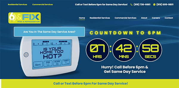
- 6 & Fix HVAC & Refrigeration: The website has a sleek, straightforward, and modern design that is pleasing to the eye. The color design is relaxing, and the layout is simple to browse. Navigation is seamless, with precise menu selections that take viewers exactly where they want to go. From the start, the organization evidently provides HVAC and plumbing services. Each service is detailed and helpful, allowing visitors to understand what to expect. The website exudes professionalism, from the well-written content to the direct calls to action. Contact information is easily accessible, which is reassuring. Honest customer reviews and testimonials are clearly presented, instilling trust and confidence in new customers. Throughout the site, there are apparent calls to action that direct users to the next step, whether scheduling a service or requesting a price.
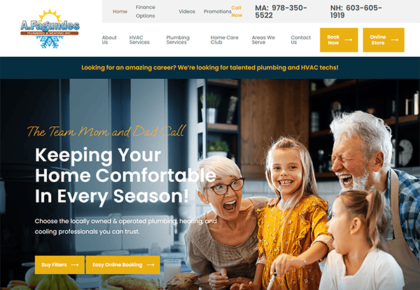
- A. Fagundes Plumbing & Heating Inc: Its website’s clean and professional design quickly conveys trust and dependability. The choice of a serene color palette and well-chosen typeface improves readability and communicates expertise. The website’s layout blends elegance and ease of use, and the graphic elements perfectly suit its topic. The layout design is very imaginative. The website efficiently integrates relevant and high-quality pictures to supplement the information and improve the user experience. Graphical components are utilized sparingly yet deliberately to highlight important ideas and calls to action. Across the website, straightforward calls to action direct users to contact the team for additional information, sign up for a consultation or access instructional materials.
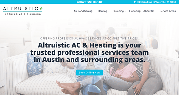
- Altruistic AC & Heating: The website has a sleek, modern style that is simple and neat. The homepage’s clean and attractive style, complete with a calming color scheme that encourages serenity and professionalism, immediately draws visitors in. The navigation is smooth and easy, allowing visitors to easily explore the numerous services available. The service pages are well-organized, containing clear, concise information and high-quality photos demonstrating their knowledge and devotion to excellence. The typography and layout are executed professionally, making the website easy to navigate. The use of white space across the site lends to a sense of openness and clarity, allowing you to quickly locate what you’re searching for without feeling overwhelmed. The website is responsive and adaptable across multiple devices.
Investing in a high-quality HVAC website is an investment in your business’s future. A professional and user-friendly website attracts more visitors and converts them into loyal customers. You can set your HVAC business apart from the competition by showcasing your expertise, providing essential information, and offering a seamless user experience.
In today’s digital environment, your website is sometimes the first point of contact prospective clients have with your company. To make a good first impression can significantly impact your organization’s growth and profitability. Do not leave your online presence to chance; it ensures that your website reflects the professionalism and quality of your HVAC services.
By collaborating with a renowned web design studio like CyberOptik, you can guarantee that your HVAC website fulfills all the requirements for achieving success. From design and functionality to SEO and user experience, we know what it takes to create a top-tier website. Contact us today for a free consultation about your HVAC website, and let us help you craft a website that attracts and converts visitors into repeat customers.

