In the flourishing Health and Wellness sector, a compelling website is not just a digital storefront—it’s a cornerstone of your brand identity. As consumers become increasingly discerning about their health choices, they seek platforms offering quality products or services and providing a seamless, informative, and trustworthy online experience. A well-crafted Health and Wellness website design serves as a 24/7 ambassador for your brand, offering valuable insights, fostering community, and, most importantly, building trust.
The digital landscape for Health and Wellness is highly competitive, teeming with brands vying for consumer attention. Your website must stand out through eye-catching visuals, intuitive navigation, responsive design, and content that resonates with your target audience. Your website should be a harmonious blend of form and function, designed to guide users effortlessly from their initial query to the final purchase or appointment booking.
Moreover, as Health and Wellness topics often involve complex information, your website must be adept at breaking down this complexity into digestible, engaging content. This enhances user experience and positions your brand as an authority in the field, a crucial factor for building long-term customer relationships.
Examples of the Best Health and Wellness Website Designs
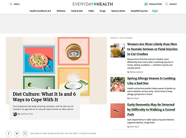
- Everyday Health: When you land on the homepage, you’re greeted with a clean, organized layout that immediately instills a sense of trust and authority. The thoughtful use of calming colors, visually appealing images, and well-balanced typography contribute to easy readability and naturally direct the user’s attention through the site. Navigation is intuitively designed, facilitating a smooth browsing experience that allows users to locate pertinent information swiftly. A distinguishing aspect of Everyday Health is its dedication to offering evidence-based and reviewed content by experts. Every article is enlightening and substantiated by reputable sources, underscoring the website’s focus on accuracy and trustworthiness.
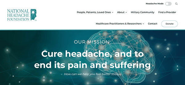
- National Headache Foundation: The site’s uncluttered design and logical layout instantly convey a sense of trustworthiness and expertise. Given its focus on headaches and migraines, the choice of a soothing color palette is a considerate detail that enhances user comfort. Navigation is smooth and intuitive, facilitated by a well-structured menu and distinct section headings. A rich array of content is available, from informative articles and various treatment methods to patient testimonials, all readily accessible. The website also showcases its commitment to providing medically accurate and up-to-date information. Each article and resource is vetted and often accompanied by citations from medical journals or experts in the field, instilling a sense of trust and credibility.
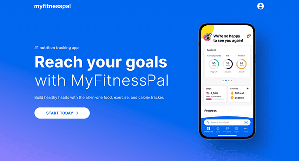
- MyFitnessPal: The MyFitnessPal website impresses with its sleek, modern design that immediately engages users. Its intuitive layout and vibrant color scheme catch the eye and make navigation a breeze. The site is meticulously organized, allowing users to effortlessly access many features—from tracking food and exercise to joining community forums. One of the standout elements is the user-centric approach, evident in the personalized dashboard that offers real-time updates on calories, nutrients, and exercise. The website also excels in providing a wealth of educational content, including articles, recipes, and workout plans, all aimed at empowering users to achieve their fitness goals. Moreover, the site’s commitment to data security and user privacy is commendable, adding an extra layer of trust.
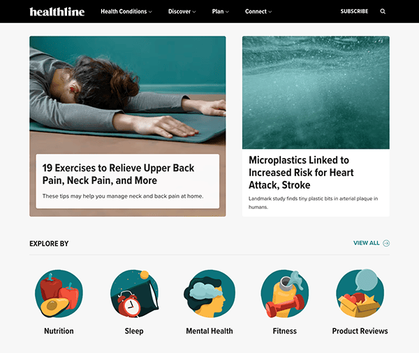
- Healthline: The website immediately captures attention with its clean, professional design that exudes credibility and authority in the health and wellness sector. Its layout is thoughtfully organized, facilitating easy navigation through various topics—from medical conditions and treatments to lifestyle tips. The site employs a calming color scheme, subtly enhancing the user experience, particularly when searching for health-related information that can sometimes be stressful. Beyond that, the platform enriches user engagement by featuring interactive tools like symptom checkers and calculators, which provide added value to the user.
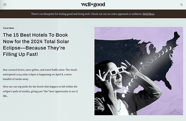
- Well + Good: The website immediately welcomes visitors with a vibrant and visually appealing design that perfectly aligns with its focus on wellness and healthy living. Its stylish and functional layout makes navigation effortless across various topics, from fitness and beauty to mental health. The site employs a lively color palette that adds a sense of energy and positivity, enhancing the overall user experience. One of the standout features is the site’s rich multimedia content, including videos, podcasts, and interactive quizzes, which offer users multiple ways to engage with the material. Moreover, the site distinguishes itself by featuring authoritative insights and counsel, regularly incorporating dialogues with specialists across various domains of wellness, which lends an added dimension of trustworthiness to its content.
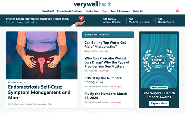
- Verywell Health: The website utilizes a soothing color palette that subtly underscores its emphasis on wellness and health. Font choices are meticulously curated to optimize legibility, facilitating effortless consumption of important health-related content. Navigation is designed for user ease, featuring logically arranged categories and an efficient search mechanism that enables quick access to desired information. One of the site’s standout features is its commitment to medically reviewed and evidence-based content. This is clearly indicated in each article, adding a layer of trust and credibility, which is crucial in the health sector.
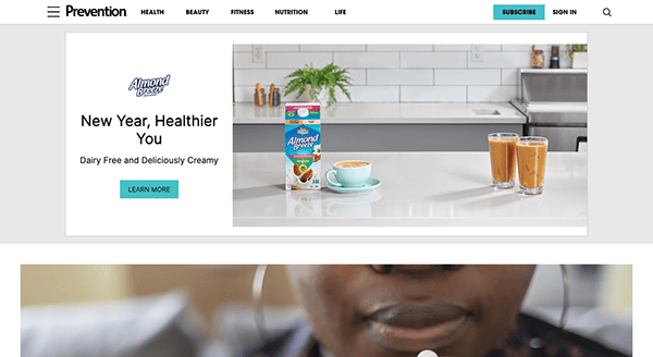
- Prevention: When visitors arrive at the homepage, they’re met with a color palette that harmoniously aligns with the site’s health and wellness ethos. The selected fonts are aesthetically pleasing and optimize readability, facilitating user interaction with various topics, from dietary advice to physical fitness and preventive measures. The strategic use of white space adeptly offsets text and visuals, ensuring the site remains uncluttered while still being information-rich. User-focused features like dropdown menus and interactive sliders are seamlessly integrated, elevating user interaction without causing distraction. The content is meticulously researched, frequently includes expert insights, and is substantiated by scientific evidence.
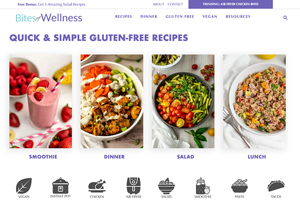
- Bites of Wellness: The website serves as a hub for delicious gluten-free recipes that are easy to prepare and budget-conscious. The website employs a clean, straightforward design and intuitive user interface. The website uses a harmonious color scheme that complements its wellness theme. Content is systematically arranged, making it simple for users to navigate through various recipes and articles. The site is visually enriched by including high-resolution images that add allure to the featured recipes. Prominently displayed Call-to-Action buttons and a comprehensive search feature significantly elevate the user’s interactive experience.

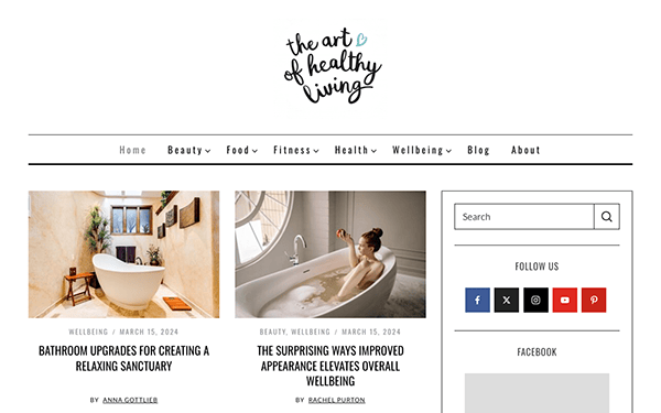
- The Art of Healthy Living: The website boasts a minimalist yet calming design, richly populated with content spanning topics from fitness and nutrition to mental well-being and holistic health. Its navigation is effortlessly smooth, featuring a well-organized menu and clearly defined categories that make information retrieval or article exploration straightforward, even for first-time visitors. A distinguishing aspect of the site is its roster of knowledgeable contributors and writers. The content is thoroughly researched and penned by authorities in the subject matter, ensuring that the information presented is trustworthy and current.
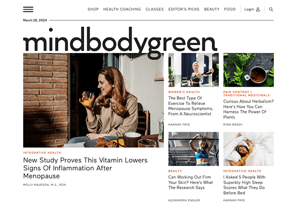
- Mind Body Green: As soon as you land on the website, you’re met with a visually striking design that radiates a sense of calm. The harmonious blend of muted colors, generous white space, and carefully selected images crafts a soothing environment ideal for delving into mental, physical, and emotional health matters. The site’s user-friendly structure simplifies the search for specific content, marking it as an all-encompassing hub for holistic well-being. With a diverse offering of articles, videos, podcasts, and courses, the website serves as a comprehensive repository for a wide range of health and wellness topics.
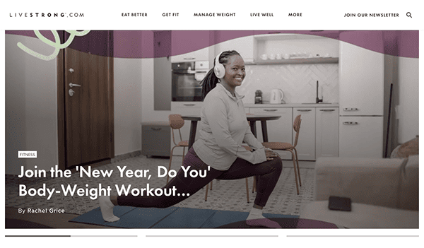
- Livestrong: The website greets its audience with a sleek, contemporary design that balances aesthetic allure and practical functionality. Its layout is meticulously organized, characterized by a harmonious color palette and an emphasis on content clarity, which lends an air of professionalism and credibility to the platform. Navigation is made effortless through an intuitively arranged menu and a robust search feature, facilitating easy access to information across various categories for users with varying degrees of digital proficiency. The site is further enriched by experts and contributors who deliver thoroughly researched and highly informative content.
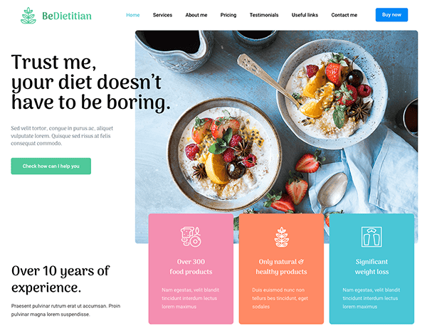
- BeDietitian: The design is clean elegant, and exudes a sense of freshness. Every element, from the color palette and typography to the layout, is deliberately selected to offer a visually gratifying user experience. Navigation is intuitive and user-friendly, with clear menus and a logical page structure. Visitors will find it easy to explore the website and locate essential information, including details about services, client testimonials, or blog posts. Visual elements like images and graphics are flawlessly woven into the design, elevating its overall aesthetic appeal. Additionally, including contact forms and readily available contact details streamlines communication for prospective clients, enhancing the practice’s efficiency.
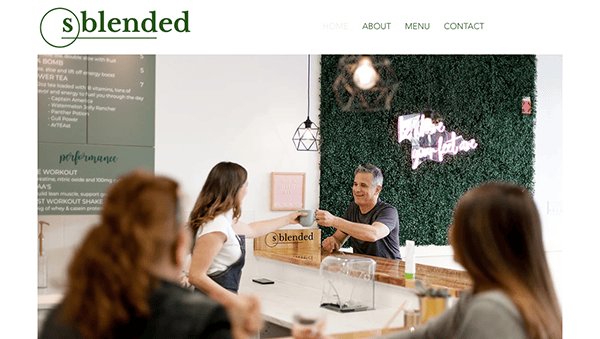
- Sblended: Their website immediately captivates with its inviting and vibrant design. The combination of cheerful colors, tasteful imagery, and a visually pleasing layout exudes warmth and positivity, making visitors feel at home. The website effectively utilizes visuals to engage visitors. High-quality images of nutritious meal replacement shakes, smoothies, and teas showcase the offerings and serve as visual inspiration for a healthier lifestyle. Strategically placed call-to-action buttons and contact forms make it easy for visitors to take the next step, enhancing user engagement and facilitating communication.
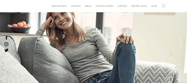
- Nutrition by Natalie: As soon as you arrive on the website, you’re met with a visually appealing and sophisticated design. The harmonious blend of muted colors, striking images, and a clean layout fosters a sense of warmth and accessibility. The site’s essence is its focus on nutrition, offering a rich array of articles, recipes, and resources that cater to a diverse spectrum of nutritional preferences and requirements. The content is not only well-informed and meticulously researched but also engagingly presented. Client success stories and testimonials are given prominent placement, serving as compelling evidence of the positive outcomes achieved through Nathalie’s services.
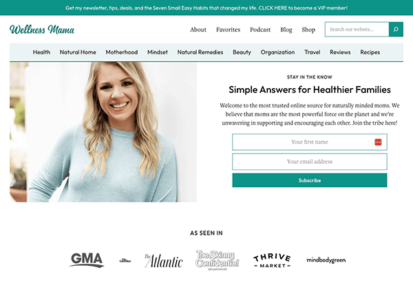
- Wellness Mama: The website immediately captivates with its elegant and soothing design. The clean, minimalist layout and harmonious color palette create an inviting, calming atmosphere reflecting wellness’s essence. Its website provides extensive content that caters to a wide range of wellness interests and goals. The website’s articles, recipes, and resources cover everything from natural remedies and nutrition to parenting and sustainable living. It uses visuals effectively, featuring enticing images of healthy recipes, wellness activities, and natural solutions. Interactive features like comment sections and options for social sharing are seamlessly integrated, nurturing a sense of community and stimulating reader engagement.
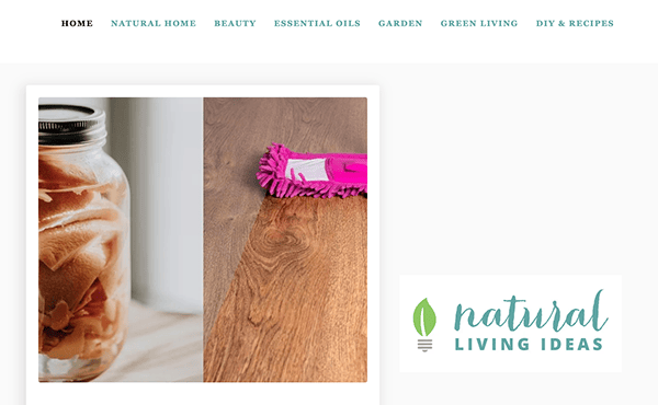
- Natural Living Ideas: The website radiates a sleek and welcoming design, and its well-balanced color palette and artful imagery conjure an atmosphere of peace and natural harmony. This makes it an ideal hub for exploring various facets of natural living. The site stands out for its broad range of content, covering everything from natural health and wellness to sustainability and do-it-yourself solutions. It adeptly employs visuals to captivate and inspire its audience. The high-resolution images of natural treatments, DIY endeavors, and eco-conscious practices not only enrich the content but also serve as a catalyst for readers to embrace healthier and more sustainable lifestyles.
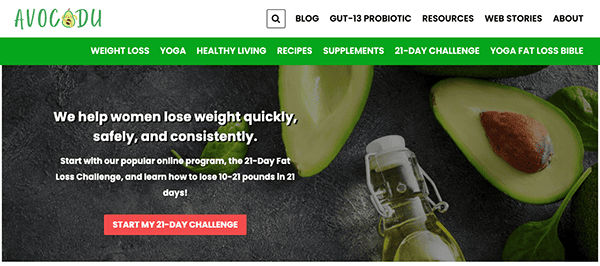
- Avocadu: When you land on the website, you’re met with a vibrant and captivating design. Its dynamic layout, spirited color scheme, and judicious use of visuals craft an atmosphere that’s both energetic and focused on well-being, striking a chord with those keen on enhancing their health. The site’s navigation is seamless, facilitated by a logically arranged menu and user-friendly page layout. This makes it straightforward for visitors to locate everything from fitness plans and dietary guidelines to general wellness advice. The site skillfully employs visual elements to both engage and inspire its audience. Vivid images of wholesome meals, exercise regimens, and healthy living practices enrich the content and catalyze readers to embrace better lifestyle choices.
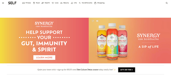
- Self: The website greets visitors with a sleek and inviting design that immediately captures attention. The modern layout, stylish typography, and tasteful imagery create an atmosphere of sophistication and motivation, setting the perfect tone for exploring all things related to health and wellness. Navigation is a breeze, courtesy of the site’s user-focused design. Its intuitive menu and well-organized page layout make it easy for visitors to locate the specific information they’re after, whether in fitness, nutrition, mental well-being, or beauty. The site adeptly utilizes top-notch visuals to captivate and inspire its audience. Eye-catching images of exercise routines, nutritious meals, and lifestyle vignettes not only enrich the content but also serve as a motivating force for readers to make healthier life choices.
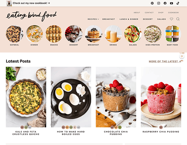
- Eating Bird Food: The website welcomes users with a warm and inviting design. The comforting color scheme, charming visuals, and well-considered layout collectively establish a mood of ease and eagerness to discover the various facets of healthful and tasty eating. The site’s navigation is intuitive and pleasurable, owing to its user-centric design and systematically arranged content. The website offers extensive content that champions the cause of wholesome nutrition. Whether it’s delectable recipes, dietary recommendations, lifestyle insights, or fitness advice, the platform serves a broad demographic eager to enhance their overall well-being.
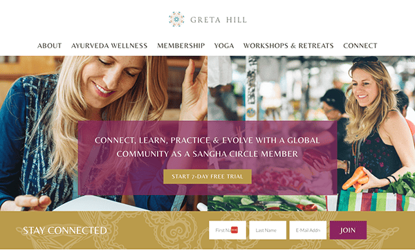
- Greta Hill Wellness: From the first arrival, the website envelops visitors with a visually mesmerizing design. The artful layout, rich color palette, and tasteful use of imagery create an immersive ambiance that reflects the artist’s unique perspective and passion for creativity. The website excels in providing various content, including articles, recipes, and playlists aimed at inspiring mornings. The site also features a section, “As Seen In,” adding an element of credibility and reach. Incorporating high-resolution images and elegant typography elevates the site’s visual allure, making it a feast for the eyes and a valuable resource for information.
As we’ve demonstrated, the best Health and Wellness websites are more than just visually appealing—they are user-centric platforms offering many functionalities designed to enhance customer engagement and satisfaction. Whether through interactive features, educational resources, or personalized recommendations, these websites go the extra mile to provide value to both the brand and the consumer.
Investing in a high-quality Health and Wellness website design is about keeping up with industry standards and setting your brand apart in a saturated market. An expertly crafted website is a powerful tool for customer retention and acquisition, acting as a 24/7 ambassador for your brand. It can also be a valuable resource for existing customers, providing them with the tools they need to manage their health effectively.
Should you aspire to take your Health and Wellness brand to unparalleled levels, now is the time to act. Contact CyberOptik today for a free consultation about your Health and Wellness website. Our team will closely partner with you to formulate a tailored strategy that meets your needs, elevating your website from merely good to outstanding.
Ready to transform your online presence in the Health and Wellness industry? Contact CyberOptik for a free consultation today, and let us help you create a website that connects with your target audience and fuels business expansion.

