In an industry as competitive as electrical services, standing out from the crowd is more crucial than ever. A well-designed electrician website serves as the digital storefront of your business, offering potential clients a glimpse into your expertise, professionalism, and the services you provide. It’s not just about aesthetics; a high-quality electrician website design can significantly impact your search engine rankings, customer engagement, and, ultimately, your bottom line.
The digital age has empowered consumers to be more discerning than ever. Before even picking up the phone, most people will conduct online research, comparing electrician websites and reading reviews. Your website is often the first point of contact between you and potential clients; hence, it must be visually appealing, easy to navigate, and rich in content. A well-designed website can turn away customers before they even get a chance to understand what you offer.
Moreover, a robust online presence is vital for local businesses. With the increasing use of mobile devices for local searches, having a responsive and fast-loading website can distinguish between a missed opportunity and a loyal customer. Your electrician website is not just a digital business card; it’s a powerful marketing tool that can drive leads, increase conversions, and establish your brand in the community.
Examples of the Best Electrician Website Designs
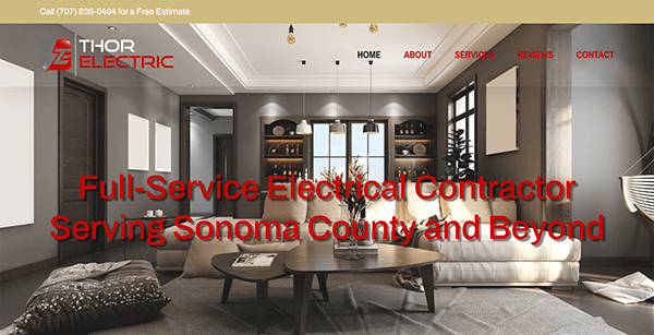
- Thor Electric: The site employs a clean, modern design that aligns well with the electrical services industry, presenting a professional image right off the bat. It features an intuitive navigation with a straightforward menu, making it easy for users to find what they want. A harmonious blend of colors, typography, and visuals enhances the site’s look and feel. Comprehensive details about the range of services offered, from minor service requests to extensive design-build projects, are readily available. The presence of customer testimonials further bolsters the site’s credibility and instills confidence in the services provided. To further engage visitors, a strategically positioned “Get an Estimate” CTA button is prominently displayed.

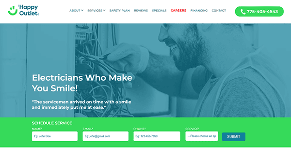
- The Happy Outlet: The website showcases a lively and captivating design that immediately draws the eye. Its primary color palette of green and white not only conveys a professional and trustworthy image but also subtly underscores the brand’s dedication to eco-friendly and secure electrical solutions. The site has a user-friendly navigation structure, highlighted by a well-organized menu that simplifies locating essential services, ranging from circuitry and wiring to safety evaluations. A thorough presentation of the company’s service offerings is further reinforced by authentic customer reviews, enhancing the site’s credibility and trust factor. The integration of a chatbot feature serves to address frequent customer prompt inquiries, thereby elevating user engagement and boosting conversion rates.

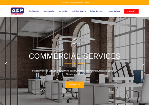
- A & P Electrical Services: The website’s design prioritizes functionality over flair, providing a user-friendly experience without the distraction of excessive design features. Its color scheme is minimalistic, aligning well with the site’s functionality focus. The site is organized into distinct sections for Residential, Commercial, and Industrial services, facilitating quick navigation to relevant areas. Key contact details, such as the office phone number and business hours, are prominently displayed, making it convenient for users to reach out. The site also emphasizes its readiness to handle emergency situations by mentioning the availability of on-call electricians and well-equipped vans, adding a dynamic aspect that enhances customer engagement.

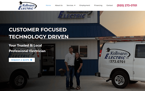
- Kollmann Electric LLC: The website has a clean and professional design that reflects the company’s experience and dependability in electrical services. The use of bold lettering and a clean color scheme of blues and whites inspires confidence and trust in potential clients. The homepage is well-designed, with straightforward navigation and conspicuous contact information for easy access. High-quality photos and helpful text promote the company’s services, increasing user engagement. The website’s responsive design provides a fluid browsing experience on desktop and mobile devices.
- Louis Shiffman Electric: The website acts as an all-encompassing hub for electrical supplies and distribution, backed by a century of expertise in the industry. The website’s design is simple yet functional and professional. The layout is straightforward, focusing on ease of use rather than visual spectacle, which is crucial for a positive user experience. The platform provides an extensive array of information on the company’s offerings, ranging from electrical tools to safety gear, serving as a comprehensive resource for both residential and commercial electrical requirements. Key contact details, such as the office phone number and business hours, are prominently displayed, along with a note about walk-in services, making it highly accessible for users seeking to engage with the company’s services.
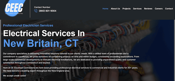
- CE Electrical Contractors: The website features an appealing color palette, primarily consisting of white and blue, which enhances its visual allure. Its design is well-structured, offering effortless navigation facilitated by alternating images and refined typography. The platform delivers an extensive overview of the company’s diverse services, ranging from emergency assistance to EV charging solutions, serving as a comprehensive resource for multiple electrical requirements. Including customer reviews on the site bolsters the credibility and trustworthiness of the services provided. Additionally, the website underscores its quick response times and cost-effective pricing, which are pivotal elements in driving customer engagement.

- Stay Wired Electrical: The site employs a clean, professional layout that is easy to navigate, ensuring that users can quickly find the required services. The color scheme is understated yet effective, using neutral tones to convey a sense of reliability and expertise. The website is rich in content, offering a comprehensive overview of the company’s wide range of services, from emergency electrical repairs to commercial installations. The site also excels in user engagement features. Customer testimonials are prominently displayed, adding a layer of trust and credibility to the services offered. The website also emphasizes its 24/7 availability and provides multiple avenues to contact, including a phone number and a “Request a Call Back” feature.
- Casey’s Electric: The site’s modern and professional layout is visually pleasing, thanks to a well-chosen color scheme and typography. Adding to its design prowess is an eye-catching video slider on the hero page, which instantly engages visitors with a dynamic and visually rich overview of the company’s offerings. The site further builds credibility and encourages user interaction through prominently displayed customer reviews and multiple avenues for contact, such as a “Get a Quote” form. The website is adept at organizing its content and segmenting its diverse services into easily understandable sections. This is especially useful for those who may need to gain prior knowledge of electrical services, as it offers them quick and straightforward guidance. Additional features like a thoughtfully designed footer and a listing of serviceable areas contribute to the website’s focus on user convenience and accessibility.

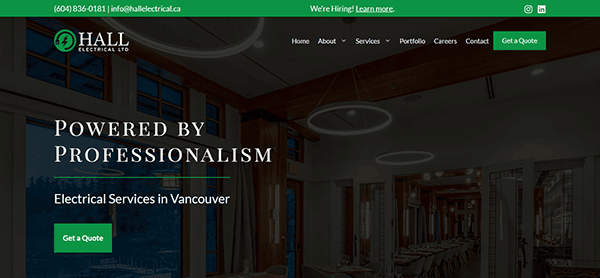
- Hall Electrical: The homepage showcases a visually appealing array of images and key elements, featuring a polished slider in the hero section that highlights high-quality work and compelling headlines. The design maintains a clean and professional aesthetic, prioritizing ease of navigation for the user. A subdued color palette enhances the site’s sophistication, while its well-structured layout facilitates quick access to needed services. The site shines in how it presents its content, delivering an in-depth look at both commercial and residential electrical offerings. Each service is elaborated upon, offering valuable information to prospective clients. Key contact details are easily accessible, and including unique performance metrics, such as “Hours of Experience” and “Meters of Wire Installed,” lends additional credibility to the platform.

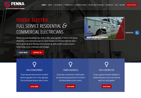
- Penna Electric: When you arrive on the homepage, the site welcomes you with a sleek, contemporary design that instantly positions the brand as a trustworthy and competent electrical service provider. The backdrop features a visually engaging image complemented by an intuitive drop-down menu for effortless navigation. Distinct description boxes are placed on the homepage to guide homeowners, business proprietors, or contractors to the required services. A prominently displayed call-to-action button at the top of the page directs visitors to a contact form, making it convenient to schedule an appointment. Additionally, a brief video featuring the owner offers insights into the company’s unique selling points, areas of expertise, and commitment to complete transparency with clients.

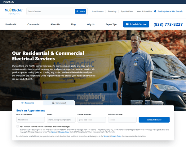
- Mr. Electric: The website presents a sleek, intuitive design that stands as a prime illustration of contemporary web aesthetics. It adheres to a unified color palette that resonates with the brand’s ethos. Skillful utilization of white space contributes to an uncluttered visual experience. The site is easy to navigate, with a clear menu and straightforward layout. Strategically positioned call-to-action buttons facilitate user engagement, guiding them to explore services further or initiate contact. The content is concise and enlightening, offering a rapid overview of the available services. Additionally, the site incorporates cutting-edge features like smart home technology, signaling a progressive mindset.

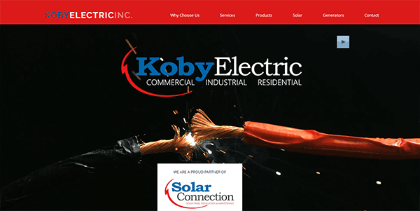
- Koby Electric Inc.: The website immediately engages visitors with a captivating video related to the electrical field, offering a visually compelling introduction to the brand. A well-chosen color scheme adds to the site’s cohesive feel, enhancing user experience. The design elements are neither flashy nor subdued, striking a good balance. Navigation is streamlined and facilitated by a clearly laid-out menu, and the call-to-action features are thoughtfully positioned to guide user actions effectively. The inclusion of an interactive chat box is an astute decision for real-time engagement, offering immediate support while personalizing the user experience.

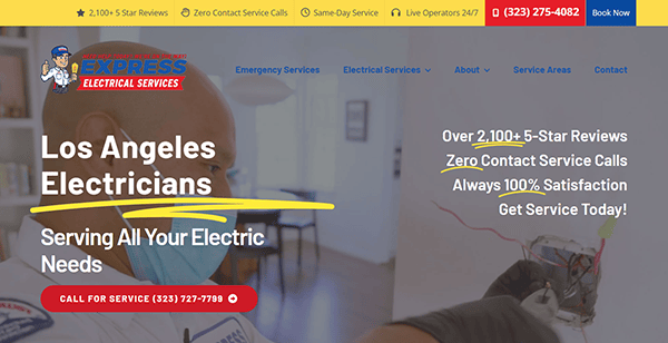
- Express Electrical Services: The website has a clean and professional design, which is essential for building trust and credibility in the service industry. Its website elements, from typography to layout, seem carefully chosen to align with the brand’s identity. Advanced features like a “Specials/Coupons” section and 24/7 live operators add layers of interactivity and support, likely contributing to a compelling platform for electrical services. Although the available content was limited, the design clearly reflects a well-planned strategy geared toward customer acquisition and satisfaction. The presence of compelling calls-to-action, an emphasis on prompt service, and the transparent display of customer reviews all point to an approach that is professional and centered on the customer’s needs.

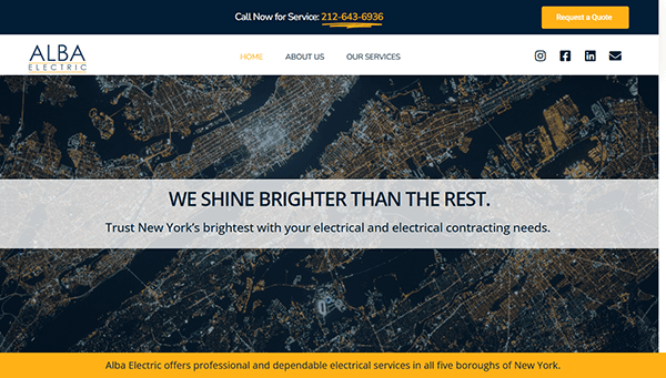
- Alba Electric: The site is designed to be functional and focuses on delivering key messages effectively. The tagline “We Shine Brighter Than the Rest” immediately sets the tone for the brand’s confidence and expertise. The site adopts a minimalist yet impactful color palette and font style, harmonizing with the brand’s overall persona. Its layout is intuitively structured, facilitating ease of navigation for visitors seeking specific information. Thoughtful spacing between design elements likely enhances readability and the user’s overall experience on the site. Strategically positioned call-to-action prompts such as “Call Now for Service” and “Request a Quote” are effectively utilized to steer user actions.

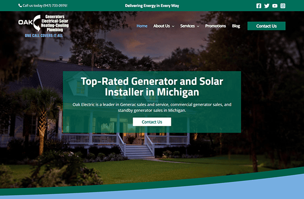
- Oak Electric: The website is a prime example of modern web design tailored to the electrical services industry. Its chosen color scheme, predominantly featuring calming shades of green and white, radiates an aura of environmental consciousness and freshness. The site’s layout is meticulously organized, featuring an intuitive menu that seamlessly navigates users through its diverse service offerings and resources. Upon landing on the homepage, visitors are promptly introduced to the brand’s ethos and array of services, effectively conveying the company’s mission. Additionally, the website bolsters its credibility by highlighting various certifications and affiliations. The presence of a “Testimonials” section and multiple accolades further amplifies its trust factor.

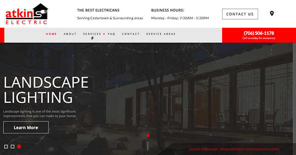
- Atkins Electric: The website’s color palette, which leans towards professional hues, enhances its overall credibility. Its hero section is particularly striking, featuring a blend of grayscale background images and animated geometric shapes that add a dynamic touch. The design also incorporates hover effects and animations as you scroll, lending an added layer of elegance to the user experience. The navigation is straightforward and intuitive, facilitating ease of use for visitors seeking specific information. The ‘Services’ tab includes drop-down options that offer a comprehensive list of services, an innovative design choice for a business with a diverse range of offerings. User interface elements like buttons and forms are designed with user experience in mind, making interactions likely smooth and effortless. Adding business hours and emergency contact information further enhances the website’s user utility.

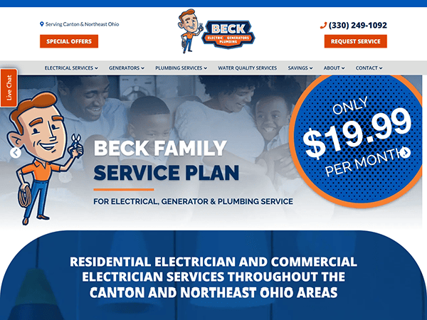
- Beck Electric Company: The website design demonstrates a strong and professional presence, effectively utilizing a color palette primarily composed of blues and oranges. Its navigation is user-friendly and intuitive, facilitating quick access to desired information. Including drop-down menus under different service categories is a thoughtful design element, especially beneficial for a company with a diverse range of offerings. The homepage acts as an informative hub, shedding light on the company’s ethos and range of services. Beyond its aesthetic appeal, the website is designed for functionality, ensuring prospective clients can effortlessly find the essential information they seek.

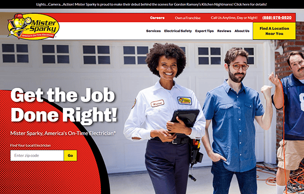
- Mister Sparky: As you land on the homepage, you’re welcomed by a clean, modern design that instantly conveys the brand’s commitment to professionalism and quality service. This is further emphasized using captivating images, informative infographics, and interactive hover effects. One of the standout elements is the site’s emphasis on immediate customer engagement, highlighted by a prominently displayed “Get in Touch with America’s On-Time Electrician” section. This feature simplifies the process for visitors to locate their local electrician by inputting their zip code. The website excels in offering detailed information on a range of services, from urgent repairs to smart home setups. Adding to its credibility, the site includes customer testimonials and reviews, which bolster the brand’s reputation for reliability.
- PK & Altman Electric: The homepage greets visitors with a clean, organized layout that immediately establishes the brand’s professionalism and reliability. Notable features like 24/7 emergency availability and a “Free Estimates” section add layers of transparency and trust, setting the brand apart from competitors. The website goes above and beyond regarding accessibility, featuring screen-reader instructions and avenues for user feedback. It offers a wealth of content, covering an extensive array of services from upscale residential to commercial endeavors, and bolsters its credibility with customer testimonials. The site’s design effectively resonates with prospective clients, instilling confidence and reflecting the brand’s dedication to excellence.

- Kollmann Electric: Its website has an elegant and sophisticated design, featuring a monochromatic hero header that harmoniously blends with the primary call-to-action and engaging headline. The generous use of white space elevates the content’s sophistication and draws attention to key features. Navigation is streamlined credits to a well-organized menu that effectively sorts the array of services, facilitating a smooth user experience. The site thoughtfully includes strategically positioned call-to-action elements such as “Request a Quote,” directing users to engage further. Additionally, a “What Our Customers Have to Say” section adds an extra layer of trust, featuring reviews from satisfied customers.
After delving into top-tier examples of electrician websites, it becomes evident that a meticulously designed website is not a mere extravagance but an essential asset for electricians focused on sustained growth. These standout websites do more than highlight the electricians’ competencies and service offerings; they also serve as rich repositories of useful content for visitors, ranging from educational blogs and instructional guides to real-time quote generators. These sites exemplify the transformative influence of superior web design on business expansion.
In the contemporary digital ecosystem, consider your website as your most influential brand ambassador. Operating ceaselessly, it furnishes prospective clients with indispensable information while offering a convenient channel for communication. A strategically designed website emerges as your paramount instrument for fostering trust, solidifying your brand’s credibility, and aiding in transforming potential leads into devoted customers. The significance of your website as a core component of your overarching business plan cannot be overstated.
Should you aspire to amplify your digital visibility, CyberOptik stands ready to assist. Specializing in electrician website design, we’re equipped to craft a website that is not merely visually appealing but also performance-oriented. Our team is attuned to the specific demands of the electrical services sector, enabling us to design a website that distinguishes you in a competitive market. Contact CyberOptik for a complimentary consultation regarding your electrician website and initiate your journey toward a transformative digital presence.

