Maintaining a solid online presence in the fast-paced commercial construction realm has shifted from being a luxury to an essential requirement. The digital age has transformed how businesses connect with clients, and in an industry as competitive as commercial construction, your website stands as your digital business card. It’s not just about showcasing your projects; it’s about building a narrative around your brand. A well-designed website in the commercial construction sector can significantly elevate your brand’s visibility and credibility. It’s a platform where potential clients can explore past projects, understand your expertise, and envision future collaborations.
The best construction website design goes beyond aesthetics. It serves as a functional tool that aligns with the needs of your target audience. Whether it’s architects, project managers, or investors, your website should speak directly to their concerns and interests. It should be a repository of your work, a testament to your skills, and a clear indicator of your understanding of modern construction trends and technologies. Building construction websites that are informative, easily navigable, and visually appealing can set you apart in a crowded marketplace. They should reflect the quality of your work and your company’s values and vision.
In this digital era, your website is often the first point of contact with potential clients. It’s where first impressions are formed, and decisions are made. A compelling website in the commercial construction industry should effectively communicate your unique selling propositions, showcase your portfolio in the best light, and make it easy for clients to reach out. It’s about creating an online experience that connects with your audience, motivating them to interact and select your services.
Examples of the Best Commercial Construction Website Designs
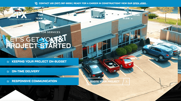
- APX Construction Group: Its website takes viewers to a new height of dynamic features with captivating drone footage, which immerses viewers in a visual journey that showcases the company’s projects with unparalleled clarity. The color scheme, thoughtfully chosen and expertly implemented, creates a visual harmony that speaks to the brand’s sophistication. Navigating through its website is smooth, thanks to its intuitive layout and fixed, well-organized menu. It guides users into exploring its services, projects, and contact information in a seamless journey. One of the website’s strengths is its engaging and interactive content strategy. Concise and comprehensive descriptions of services, complemented by striking visuals, effectively communicate the company’s expertise and versatility.

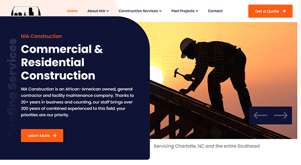
- NIA Construction: Navigating through its website is a refreshing experience marked by a seamless fusion of elegance and functionality. The site’s design immediately captivates with its modern and visually appealing layout, setting the stage for a user-friendly exploration. The color palette on the website is tasteful and professional, creating a cohesive and inviting atmosphere. This thoughtful choice enhances the visual appeal, providing a pleasing backdrop to the comprehensive information about NIA Construction’s services and projects. Its website also impressively incorporates compelling Calls to Action (CTAs) throughout, seamlessly guiding visitors to engage with the content and take meaningful next steps. It has effectively mastered the art of compelling CTAs, turning its website into an engaging platform encouraging visitors to participate actively in their construction journey.

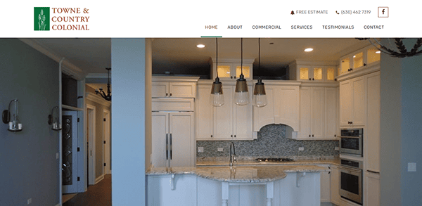
- Towne & Country Colonial, Inc.: Upon visiting TC Colonial Construction’s website, visitors are immediately greeted by a sleek and professional layout that mirrors their dedication to excellence and accuracy. The website stands out for its intuitive navigation, featuring a neatly arranged menu that simplifies the process of locating service details, project showcases, and contact information. The content is crafted to be enlightening and succinct, achieving a perfect harmony that captivates the reader. Moreover, client testimonials infuse genuine reliability and trust, effectively highlighting the company’s commitment to surpassing client expectations.

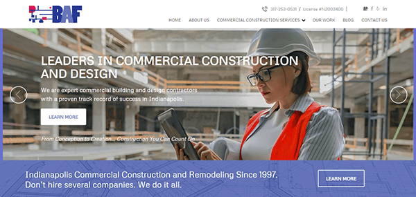
- BAF Corporation: From the outset, the website impresses with its sophisticated and modern aesthetic, aligning perfectly with the company’s professional image. The chosen color palette radiates a serene yet professional vibe, effectively capturing the visitor’s interest. The website excels in ease of navigation; its intuitive design ensures straightforward access to vital information about the company’s services, history, and how to get in touch. The content is expertly crafted, offering a clear and concise summary of what BAF Corporation brings to the table. A standout aspect of the website is its employment of high-quality images, which significantly enrich the site’s story, vividly presenting the company’s projects and successes in an engaging visual format.

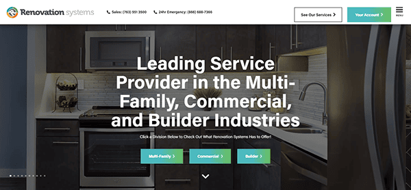
- Renovation Systems: Upon visiting the site, viewers are welcomed by a lively and contemporary design showcasing the company’s forward-thinking stance in renovation services. The website’s layout is aesthetically pleasing and intelligently organized, ensuring a smooth and straightforward navigation experience. The website is crafted to prioritize user convenience, ensuring visitors can swiftly and effortlessly find the information they need. A standout feature of the website is its dynamic use of visuals and graphics, which vividly bring the company’s projects and skills to life, making them more tangible and engaging for the viewer.

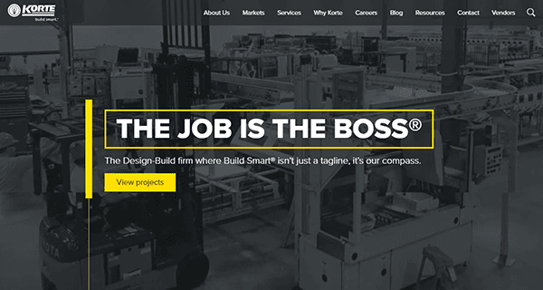
- The Korte Company: Its website is a masterclass in web design, blending sophistication with functionality in a rare and commendable way in the construction industry. As visitors enter the site, they are immediately engaged by a dynamic video that sets the tone for the company’s innovative and professional ethos. The homepage video is a powerful tool that effectively communicates the scale and scope of its projects. The website’s design is exquisite, featuring a clean layout with a well-balanced color scheme that exudes professionalism and class. The website also excels in its use of high-quality imagery and graphics. The crisp, professional images convey the scale and scope of its capabilities, adding depth to the website’s narrative.

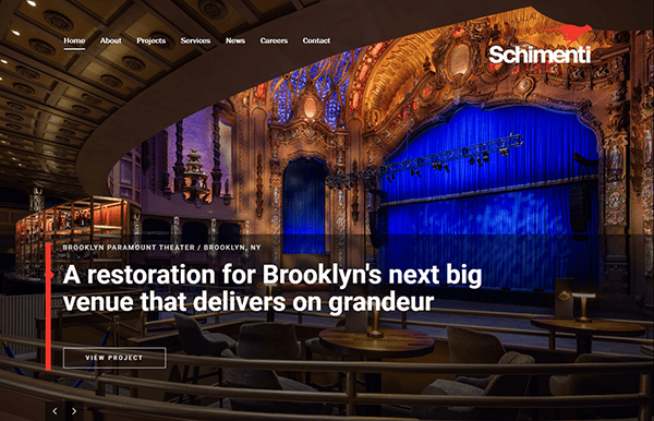
- SCHIMENTI: Visitors to the site are greeted with a contemporary, elegant design that perfectly mirrors the company’s forward-thinking approach to construction. The homepage instantly engages with its vibrant visuals and sleek design. Featuring prominent, high-quality images, the website effectively displays its broad portfolio, emphasizing its proficiency in various construction projects. The strategic use of whitespace enhances the site’s readability and focus, guiding visitors through the content smoothly. Navigation is a breeze on this website. The menu is intuitively designed, allowing easy access to essential sections such as the company’s services, project gallery, team profiles, and contact information.

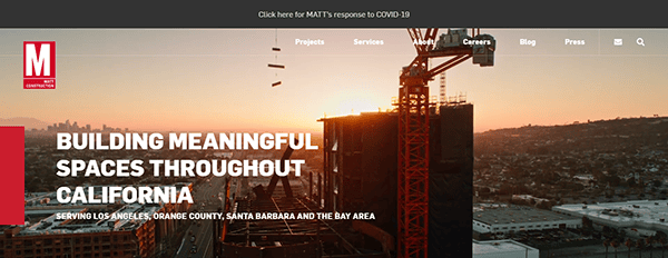
- Matt Construction: The website welcomes visitors with a sleek and modern design that aligns with the company’s stellar reputation for excellence in construction. The homepage commands attention through its eye-catching visuals and a crisply organized, contemporary layout. Featuring high-quality images, the site showcases MATT Construction’s impressive portfolio and captivates visitors, immersing them in the site’s content. The navigation is intuitive and user-friendly, while the content strikes a perfect balance between being concise and informative providing enough detail to engage visitors. Notably, awards and recognitions are seamlessly incorporated into the site, underscoring the company’s esteemed position in the construction industry.

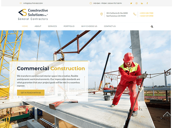
- Constructive Solutions, Inc.: The website presents a clean and professional design, fostering a sense of trust and dependability, which are crucial for clients searching for construction services. Its content is thoughtfully crafted to meet expectations and address prospective clients’ concerns. Phrases like “transforming dreams to reality” effectively tap into clients’ aspirations for efficient, high-quality construction work. The portfolio section, enriched with high-quality images, enhances the site’s visual appeal, allowing visitors to connect visually with the company’s capabilities. The website excels in clearly outlining the variety of services it provides. Calls to action such as “Get in touch with us” and “Get Free Consultation” are strategically placed, making them prominent and inviting, thereby boosting user interaction and simplifying the process for business inquiries.

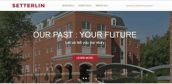
- Setterlin: The website features a sophisticated design that aligns well with the company’s long-standing reputation in the construction industry. Its clean and professional appearance and harmonious color palette significantly boost the website’s aesthetic appeal. Navigation on the site is exceptionally user-friendly, featuring well-defined sections such as Services, Portfolio, About Us, and contact. The site thoroughly explains its services, encompassing pre-, construction, and post-construction phases. Such detailed descriptions provide prospective clients with a clear understanding of the company’s extensive capabilities. The website skillfully narrates the company’s history and fundamental values, highlighting reliability, pride, professionalism, and integrity. This narrative strategy effectively cultivates a feeling of trust and authenticity.

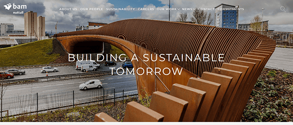
- Bam Nuttall: The website features a contemporary design that aligns with the company’s forward-thinking approach to infrastructure development. It effectively showcases their involvement in various sectors, including railways, wind farms, and other significant infrastructure developments, emphasizing their contribution to the country’s growth and development. High-quality images and graphics, adeptly showcasing their projects and case studies, add a dynamic visual element to the site. Additionally, the site effectively conveys the company’s dedication to sustainability and innovation, showcased notably through its adoption of digital engineering and a commitment to achieving net-zero carbon emissions. Furthermore, the website includes a dedicated section for the latest news and updates, ensuring visitors stay updated on the company’s recent endeavors, key milestones, and notable achievements.

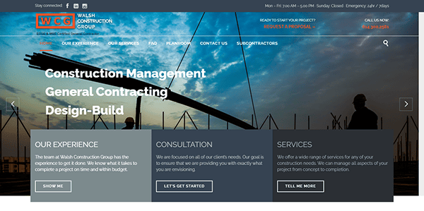
- Walsh Construction Group: Its website displays a modern and professional design. The homepage features eye-catching slider images offering a glimpse of the company’s high-quality work. A clean and intuitive layout allows easy navigation, ensuring visitors quickly find information about its services, projects, and contact details. A cohesive color palette that evokes professionalism and trust and a readable typography contribute to a polished visual presentation. Its website integrates high-resolution images of project photos and creates a captivating user experience, demonstrating the quality of its workmanship. The inclusion of client testimonials along with clear calls-to-action (CTAs) guides visitors to get in touch or explore their services, further enhancing the website’s credibility and user engagement.

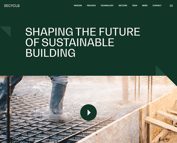
- Recycl8: The website features an innovative design that reflects the company’s commitment to sustainability and modern technology. The layout is engaging, focusing on visual storytelling that captures the essence of its mission. The website’s user-friendly navigation allows visitors to easily access information about the company’s unique approach and services. The website provides detailed information about its mission, process, and technology. This educational content helps visitors understand the significance of their work in the context of sustainability and the Circular Economy. The site effectively communicates the company’s dedication to reducing carbon emissions and transforming waste into valuable resources. This focus aligns with current environmental concerns and positions the company as a leader in sustainable practices.

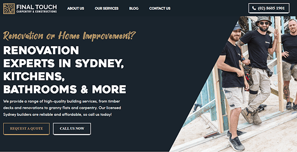
- Final Touch Carpentry & Constructions: The website features a professional yet welcoming design that aligns with the company’s focus on high-quality building services. Its neat and well-structured layout facilitates effortless navigation and information discovery for visitors. High-quality imagery is strategically used to display their services and previous projects, effectively demonstrating the company’s skilled craftsmanship and providing prospective clients with a preview of their potential experience. The site strongly focuses on the company’s dedication to customer satisfaction, featuring client testimonials and underscoring their devotion to quality, dependability, and cost-effectiveness. Additionally, the website encompasses a blog section filled with helpful advice and insights on construction and home improvement, enhancing its educational value and establishing the company as an authority in the industry.

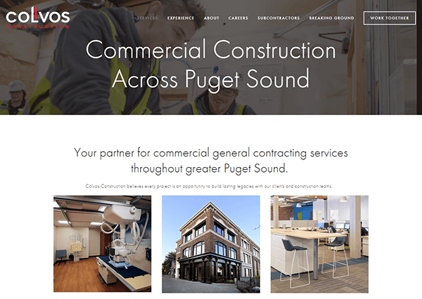
- Colvos Construction: Its website’s first thing that strikes viewers is its professional and modern design. The site’s clean and well-organized layout mirrors the precision and clarity you’d expect from a top-tier construction firm. It brilliantly reflects its professional ethos and commitment to quality in the commercial construction sector. It has a user-friendly approach to navigation, which is crucial in today’s fast-paced digital world, where ease of access to information is vital. For those interested in the specifics of its services, its website offers comprehensive descriptions covering everything from pre-construction planning to the final stages. Additionally, the site provides educational content that gives insights into their construction management process, adding value for industry professionals and clients.

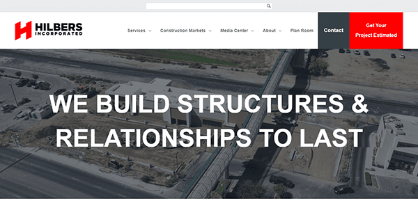
- Hilbers Incorporated: Celebrating over 60 years in the industry, the website effectively showcases its extensive experience in full-service commercial construction across the United States. The website strikes a perfect balance between professionalism and visual engagement. Navigating through its website is intuitive and straightforward. It highlights the company’s experience across diverse market segments, from retail and grocery store construction to medical facilities and multi-family complexes. The website includes a news section featuring recent construction projects, community work, and company events, keeping visitors informed of its latest developments and contributions to the industry.

- Kiewit: The website of Kiewit masterfully combines professional elegance with a welcoming ambiance. Its design facilitates smooth navigation, enabling visitors to easily access details about the company’s services, previous projects, and core values. The site shines in its visual narrative, featuring top-notch images that vividly display the company’s varied project portfolio. It provides detailed overviews of custom home construction, renovations, and project management. A notable aspect of the website is its emphasis on client satisfaction. Prominently featured testimonials from happy clients underscore the company’s dedication to delivering quality and ensuring client contentment. This focus on the client is essential in fostering trust and establishing a credible reputation.
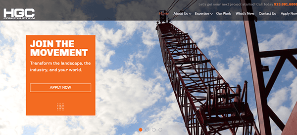
- HGC Construction: The website design masterfully combines professional elegance with a touch of modern flair. Its layout is crisp, contemporary, and methodically structured, facilitating effortless navigation for visitors seeking information about the company’s services, notable projects, and core principles. A standout feature of the site is its fixed menu, which significantly enhances the browsing experience by offering uninterrupted and straightforward access to the primary navigation, no matter the user’s position on the page. This feature contributes to the site’s overall user-friendliness and efficiency. The website impressively utilizes top-tier visual imagery to display its projects, effectively capturing the viewer’s attention. Beyond just a showcase of projects and services, the website reflects its fundamental values and dedication to community and sustainability, aligning with the current trend towards environmentally responsible and community-focused construction practices.

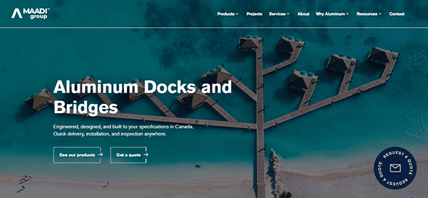
- Maadi Group: Its website has a modern and professional design, reflecting its commitment to excellence. The homepage presents a neat arrangement with a well-chosen color scheme, instilling confidence and dependability. The site’s navigation is user-friendly, with clear menus and an intuitive interface, allowing visitors to browse their extensive service offerings easily. Navigating the website is a seamless experience, with each section thoughtfully laid out. It provides comprehensive product descriptions, which are incredibly useful for potential clients and those in the industry eager to understand the company’s service range. The website effectively emphasizes its commitment to innovation and environmental responsibility in the field of aluminum construction.

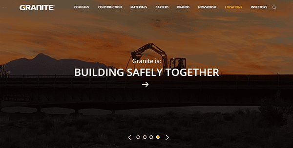
- Granite Construction: Its website presents a stylish, modern design that aptly reflects the company’s innovative spirit and professional ethos. The color scheme is tastefully chosen, offering a visually pleasing and unified appearance. Embracing a minimalist approach, the website utilizes ample white space, contributing to a clean, uncluttered look that draws attention to the vital content. The user-friendly navigation ensures visitors can find and explore the company’s diverse services effortlessly. The website’s well-structured menu and distinct calls-to-action (CTAs) facilitate smooth and intuitive user navigation. A harmonious blend of high-quality images and detailed content enriches the user experience, offering insightful glimpses into the company’s range of services and expertise.

As we delve into commercial construction, it’s crucial to recognize the power of a well-crafted website. The best construction website design showcases a company’s portfolio and communicates its unique story, approach, and expertise. These websites serve as a digital handshake, offering a glimpse into the professionalism and quality a company brings to the table.
In wrapping up, remember that your commercial construction website is far more than a digital pamphlet. It’s a tactical asset with the potential to impact client perceptions and decisions significantly. A well-designed website reflects your brand’s professionalism, attention to detail, and commitment to quality. It’s essential to building trust and establishing a robust online presence.
If your current online presence only partially captures the essence of your brand or if you’re looking to create a new, impactful digital footprint, CyberOptik is here to assist. With our expertise in making the best construction website design, we understand the nuances that drive client engagement and business success in the commercial construction industry. Take your online presence seriously; it’s vital in showcasing your expertise and attracting your desired clients.
Ready to elevate your commercial construction website? Contact CyberOptik for a free consultation about your building construction website. Let’s construct a digital presence that stands as robust and enduring as your construction projects and as tall and strong as the structures you build.

