In the dynamic world of business coaching, having a compelling online presence is more than just a necessity—it’s a game-changer. A well-designed website serves as a digital business card, a platform for thought leadership, and a tool for client acquisition. It’s the first impression potential clients get of a business coach, which can significantly influence their decision to engage with your services.
Business coaching websites are unique in that they need to showcase not just the coach’s qualifications and services but also their personality and coaching style. A top-tier business coaching website should possess visual allure, intuitive navigation, and be brimming with meaningful content that reflects the coach’s proficiency and methodology. It should also include clear calls to action, client testimonials, and a straightforward way for potential clients to get in touch.
Moreover, a professional website can be a powerful tool to establish authority in an industry where trust and credibility are paramount. It can be a platform to share insights, case studies, and success stories highlighting the coach’s ability to help businesses overcome challenges and reach their full potential. A top-notch business coaching website is a strategic investment that can drive business growth and enhance brand reputation.
Examples of the Best Business Coaching Website Designs
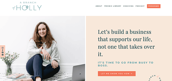
- A Branch of Holly: A Branch of Holly welcomes its visitors with an elegant, contemporary, and polished design. The website fosters a warm and inviting ambiance by employing a calming color palette and featuring top-notch images. The site’s tagline, “Let’s create a business that enhances our lives, not consumes them,” effectively conveys the brand’s purpose and strikes a chord with the intended audience. The well-crafted content imparts valuable insights to small business owners and entrepreneurs, ensuring a rich and informative experience for its audience. This website is a remarkable resource and testament to Holly Bray’s expertise in business coaching and productivity, making it an invaluable destination for professionals in these fields.
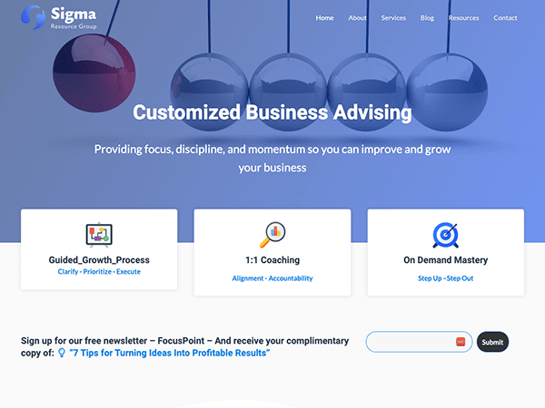
- Sigma Resource Group: The Sigma Resource Group’s website exudes a strong sense of professionalism and commitment to assisting business leaders. Inspiring phrases like “Helping Business Leaders Conquer Their Challenges” and “Think Big – Start Small – Move Fast” skillfully capture the essence of the brand’s mission. The website prominently showcases its services in Strategy & Planning, Business Coaching, and Leadership Mastery, accompanied by concise yet informative descriptions and links for further exploration. By incorporating testimonials, the site provides social proof, reinforcing the positive impact the company has had on its clients. This website is invaluable for business owners and executives searching for strategic growth and development support.
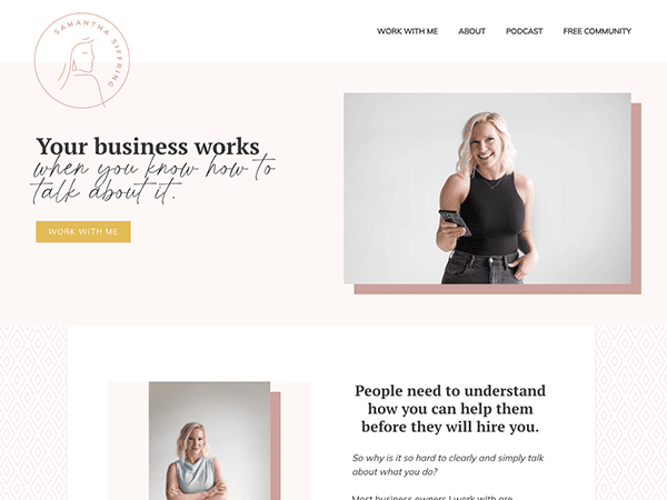
- Samantha Siffring Coaching: As visitors enter Samantha Siffring’s website, a clear and concise mission welcomes them excitingly: to help businesses thrive without burnout. The website employs high-quality images and graphics to elevate the user experience, maintaining consistency with the brand’s color palette and messaging. This cohesive approach creates a seamless look and feel across the entire site. Samantha Siffring’s website offers a wealth of resources for its target audience. From insightful blog posts to a free visibility guide, the content is designed to provide visitors value. With its user-friendly design, valuable content, and compelling CTAs, the site is an excellent platform for attracting and engaging potential clients. Her expertise and the value she brings to her clients are effectively communicated through the website.
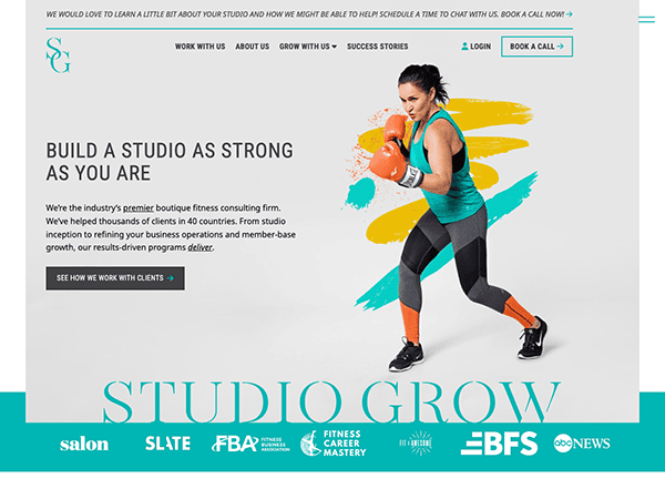
- Studio Grow: Studio Grow’s website leaves no room for ambiguity, promptly conveying its mission to revitalize boutique fitness studios into thriving businesses. The design boasts a sleek and professional aesthetic, emphasizing the brand’s core offerings. Utilizing high-quality images and graphics that deeply resonate with the target audience, the site ensures an engaging user experience complemented by compelling calls-to-action (CTAs). By integrating a captivating design, distinct messaging, and a strong focus on community, the site emerges as the ultimate go-to resource for boutique fitness studio owners. However, with additional written content and resources, the website can solidify its status as a leading authority in the boutique fitness industry.
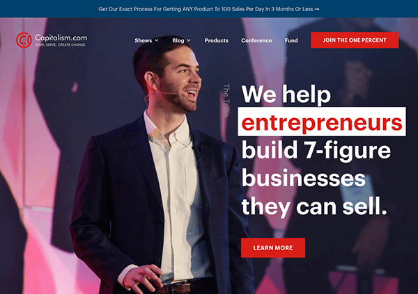
- Capitalism.com: Capitalism.com positions itself as a central hub for entrepreneurs, emphasizing capitalism’s potential to incite transformation and create wealth. The website boasts a sleek and polished design, effectively clearly showcasing its offerings and mission. The visuals are consistent with the brand’s color palette and overall theme, creating a cohesive look and feel. Their website content empowers and educates entrepreneurs, making it valuable for the target audience. Its navigation is intuitive, with transparent sections for podcasts, blog posts, products & events, and community engagement. Additionally, success stories and testimonials add credibility and demonstrate tangible results achieved by clients and community members.
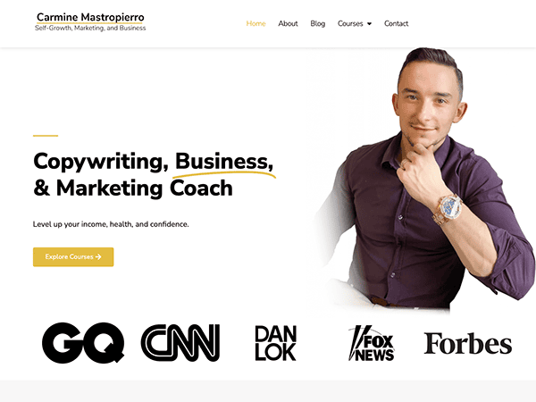
- Carmine Mastropierro: Upon visiting Carmine Mastropierro’s website, you are immediately introduced to a professional and sleek design. The website utilizes high-quality images and graphics to significant effect, seamlessly complementing the content and elevating the user experience. The main message, “Self-Growth, Business, & Marketing Coach,” is prominently showcased, clearly defining the website’s purpose. The site offers valuable content, including YouTube videos and blog articles, catering to diverse interests and needs. The well-structured content provides valuable insights into self-development, marketing, and business. Including student testimonials adds authenticity and showcases the positive impact of Carmine’s coaching and courses.
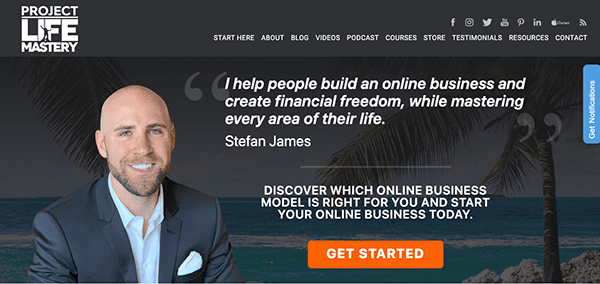
- Project Life Mastery: Project Life Mastery’s website design is modern, with a mix of vibrant colors and high-quality images, creating an inviting atmosphere. The website remarkably displays its primary message: “I help people build an online business and create financial freedom while mastering every area of their life,” providing a clear and concise representation of the brand’s mission. The content-rich website offers various resources, from blog articles to online courses. Topics range from self-development to online business strategies, reflecting the brand’s commitment to holistic mastery. The website has user-friendly navigation, featuring a straightforward top menu that guides visitors to essential sections like “About,” “Courses,” “Blog,” and “Contact.” The dropdown menus are minimal, ensuring a smooth and easy browsing experience.
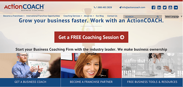
- ActionCOACH: ActionCOACH’s website presents a professional and well-structured layout. The design is modern, with a mix of vibrant colors and high-quality images, creating an inviting atmosphere. Using high-quality imagery, graphics, and videos are strategically placed throughout the site, enhancing user engagement and browsing experience. Its captivating visuals complement the content, making complex topics more digestible. The website features testimonials and success stories, which enhance trust and authenticity. These testimonials showcase real benefits and positive experiences from the brand’s offerings.
- Prestige Business Coaching: Prestige Business Coaching website evidently showcases a platform dedicated to offering business advice and insights. The website impresses with its clean and well-organized design, ensuring easy navigation for visitors. The main message, “FREE BUSINESS ADVICE & BLOGS from Award-Winning Business Coach Robert Viney,” is prominently displayed, enticing and drawing visitors in. The content is rich, with articles on productivity, business growth, and success habits. The site also highlights awards and recognitions, further establishing its authority in the field. Moreover, Prestige Business Coaching offers a wealth of valuable resources tailored to entrepreneurs and business owners seeking to elevate their success.
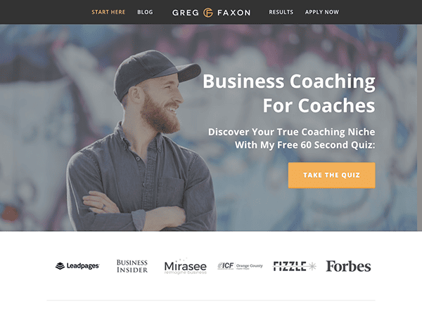
- Greg Faxon: Greg Faxon’s website presents a clean and professional design that immediately communicates its purpose: business coaching for coaches. The site’s design is minimalistic, focusing on text over visuals. The site’s straightforward tagline, “Business Coaching For Coaches,” effectively communicates its niche orientation to visitors. One of the standout elements is the interactive quiz called “Discover Your True Coaching Niche,” which captivates visitors and delivers personalized insights. The website also offers valuable articles covering various subjects, such as identifying a coaching niche, attracting clients, and crafting a mission statement. Moreover, visitors can access a complimentary PDF guide on client acquisition, making it a compelling lead magnet.
- Vanguard Business Coaching: Vanguard Business Coaching’s website emanates professionalism and experience in providing business coaching services. The clean and straightforward design creates an appealing and professional impression. The website’s content is highly informative, centering on the exceptional value of their coaching services. The blog section further enriches the experience, providing valuable insights on topics that are directly relevant to business coaches. Apart from the previously mentioned features, the website proudly showcases testimonials and success stories, enhancing the brand’s credibility and reputation. As a result, the website successfully communicates its offerings and serves as a valuable resource for potential clients.
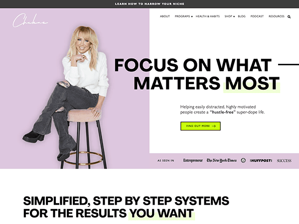
- Chalene Johnson: Chalene Johnson’s website is a dynamic and captivating platform that instantly conveys its mission: to assist easily distracted, highly motivated individuals in crafting a “hustle-free” super-dope life. The site’s contemporary design is visually appealing, and a prominent call to action urges visitors to explore and uncover their unique niche. The website boasts a visually captivating design, incorporating high-quality images and a lively color palette. These visuals elevate the user experience, creating an engaging and inviting environment for visitors. The content is informative and interesting, focusing on health, habits, and business. The Call-to-Action( CTAs) are well organized and compelling, which guides visitors towards valuable resources and potential services.
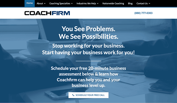
- Coachfirm: Coachfirm confidently positions itself as a specialized platform for business coaching, underscoring its proficiency in propelling small businesses toward prosperity. With its compelling tagline, “You See Problems. We See Possibilities,” the website establishes a constructive and optimistic ambiance from the outset. The website introduces the “Bizpods(R) Coaching Program,” a proprietary coaching program designed to bring about positive change in business management. The site is user-friendly, content-rich, and designed to convert visitors into clients. The platform is designed thoughtfully to cater to business owners seeking guidance and substantial growth, making Coachfirm’s services undeniably compelling and highly beneficial.
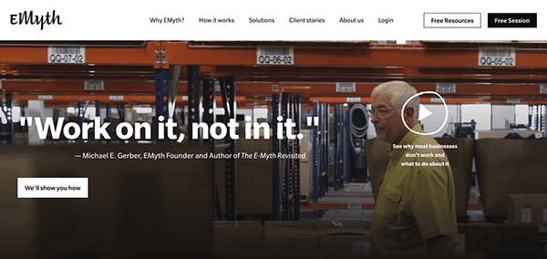
- EMyth: EMyth stands out as a comprehensive business coaching platform, emphasizing its four-decade-long expertise in guiding entrepreneurs and businesses toward success. The website boasts a sleek and polished design, ensuring effortless navigation. Engaging visuals complemented by concise headings drive visitors through the site’s diverse offerings, enhancing the overall user experience. The website abounds with testimonials from a wide range of businesses, effectively showcasing the positive influence of EMyth’s services. These impactful testimonials are compelling endorsements, reinforcing the company’s effectiveness and credibility.
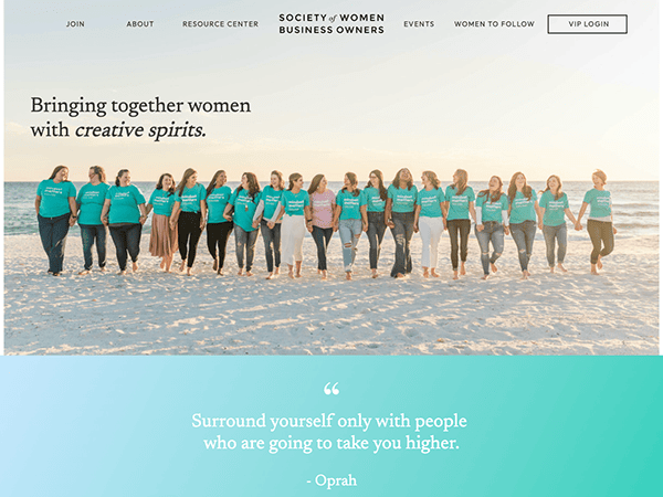
- Society of Women Business Owners (SOWBO): The website of the Society of Women Business Owners (SOWBO) exudes vibrancy, serving as a dedicated platform to empower and support women entrepreneurs. Through its tagline, “Uniting women with creative spirits, business acumen, and compassionate hearts,” the site establishes a sense of community, empowerment, and cooperation, fostering an inspiring environment for women in business. The website’s design is clean, professional, and visually appealing. The use of soft color tones combined with compelling visuals creates an inviting atmosphere. The site emphasizes the importance of community, with testimonials and success stories showcasing the positive impact of SOWBO’s services.
- Jacquette M. Timmons: The website is a dedicated platform for personal financial coaching, delving into the core beliefs and behaviors influencing financial success. Its tagline, “Financial success doesn’t start in your wallet,” immediately evokes introspection and a deeper understanding of financial behavior. The clean and professional design uses whitespace, captivating visuals, and clear calls to action to create an inviting ambiance. Through the “Financial Wheel” framework, the site offers valuable insights to help individuals make informed financial choices. Notably, the “Half-Day VIP Coaching Session” showcases a personalized approach to financial coaching. Moreover, Jacquette’s media features lend credibility to her expertise, emphasizing the site’s commitment to providing quality financial guidance.
- Hatch Tribe: Hatch Tribe’s website impresses with its clean and organized homepage design. The light and breezy color palette evokes a sense of serenity and a professional atmosphere at first glance. The website also excels in conveying its primary focus: business consulting. The intuitive navigation guides visitors to essential resources, coaching sessions, and community engagements. Hatch Tribe’s website is designed to be user-friendly and content-rich, catering to the needs of entrepreneurs on their journey. It provides valuable support and engagement for business owners seeking a holistic approach to business growth. With its offerings aligned with modern business needs, Hatch Tribe is a valuable resource for ambitious entrepreneurs.
- Ali Brown: The website emanates professionalism and clarity through its clean design, skillfully utilizing whitespace and captivating visuals to create a seamless user experience. Her website positions her as a leading figure in the world of entrepreneurship coaching, particularly for women. The site’s emphasis on “Sustainable Success” and the tagline, “Grow & Scale Your Business… The Sustainable Way,” underscores a holistic approach to business growth that goes beyond just financial metrics. Its website is a user-friendly and content-rich platform thoughtfully designed to engage and support entrepreneurs on their journey, with a particular focus on women. Entrepreneurs will discover immense value in Ali Brown’s offerings, which align with the demands of modern business and provide a holistic approach to business growth.
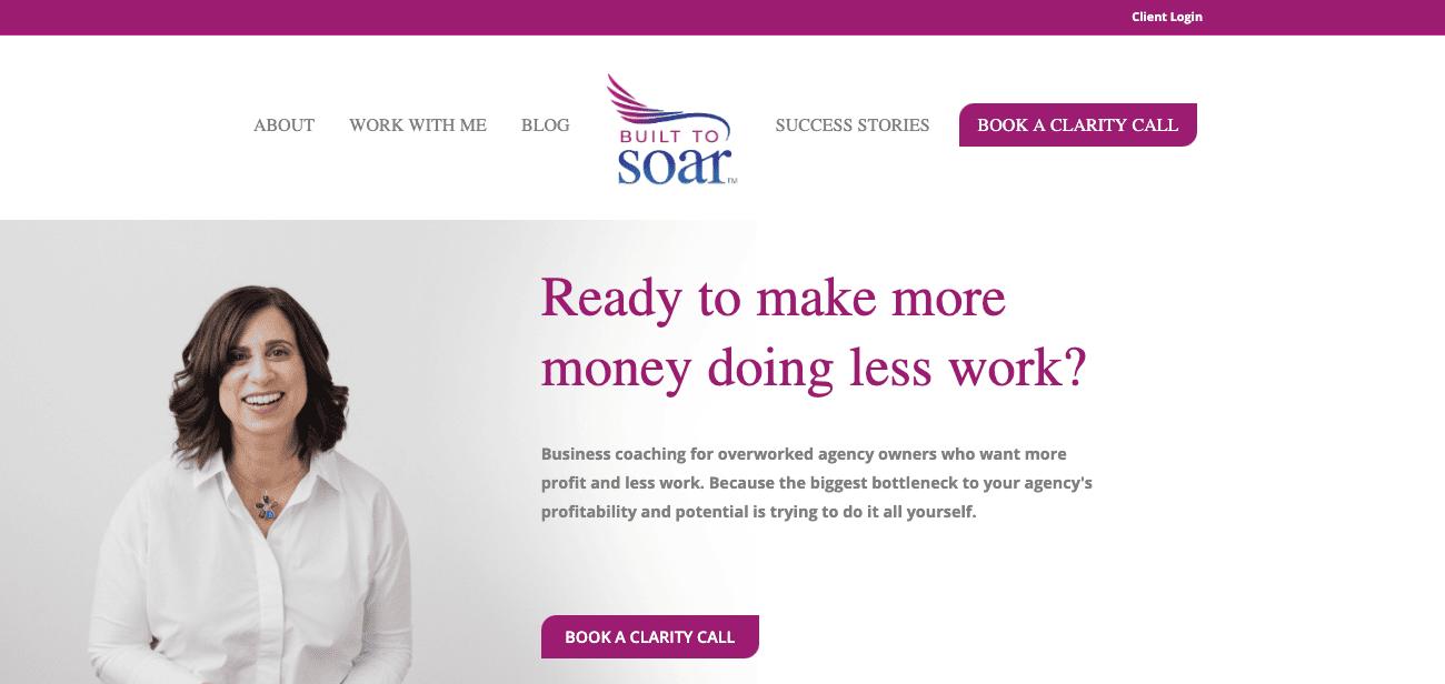
- Built to Soar: Built to Soar offer a unique and fresh perspective on business growth, prioritizing sustainable success and purposeful productivity. The website is visually appealing with a clean and modern design. Using whitespace, combined with compelling visuals, ensures a seamless user experience. The website’s core message revolves around rethinking traditional work methods to attain sustainable success. Valeri’s philosophy is centered on the idea that entrepreneurs can achieve more by embracing the concept of “doing less and being more.” The site emphasizes “purposeful productivity” while actively addressing the importance of avoiding burnout.
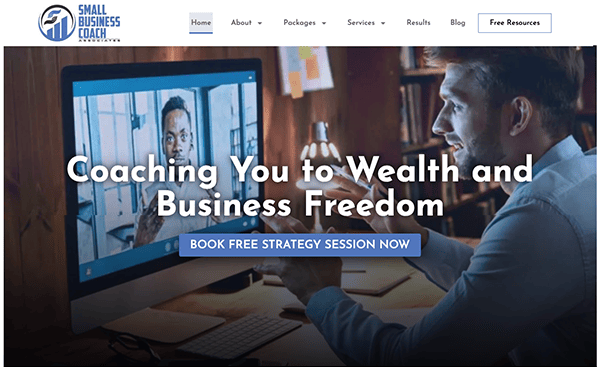
- Small Business Coach Associates: Small Business Coach Associates is a specialized platform offering tailored professional business coaching services to meet the needs of small businesses and entrepreneurs. The website places significant emphasis on clarity, accountability, and strategic planning as essential factors in achieving business success. Visitors can book a free strategy session with a straightforward design and clear calls-to-action. Notably, the site showcases the company’s extensive experience, highlighting the founder’s achievements and awards, adding credibility to their offerings. The website also provides a complimentary strategy session, a fantastic opportunity to engage prospective clients and showcase the value of their services.
After exploring the importance of a well-designed website in the business coaching industry, it’s time to delve into some examples. These websites stand out not just for their aesthetic appeal but for their functionality, user experience, and the value they offer visitors.
The world of business coaching is diverse and ever-evolving, and the best websites in this industry reflect that dynamism. They are more than just digital brochures—they are engagement, learning, and connection platforms. They offer a blend of personal stories, professional insights, and actionable advice that resonates with their target audience.
Moreover, these websites understand the power of social proof. They showcase client testimonials, case studies, and success stories that highlight the tangible impact of their coaching services. They also make reaching out easy for potential clients, with clear calls to action and multiple contact options.
Finally, the best business coaching websites are those that stay true to the coach’s unique brand and vision. They convey a sense of the coach’s personality and coaching style, making potential clients feel like they’ve started to get to know the coach even before their first interaction.
If you’re a business coach looking to create or revamp your website, CyberOptik is here to help. We recognize the distinct requirements and hurdles of the business coaching sector, and we are dedicated to assisting you in crafting a website that is both aesthetically pleasing and actively beneficial for your enterprise.
Elevate Your Business Coaching Website with CyberOptik
A skillfully crafted website stands as a potent instrument for business coaches. It amplifies credibility, showcases your mastery in the field, and draws a more extensive clientele. However, creating such a website requires a blend of technical skills, design expertise, and a deep understanding of the business coaching industry.
That’s where CyberOptik comes in. We specialize in creating high-quality, customized websites for business coaches. We recognize that your website embodies your brand, and we are devoted to designing a platform that mirrors your distinct flair and methodology.
Whether starting from scratch or looking to revamp your existing site, we’re here to help. We’ll work closely with you to understand your goals, your brand, and your target audience. Then, we’ll create a website that meets and exceeds your expectations.
Ready to take your business coaching website to the next level? Get in touch with CyberOptik today for a free consultation. Let us demonstrate how an expertly crafted website can elevate your online visibility and propel your coaching enterprise to success.

