NexteerThe automotive industry stands at the forefront of innovation and technological advancement in today’s fast-paced digital world. A great website serves as the engine of a brand’s online presence, powering its journey toward capturing car enthusiasts’ and customers’ attention and loyalty. For automotive companies, having a standout online presence isn’t just about showcasing their latest models; it’s about creating an immersive digital experience that reflects their brand’s quality, performance, and innovation. The best automotive websites go beyond mere aesthetics, integrating functionality with engaging content to guide visitors through a journey as exhilarating as the vehicles themselves.
The importance of an effective website in the automotive sector cannot be overstated. With consumers increasingly turning to online research before making a purchase, the first impression made by a website can significantly influence buying decisions. This digital footprint must present the vehicles in the best light and provide comprehensive information, seamless navigation, and interactive elements that allow visitors to customize and visualize their dream car. The best automotive website design incorporates intuitive layouts, high-quality images, and detailed specifications, ensuring that potential buyers have everything they need at their fingertips.
Moreover, a well-designed automotive website is a powerful tool for building brand identity and loyalty. It tells a brand’s story, highlights its heritage, and showcases its commitment to innovation and excellence in engineering. By effectively communicating a brand’s values and vision, the best automotive websites create a connection with their audience, turning casual browsers into lifelong customers. This emotional engagement is crucial in the highly competitive automotive market, where differentiation is vital to standing out.
Examples of the Best Automotive Website Designs
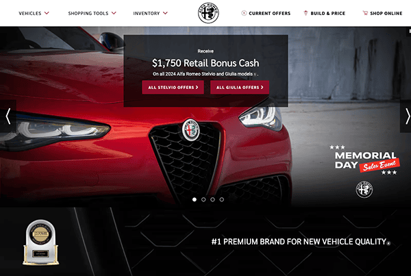
- Alfa Romeo: When viewers land on the website, they are drawn in by its sleek and user-friendly design. The layout effectively captures the refinement inherent in the brand. It has a clean, modern style. Its website immediately draws visitors in with its attractive black, white, and red color scheme. And the homepage’s stunning graphics strike the browsing experience and leave a lasting effect on visitors. The site’s many sections were easy to navigate because of its user-friendly interface and well-organized menu. Whether you are a novice visitor or a seasoned auto enthusiast, finding the information you need is simple and makes for a pleasant and easy browsing experience for everyone. The website prioritizes navigation ease by strategically placing call-to-action buttons throughout its pages.
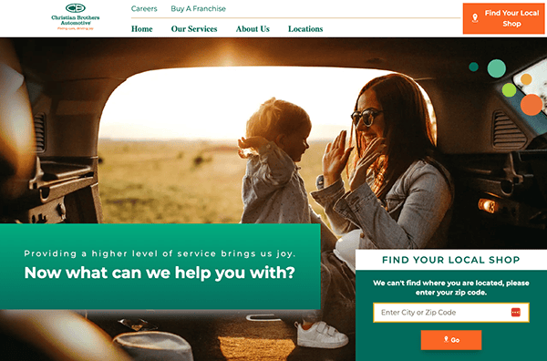
- Christian Brothers Automotive: The website’s layout, which is simple, contemporary, and adequately organized, makes navigating through its several sections simple. The beautiful color scheme of this custom automobile website was a significant feature that viewers could appreciate. The website gave accessibility priority by carefully placing vibrantly colored buttons all over the place. These buttons represent a dedication to inclusivity and user-friendly design by improving visual appeal while also guaranteeing navigational simplicity for all users.
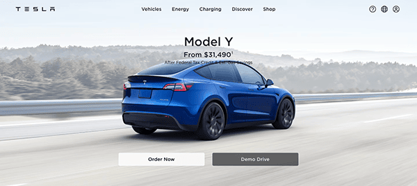
- Tesla: The crisp layout, minimalist design, and captivating visuals combine to craft an immersive and visually striking experience that immediately grabs attention and encourages further exploration. Tesla’s website’s user-friendly design and intuitive interface make navigation effortless. Users can quickly locate any information they need with a few clicks, whether looking through car models, learning about green energy options, or booking a test drive. The website uses rich multimedia elements, such as animations, interactive demos, and videos, to draw users in and better understand the company’s goals and offerings. The website’s large visual use provides a refreshing and unique experience within the automotive industry. Additionally, their implementation of clear call-to-action buttons ensures straightforward navigation throughout the site.
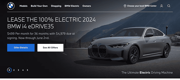
- BMW: The website’s clean layout, elegant typography, and eye-catching images create a warm and visually appealing experience that perfectly captures the spirit of BMW’s esteemed brand. The automotive website employs a striking black-and-white color scheme, resulting in a sleek and custom web design. However, perhaps the most notable feature of the homepage is the prominently displayed and clearly labeled menu, which significantly enhances user navigation and accessibility. The website effectively conveys its commitment to transforming driving and setting new benchmarks for automotive quality with its sleek design, intuitive navigation, and extensive functionality.
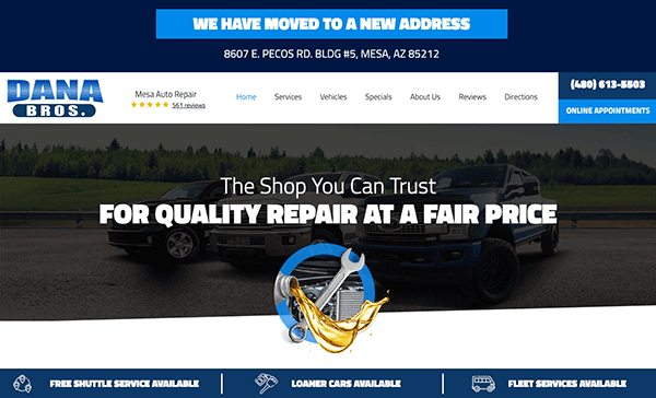
- Dana Bros.: The website’s vibrant design draws users in promptly, simplifying its offerings. The homepage uses eye-catching, high-quality graphics to highlight the company’s wide range of goods and services. The site has an easy navigation feature and provides quick access to all pertinent information courtesy of its prudent navigation. What’s impressive is the website’s seamless transition across different devices, maintaining its appeal and functionality through responsive design. Every element, including the typography and the thoughtfully selected color scheme, exhibits meticulous attention to detail, improving readability and aesthetics. Danabros’ dedication to client satisfaction is demonstrated by including case studies and testimonials, reinforcing the company’s services and inspiring more trust.
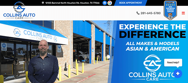
- Collins Auto Care: The website welcomes viewers with a clean and professional design that effortlessly instills trust from the moment they arrive on the site. The refreshing color palette of blue, white, and black on this custom automotive website immediately caught our eye. One standout feature of the website is its exceptionally user-friendly interface, catering to visitors of all levels of technological expertise. Incorporating a live chat box brought an interactive approach to viewers, addressing queries instantly. Additionally, incorporating customer testimonials and reviews adds a personalized touch, offering insights into the positive experiences of previous clients and further solidifying the company’s reputation for excellence.
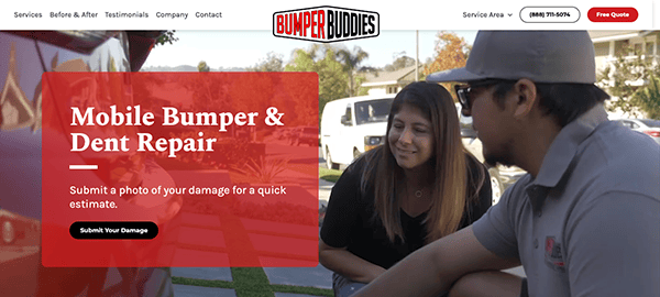
- Bumper Buddies: The automotive website’s auto-playing video greets visitors as soon as they navigate past the menu, grabbing their interest right away. The site is impressive because of how well the graphics are integrated throughout, improving user engagement and visual attractiveness. Its well-labeled menus and user-friendly tools make the navigation smooth and easy to use, guiding users to the desired information quickly. Integrating customer testimonials and before-and-after photos is a powerful testament to the company’s expertise and commitment to customer satisfaction, bolstering the website’s credibility and instilling confidence in potential clients.
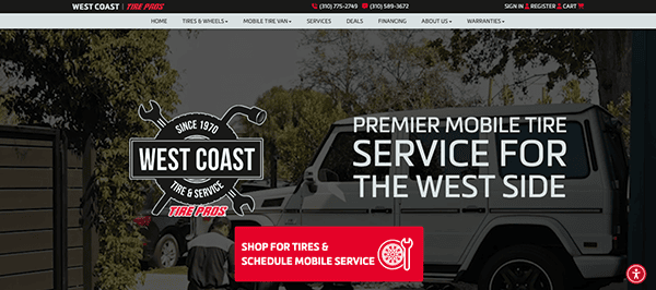
- West Coast Tire Pros: When visitors land on the homepage, they are welcomed by a modern, clean design that exudes expertise. The color scheme, which combines calm red, black, and pure white, creates a welcoming atmosphere that immediately gives off confidence and trust. Well-arranged menus and a user-friendly design make easy navigation possible. Every area is divided for easy access and browsing, whether you’re looking for vehicle repairs, tire services, or just browsing their selection. The strategic implementation of graphics was essential in securing the website’s spot on top. Notably, the site prioritizes usability, which is particularly evident in its streamlined presentation of contact information.
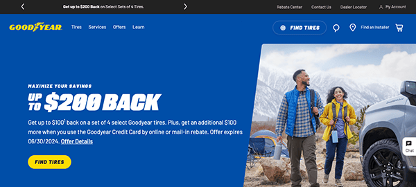
- Goodyear Tires: When visitors land on the homepage, they are greeted by a clean, modern style that exudes professionalism and reliability. The color scheme, which combines icy blues and vivid yellows, produces an eye-catching yet peaceful ambiance that precisely captures the spirit of the Goodyear brand. With clean call-to-action buttons and well-organized menus, the navigation is easy to use and leads users to their intended locations. All the information you need, including corporate information, services, and tires, is readily available and well-organized.
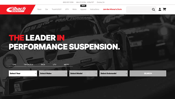
- Eibach: This automotive website’s color scheme, predominantly white, red, and black, effectively conveys an air of sophistication and immediateness. Viewers will be stunned by a striking array of high-quality images that immediately capture attention and showcase the company’s offerings as they navigate the site. The website also excels in its strategic content layout, effectively breaking up information to ensure clarity and engagement. Throughout the encounter on the website, visitors are encouraged to take action. Clear Call-to-Action buttons direct customers to their chosen destination to explore their latest product offerings, join the enthusiast community, or contact customer support. By seamlessly integrating CTAs, it ensures that every visit to their website is both informational and actionable, encouraging consumers to engage with the business on a deeper level.
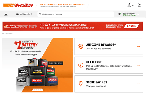
- AutoZone: The website’s clean and intuitive appearance sets a standard for simplicity in the automobile industry. The design is innovative, focusing on the simplicity of navigation, as evidenced by the prominently placed search bar, which provides instant access to required information. The website’s product pages contain a wealth of information, including high-quality photographs and comprehensive descriptions that give a thorough overview of each item. Whether you’re a seasoned mechanic or a newbie enthusiast, the website will help you make confident purchasing decisions. Its website is more than just a product catalog; it also serves as a hub for customer assistance resources. Customers can confidently tackle automobile problems with how-to guides, troubleshooting advice, and instructional videos, knowing that expert assistance is only a click away.
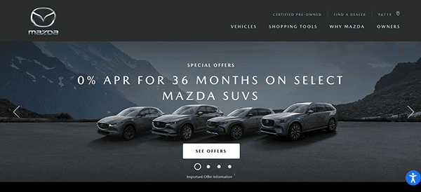
- Mazda: The website’s smooth design, engaging imagery, and straightforward layout capture customers from the moment they enter. Visitors get a seamless browsing experience, whether looking at the latest models, learning about new features, or accessing customer service resources. It uses subtle layering and compelling animations to provide an immersive browsing experience that is enjoyable at every turn. Its user-friendly interface and dedication to customer service set a high bar for web design and user experience. Whether you’re a long-time Mazda fan or a beginner, visiting the website is a pleasure, with every aspect deliberately designed to enhance the user’s trip.
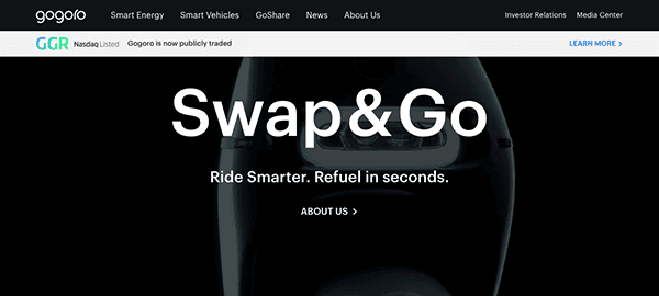
- Gogoro: The website’s basic yet beautiful animations, brilliant color scheme, and high-resolution images reflect the same degree of ingenuity that Gogoro puts into its unique, renewable energy solutions. This integrated design approach improves the website’s visual appeal and effectively communicates the company’s commitment to innovative automotive solutions. The animations offer a humorous element, while the vibrant color palette adds energy and excitement to the browsing experience. When combined with fantastic photography that highlights its automobiles in the most excellent light, the website provides an engaging and unforgettable impression that visitors remember.
- Icon Motosports: Their site is a stunning display of slick design and innovative thinking. Its visually beautiful layout, vivid images, and dynamic visuals immediately transport viewers to the adrenaline-fueled realm of motorcycle culture, laying the groundwork for an engaging browsing experience. Despite its complexity and wealth of content, this website avoids the problems of bad user experience by providing a smooth and straightforward surfing experience. Every piece has its proper place in a diligently planned layout that promotes efficiency and ease of navigation. The absence of infinite scrolling contributes to a clutter-free design, allowing users to rapidly find the information they require without feeling overwhelmed. This thorough structure created a cohesive digital environment in which each component contributes to the user’s journey, resulting in a gratifying browsing experience.
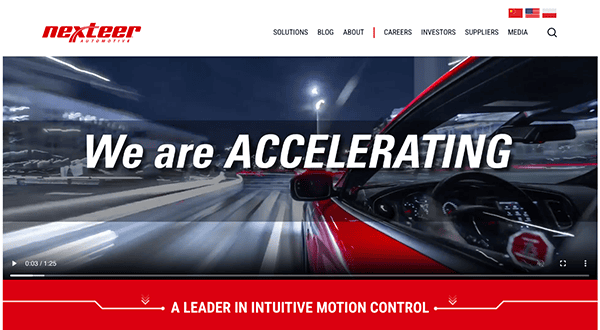
- Nexteer: The website emanates professionalism, expertly merging black, gray, red, and white tones to achieve a classy style. This harmonizing color design creates a polished browsing experience that precisely complements the content’s professional tone. It is an excellent instance for automobile companies, demonstrating how a well-executed homepage design can boost the brand’s image and effectively communicate professionalism. Compelling multimedia features like videos and interactive graphics enhance the user experience. These dynamic features capture the audience’s attention and convey essential information about its Automotive goods, technologies, and industry leadership.
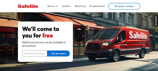
- Safelite: The website impresses with its sleek design and user-friendly layout, seamlessly blending aesthetics with functionality. Its modern interface offers a delightful browsing experience with swift loading speeds and effortless navigation. The website captivates visitors with high-quality images and crisp typography, elevating the visual experience. These elements enhance the site’s aesthetic appeal and contribute an essential role in ensuring that crucial information is effortlessly readable and understandable. Visitors can effortlessly access pertinent information, be it details on windshield repair services or scheduling appointments, facilitated by handy features like the “Find a Location” tool. Moreover, the site’s wealth of valuable content, presented in easily understandable formats, enriches its appeal, empowering users to make well-informed decisions regarding their auto glass requirements.
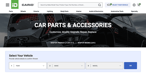
- CARiD: Upon arrival, the homepage greets visitors with vivid imagery and a neatly arranged layout, instantly guiding their focus toward essential sections such as product categories, special deals, and highlighted items. The design elements are deliberately chosen, creating a visually appealing experience that captivates consumers and promotes exploration. Furthermore, the straightforward navigation guarantees that users can easily navigate the site on a desktop or mobile device. This attention to detail in web design improves the overall design output and contributes to a positive user experience, making the website enjoyable to navigate.
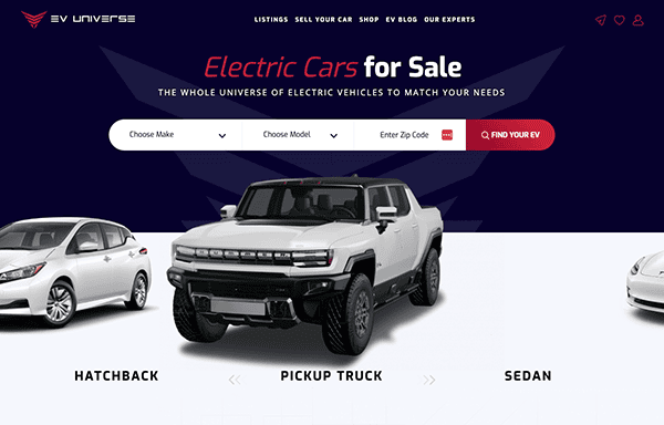
- Ev Universe: The site welcomes visitors with a sleek and modern layout that includes appealing graphics and clean typography that attracts attention. The website’s lively color palette effectively lightens the mood, using bold red, blue, and white tones to attract the viewer’s attention immediately. These vibrant colors are supplemented by bold dark and white accents, resulting in a visually appealing experience that readily attracts viewers to the content. High-quality images effectively highlight electric automobiles and related items, offering an immersive experience for consumers. The layout is well-organized, with user-friendly navigation menus and displayed sections for quick access to information.
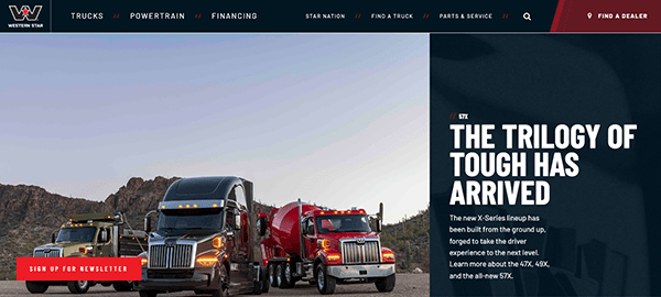
- Western Star: While browsing the website, viewers will notice the strategic use of several fonts to highlight essential titles, effectively directing the reader’s attention to key information. Using black backgrounds throughout the site adds a sense of refinement while increasing visual contrast, making the content more legible and interesting. Furthermore, the website addressed accessibility, as evidenced by the precisely labeled navigation bar. Each area is appropriately labeled, allowing users to explore the site and obtain the required information easily. This compelling design approach improves the user experience and demonstrates the website’s commitment to diversity and usability.
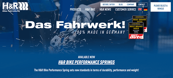
- H&R: The website’s elegant and modern design swiftly draws in visitors. The viewers are greeted with stunning imagery and an organized layout that displays expertise. One standout feature of this innovative automobile website is its conveniently accessible search bar. It enhances user experience by allowing visitors to find the information or products they are looking for rapidly. Furthermore, an autonomously streaming video provides another layer of engagement by giving visitors dynamic material that grabs their attention when they arrive on the website. These thoughtful elements help to provide a seamless and engaging browsing experience, demonstrating the site’s commitment to user ease and engagement.
In automotive excellence, where performance and design reign supreme, the digital showroom is pivotal in captivating and engaging potential buyers. The best automotive websites are a testament to a brand’s commitment to quality and innovation, offering a seamless blend of functionality and aesthetics. From immersive 3D experiences that allow users to explore every angle of a vehicle to interactive configurators that personalize the buying experience, these websites push the boundaries of what’s possible online. They highlight the features and benefits of various models and immerse visitors in the values and story of the brand, making the website not just a portal but an integral part of the customer’s journey.
As we cruise through the digital age, the role of a website in the automotive industry evolves to meet the ever-changing expectations of consumers. The best automotive websites stay ahead of the curve, leveraging the latest web technologies to offer users a fast, responsive, and secure browsing experience. These sites understand that in the competitive automotive market, the race doesn’t just happen on the track; it occurs on the digital front, where first impressions can make or break a potential sale. Therefore, investing in high-quality automotive website design is not merely an option but a necessity for brands aiming to accelerate their growth and drive into the future of digital marketing.
In conclusion, the automotive industry’s landscape is fierce competition and constant innovation. A brand’s website acts as its digital flagship, embodying the essence of its identity and the pinnacle of its technological achievements. The best automotive websites captivate with their design, inform with their content, and engage with their functionality, setting the standard for online experiences. They are crucial to a brand’s digital strategy, driving visibility, engagement, and sales.
If you’re in the automotive industry and looking to rev up your online presence, CyberOptik is here to turbocharge your digital footprint. Specializing in creating bespoke website solutions that resonate with your brand’s mission and the dynamic demands of the automotive market, CyberOptik understands the power of a great website. Contact us today for a free consultation on how to steer your automotive website into the fast lane of digital innovation. Let’s shift gears and race towards unparalleled online success together.

